This article walks you through a couple of practical examples that demonstrate how to add borders to Card widgets in Flutter (we’ll use the latest version of Flutter with Material 3 enabled by default).
Card Border Customization
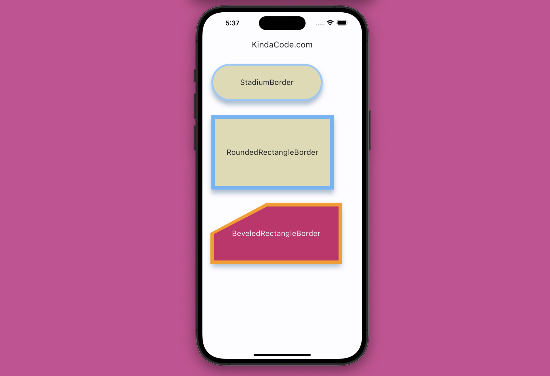
To config borders for a Card widget, focus on its shape property. We can set this property to one of the following classes:
StadiumBorder: Creates a stadium borderRoundedRectangleBorder: Creates a rectangular border (with rounded corners as needed)BeveledRectangleBorder: Creates a rectangular border with one or multiple flattened corners
This example makes use of all these classes. You’ll also see how to control the color and thickness of a card border.
Preview
The Code
The code with explanations in the comments:
// KindaCode.com
// main.dart
import 'package:flutter/material.dart';

void main() {
  runApp(const MyApp());
}

class MyApp extends StatelessWidget {
  const MyApp({super.key});

  // This widget is the root of your application.
  @override
  Widget build(BuildContext context) {
    return MaterialApp(
      // Hide the debug banner
      debugShowCheckedModeBanner: false,
      title: 'KindaCode.com',
      theme: ThemeData(
        colorScheme: ColorScheme.fromSeed(seedColor: Colors.blue),
        useMaterial3: true,
      ),
      home: const KindaCodeDemo(),
    );
  }
}

class KindaCodeDemo extends StatelessWidget {
  const KindaCodeDemo({super.key});

  @override
  Widget build(BuildContext context) {
    return Scaffold(
      appBar: AppBar(title: const Text('KindaCode.com')),
      body: Padding(
        padding: const EdgeInsets.all(20),
        // display a column of cards
        child: Column(
          crossAxisAlignment: CrossAxisAlignment.start,
          children: [
            // Card One
            Card(
              elevation: 10,
              shadowColor: Colors.blue.shade200,
              color: Colors.amber.shade100,
              // add & customize border with StadiumBorder class
              shape: StadiumBorder(
                side: BorderSide(
                  // border color
                  color: Colors.blue.shade200,
                  // border thickness
                  width: 5,
                ),
              ),
              child: Container(
                width: 300,
                height: 100,
                alignment: Alignment.center,
                child: const Text(
                  'StadiumBorder',
                  style: TextStyle(fontSize: 20),
                ),
              ),
            ),
            const SizedBox(
              height: 30,
            ),
            // Card Two
            Card(
              elevation: 10,
              shadowColor: Colors.blue.shade200,
              color: Colors.amber.shade100,
              // add & customize border with RoundedRectangleBorder class
              shape: RoundedRectangleBorder(
                  side: BorderSide(
                      // border color
                      color: Colors.blue.shade300,
                      // border thickness
                      width: 10)),
              child: Container(
                width: 330,
                height: 200,
                alignment: Alignment.center,
                child: const Text(
                  'RoundedRectangleBorder',
                  style: TextStyle(fontSize: 20),
                ),
              ),
            ),
            const SizedBox(
              height: 30,
            ),
            // Card Three
            Card(
              elevation: 10,
              shadowColor: Colors.blue.shade200,
              color: Colors.pink,
              // add & customize border with BeveledRectangleBorder class
              shape: BeveledRectangleBorder(
                  side: BorderSide(color: Colors.orange.shade500, width: 5),
                  borderRadius: const BorderRadius.only(
                    topLeft: Radius.elliptical(150, 80),
                  )),
              child: const SizedBox(
                width: 350,
                height: 160,
                child: Center(
                  child: Text('BeveledRectangleBorder',
                      style: TextStyle(fontSize: 20, color: Colors.white)),
                ),
              ),
            )
          ],
        ),
      ),
    );
  }
}
Card with Only One Side Border
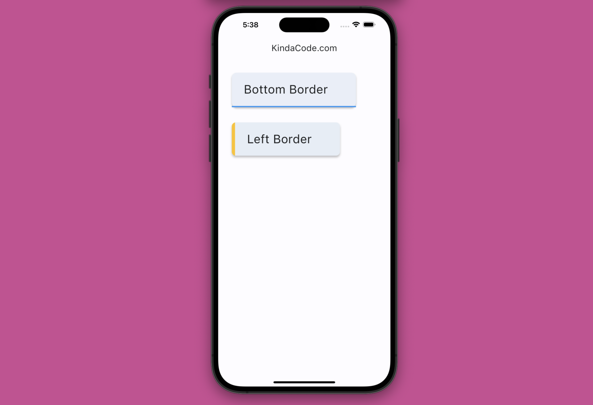
The preceding example shows how to add an all-side border to a card component. What if you want to construct a one-sided border (e.g. a left border or a bottom border)? The solution is to add a side border to a child Container of the card. We can also use a ClipPath widget to cut off unwanted areas (near rounded corners) as necessary.
Example Preview
This example displays a card with a blue bottom border and another with an amber left border.
The Code
// KindaCode.com
// main.dart
import 'package:flutter/material.dart';

void main() {
  runApp(const MyApp());
}

class MyApp extends StatelessWidget {
  const MyApp({super.key});

  // This widget is the root of your application.
  @override
  Widget build(BuildContext context) {
    return MaterialApp(
      // Hide the debug banner
      debugShowCheckedModeBanner: false,
      title: 'KindaCode.com',
      theme: ThemeData(
        colorScheme: ColorScheme.fromSeed(seedColor: Colors.blue),
        useMaterial3: true,
      ),
      home: const KindaCodeDemo(),
    );
  }
}

class KindaCodeDemo extends StatelessWidget {
  const KindaCodeDemo({super.key});

  @override
  Widget build(BuildContext context) {
    return Scaffold(
      appBar: AppBar(title: const Text('KindaCode.com')),
      body: Padding(
        padding: const EdgeInsets.all(30),
        child: Column(
          crossAxisAlignment: CrossAxisAlignment.start,
          children: [
            // Card with a bottom border
            Card(
              elevation: 3,
              child: Container(
                padding: const EdgeInsets.only(
                    top: 20, bottom: 20, left: 30, right: 70),
                decoration: const BoxDecoration(
                  border: Border(
                    bottom: BorderSide(color: Colors.blue, width: 3),
                  ),
                ),
                child: const Text(
                  'Bottom Border',
                  style: TextStyle(fontSize: 30),
                ),
              ),
            ),
            const SizedBox(
              height: 30,
            ),
            // Card with a left border
            Card(
              elevation: 4,
              shape: const RoundedRectangleBorder(
                borderRadius: BorderRadius.all(Radius.circular(10)),
              ),
              child: ClipPath(
                clipper: ShapeBorderClipper(
                    shape: RoundedRectangleBorder(
                        borderRadius: BorderRadius.circular(10))),
                child: Container(
                  padding: const EdgeInsets.only(
                      top: 20, bottom: 20, left: 30, right: 70),
                  decoration: const BoxDecoration(
                    border: Border(
                      left: BorderSide(color: Colors.amber, width: 8),
                    ),
                  ),
                  child: const Text(
                    'Left Border',
                    style: TextStyle(fontSize: 30),
                  ),
                ),
              ),
            ),
          ],
        ),
      ),
    );
  }
}
Conclusion
We’ve examined a few examples related to the border stuff of cards. Hope that these examples are helpful and bring some insight to you. The ecosystem of Flutter is rapidly evolving and broadening. Continue exploring more new things and gain more experience by taking a look at the following articles:
- Working with ListWheelScrollView in Flutter (2 Examples)
- Flutter: Get Current Scroll Offset in ListView/GridView
- 2 Ways to Create Flipping Card Animation in Flutter
- Flutter: Rendering an Image from Byte Buffer/Int8List
- How to Subtract two Dates in Flutter & Dart
- Flutter StatefulBuilder example
You can also tour around our Flutter topic page or Dart topic page for the most recent tutorials and examples.

