This article walks you through a list of the best open-source icon libraries for React in 2023. They are rated and ranked based on the number of stars they receive from GitHub users and the weekly downloads on npmjs. Old and infrequently maintained libraries will not appear in this list. Let’s get to the point without further ado (like talking about what React is or how icons are necessary).
react-icons
This comprehensive library contains many different icon sets, such as Ant Design Icons, Font Awesome, Grommet Icons, Ionicons, VS Code Icons, Material Design Icons, etc.
- GitHub stars: 10.7k+
- NPM weekly downloads: 1.8m – 2.2m
- License: MIT
- Written in: TypeScript, Javascript, SCSS, HTML
- Links: GitHub repo | NPM page | Official docs
The library supports TypeScript out of the box. You can install it by running:
npm i react-iconsThen you can import the icons you need into your code and use them as normal React components. Example:
import { AiFillAccountBook, AiFillAndroid } from "react-icons/ai";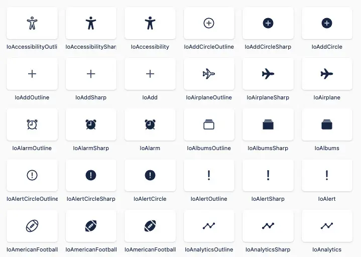
To see the names of available icons, you can check the official docs or go to one of the library’s definition files:
<your project>/node_modules/react-icons/[icon set folder]/index.d.tsMUI Icons Material
- NPM weekly downloads: 2.5m – 3m
- License: MIT
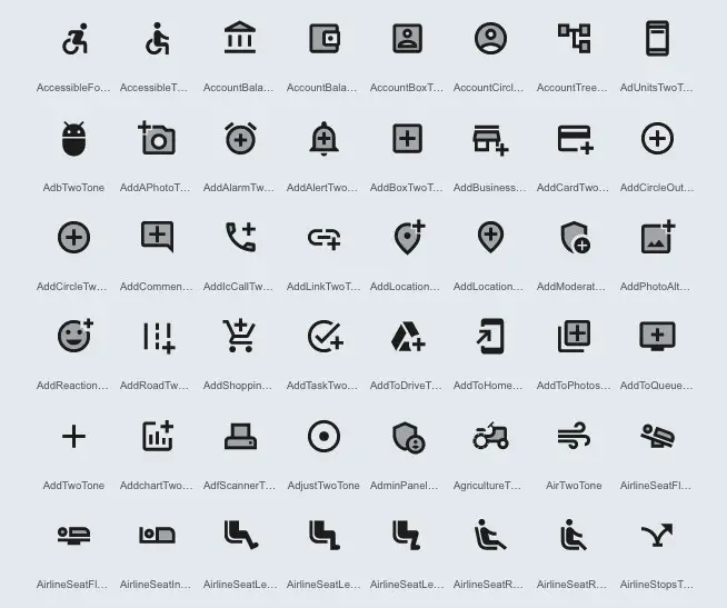
- Links: GitHub repo | NPM page | Icon list
This library provides Google Material icons available in five styles and based on the core Material Design principles and metrics.
You can install MUI icons by running:
npm install @mui/material @mui/icons-materialThen import the icons you need as typical React components:
import { AccessAlarm, ThreeDRotation } from '@mui/icons-material';These components use the MUI SvgIcon component to render each icon’s SVG path and have a peer dependency on @mui/material. The library supports TypeScript out of the box.
Ant Design Icons
Overview:
- NPM weekly downloads: 1.3m – 1.5m
- License: MIT
- Links: GitHub repo | NPM page | Official docs
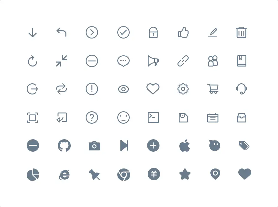
This library provides a set of semantic vector icons. You can use them separately without having to use any other Ant Design stuff.
Install:
yarn add @ant-designImport what you want:
import { SmileFilled, SmileTwoTone } from '@ant-design/icons';You can see the detailed guide on using Ant Design icons in this article.
React Font Awesome
- GitHub stars: 3.6k+
- NPM weekly downloads: 1m – 1.5m
- License: MIT
- Written in: JavaScrip
- Links: GitHub repo | NPM page | Official website
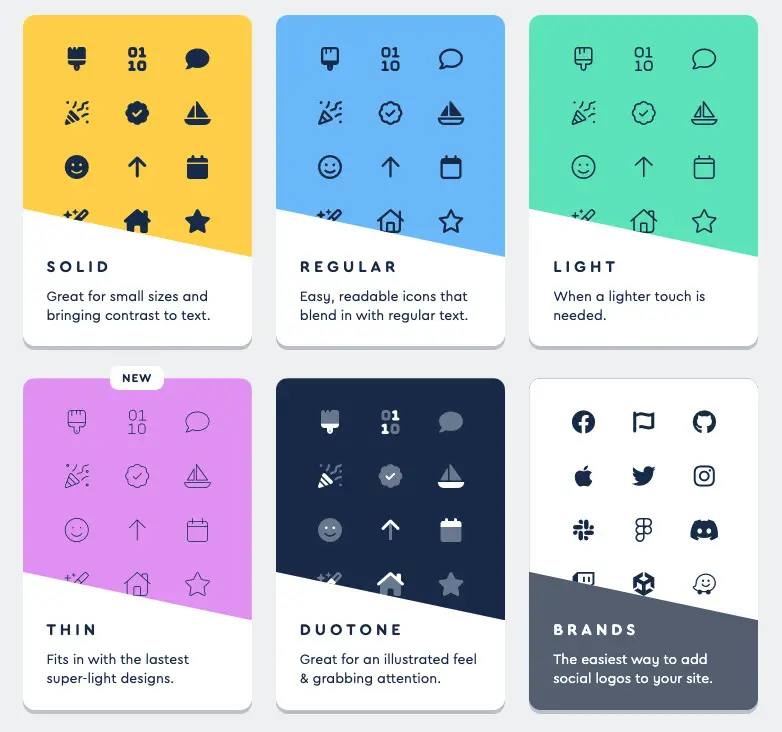
Font Awesome is a well-known set of icons and toolkits for front-end developers. The latest version of the library includes five icon styles: solid, regular, light, duotone, and the new THIN style.
You can see detailed instructions on using Font Awesome in React here.
Bootstrap Icon
- GitHub stars: 7k+
- NPM weekly downloads: 300k – 500k
- License: MIT
- Written in: HTML, Javascript
- Links: GitHub repo | NPM page | Official website
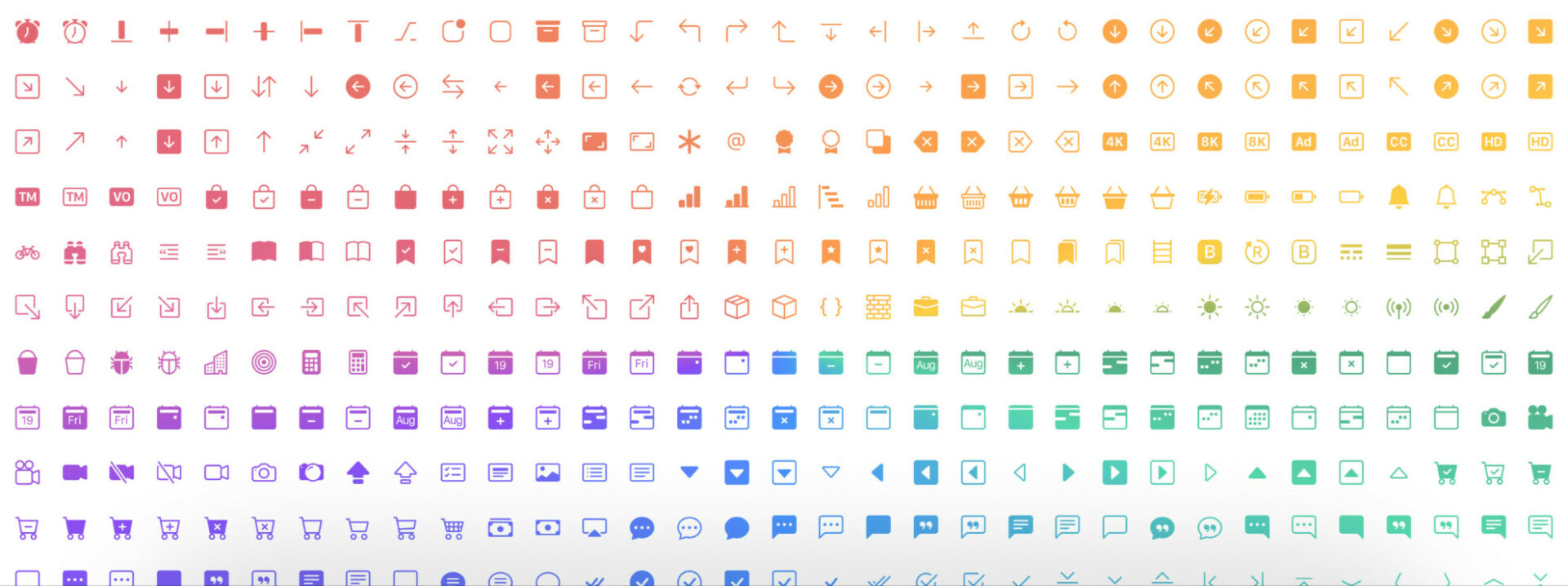
This one provides more than 1600 high-quality SVG icons.
You can add Bootstrap icons to your project by performing the following command:
npm i bootstrap-iconsDetailed guide: How to Use Bootstrap 5 and Bootstrap Icons in React
Feather React Icons
- GitHub stars: 2k+
- NPM weekly downloads: 240k – 300k
- License: MIT
- Written in: Javascript, TypeScript
- Links: GitHub repo | NPM page | Icon list
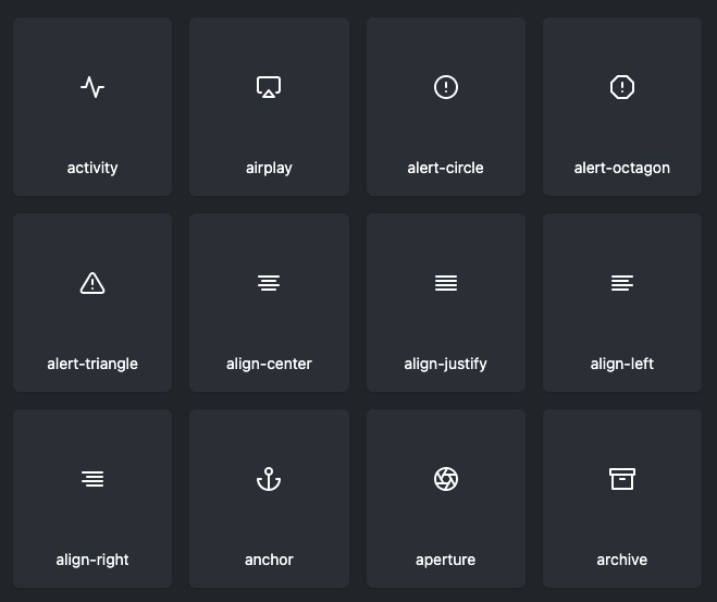
This package brings a collection of simple, beautiful, open-source icons for React.js. Each icon is designed on a 24×24 grid with an emphasis on simplicity, consistency, and readability.
Install:
npm i react-featherSample usage:
import { Camera } from 'react-feather';

const App = () => {
  return <Camera />
};

export default App;
Styled Icons
- GitHub stars: 2.1k+
- NPM weekly downloads: 20k – 25k
- License: MIT
- Written in: Javascript and TypeScript
- Links: GitHub repo | NPM page | Official website
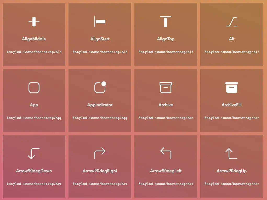
This handsome library provides over 20,000 icons from the following icon packs as Styled Components, fully supporting TypeScript types and tree-shaking/ES modules.
Install:
npm i styled-iconsSample usage:
import React from 'react'
import {Lock} from '@styled-icons/material'

const App = () => {
   return <Lock size="48" title="Hello" />;
}
Carbon Icon React
- GitHub stars: 7.4k (include stars for things other than icons)
- NPM weekly downloads: 140k – 170k
- License: Apache 2.0
- Links: GitHub repo | NPM page | Official website
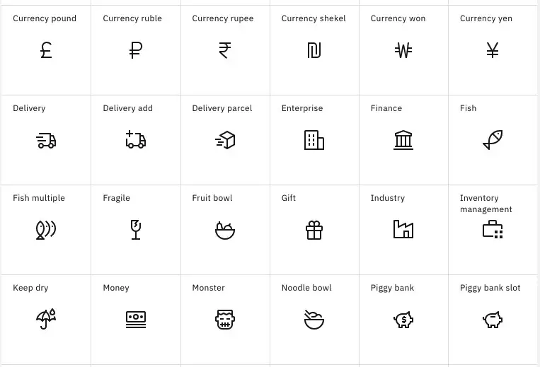
This package provides React components for icons in digital and software products using the Carbon Design System (Carbon is IBM’s open-source design system for products and digital experiences).
Install:
npm i @carbon/icons-reactSample usage:
import { Add } from '@carbon/icons-react';

function ExampleComponent() {
  return <Add size={32} />;
}
Blueprint Icons
- GitHub stars: 20k+ (include stars for things other than icons)
- NPM weekly downloads: 180k – 215k
- License: Apache 2.0
- Links: GitHub repo | NPM page | Official docs
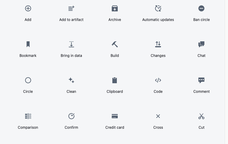
This package contains a collection of React components for displaying icons.
Install:
npm i @blueprintjs/iconsIconify React
- GitHub stars: 3.5k+
- NPM weekly downloads: 150k – 190k
- License: MIT
- Written in: TypeScript, Javascript, HTML
- Links: GitHub repo | NPM page | Official website
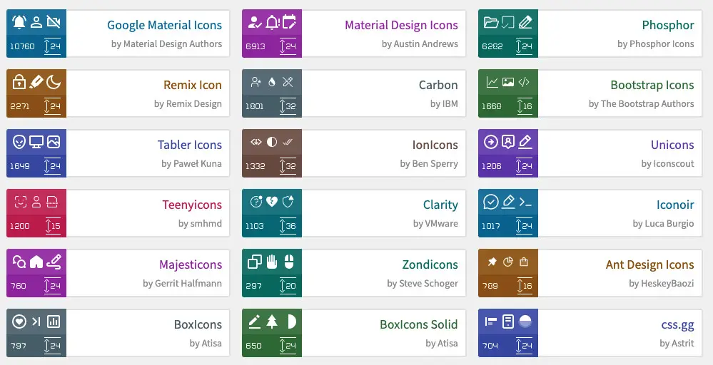
Iconify is a universal icon framework. It helps you use almost every open-source icon set with a single syntax (100+ icon sets, 100,000+ icons, including FontAwesome, Material Design Icons, DashIcons, Feather Icons, EmojiOne, Noto Emoji), and you can mix icons from multiple icons sets on the same page.
Install:
npm i @iconify/react @iconify-icons/mdiSample usage:
import { Icon } from '@iconify/react';
import home from '@iconify-icons/mdi-light/home';

function renderHomeIcon() {
	return <Icon icon={home} />;
}
Wrapping Up
We’ve covered the most well-known free icon packs that you can use to build intuitive and attractive user interfaces. If you’d like to explore more new and interesting stuff about React and modern frontend development, take a look at the following articles:
- React + TypeScript: Making a Reading Progress Indicator
- Best open-source Admin Dashboard libraries for React
- React Router: How to Highlight Active Link
- React + TypeScript: Handle onCopy, onCut, and onPaste events
- React Router: Passing Data (States) through Links
- React + MUI: Create Dark/Light Theme Toggle
You can also check our React category page and React Native category page for the latest tutorials and examples.
