A few examples of using the ClipOval widget in Flutter.
Example 1: Simple Usage
In this example, ClipOval is used to clip its child widget to a round circle or an oval (depending on the ratio between the width and height of the child). There is no need to set a size or a shape for ClipOval in this case.
Screenshot:

The code:
import 'package:flutter/material.dart';

void main() {
  runApp(const MyApp());
}

class MyApp extends StatelessWidget {
  const MyApp({Key? key}) : super(key: key);

  @override
  Widget build(BuildContext context) {
    return const MaterialApp(
      // Remove the debug banner
      debugShowCheckedModeBanner: false,
      title: 'KindaCode.com',
      home: HomeScreen(),
    );
  }
}

class HomeScreen extends StatelessWidget {
  const HomeScreen({Key? key}) : super(key: key);

  @override
  Widget build(BuildContext context) {
    return Scaffold(
        appBar: AppBar(
          title: const Text('Kindacode.com'),
        ),
        body: Padding(
          padding: const EdgeInsets.all(25),
          child: Column(
            children: [
              ClipOval(
                child: Image.network(
                  'https://www.kindacode.com/wp-content/uploads/2020/12/the-cat.jpg',
                  width: 300,
                  height: 150,
                  fit: BoxFit.cover,
                ),
              ),
              const SizedBox(
                height: 25,
              ),
              ClipOval(
                child: Image.network(
                  'https://www.kindacode.com/wp-content/uploads/2020/11/my-dog.jpg',
                  width: 300,
                  height: 300,
                  fit: BoxFit.cover,
                ),
              )
            ],
          ),
        ));
  }
}
Example 2: Using ClipOval with CustomClipper
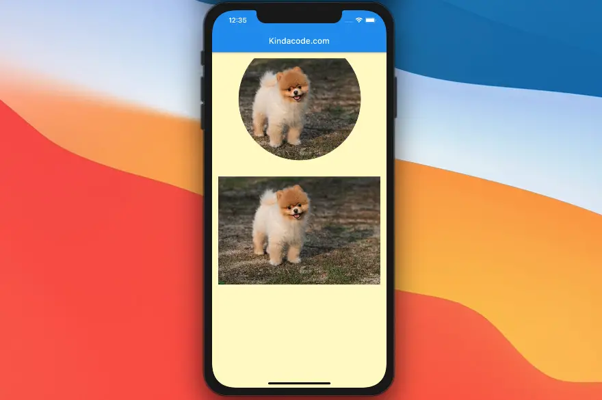
This example creates a round image but is partially cropped at the top.
Screenshot:
The full code
In this example, we implement a new class called MyClipper (it is at the very end of the code) that extends the CustomClipper class.
// main.dart
import 'package:flutter/material.dart';

void main() {
  runApp(const MyApp());
}

class MyApp extends StatelessWidget {
  const MyApp({Key? key}) : super(key: key);

  @override
  Widget build(BuildContext context) {
    return const MaterialApp(
      debugShowCheckedModeBanner: false,
      title: 'Flutter Demo',
      home: MyHomePage(),
    );
  }
}

class MyHomePage extends StatelessWidget {
  const MyHomePage({Key? key}) : super(key: key);

  @override
  Widget build(BuildContext context) {
    return Scaffold(
        backgroundColor: Colors.yellow[100],
        appBar: AppBar(
          title: const Text('Kindacode.com'),
        ),
        body: Padding(
          padding: const EdgeInsets.all(15),
          child: Column(
            children: [
              ClipOval(
                clipper: MyClipper(),
                child: Image.network(
                  'https://www.kindacode.com/wp-content/uploads/2020/11/my-dog.jpg',
                  fit: BoxFit.cover,
                  width: double.infinity,
                ),
              ),
              const SizedBox(height: 25),

              // The original picture
              Image.network(
                  'https://www.kindacode.com/wp-content/uploads/2020/11/my-dog.jpg',
                  fit: BoxFit.cover,
                  width: double.infinity),
            ],
          ),
        ));
  }
}

// Define class MyClipper
class MyClipper extends CustomClipper<Rect> {
  @override
  Rect getClip(Size size) {
    return Rect.fromCircle(center: const Offset(200, 100), radius: 150);
  }

  @override
  bool shouldReclip(covariant CustomClipper<Rect> oldClipper) {
    return false;
  }
}
Conclusion
We’ve walked through a couple of examples of using the ClipOval widget to clip its child. This is very useful in scenarios where you want to create oval-shaped things. If you’d like to explore more new and interesting stuff about Flutter, take a look at the following articles:
- Flutter ClipRRect examples
- How to make an image carousel in Flutter
- Hero Widget in Flutter: Tutorial & Example
- Creating Masonry Layout in Flutter with Staggered Grid View
- Flutter ColorFiltered Examples
- Flutter: Drawing Polygons using ClipPath (4 Examples)
You can also check out our Flutter category page or Dart category page for the latest tutorials and examples.
