AnimatedList is a built-in widget in Flutter used to implement a list view that animates its items when they are inserted or removed. This helps the user feel less sudden and more pleasant about the change in the list.
In this article, you will learn how to use AnimatedList through a couple of complete examples. The first one is simple, and the second one is a little bit more complicated.
Note: This article was recently updated in order to fix some issues related to outdated stuff and work properly with the most recent versions of Flutter (3.13.2+). Material 3 will also be used in the upcoming examples.
Example 1: Basic
This example helps you learn the fundamentals of AnimatedList.
Preview
The sample app we’re going to make contains a floating action button and an animated list. When the button is pressed, a new item will be added to the list. Each item comes with a delete button, which can be used to remove the corresponding item. Words might be ambiguous. Here’s the demo:
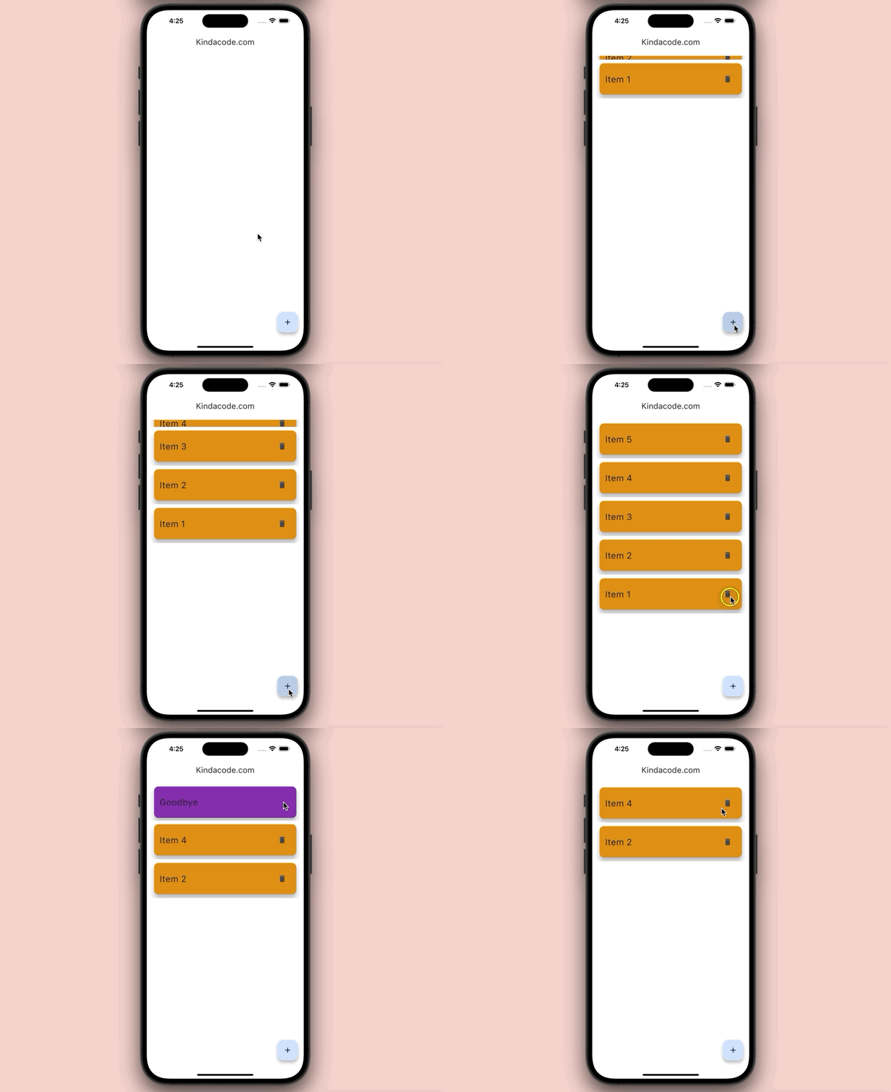
For simplicity’s sake, the sample app only contains a list and a floating button (we’ll do advanced things in the second example).
What’s the point?
- When the user presses the button, a new item will be added to the list. We use the
[_listKey].currentState.insertItem()method to initialize the animation. - When the user touches an item, it will be removed. We use the
[_listKey].currentState.removeItem()method to trigger the animation.
The full code
// KindaCode.com
// main.dart
import 'package:flutter/material.dart';

void main() {
  runApp(const MyApp());
}

class MyApp extends StatelessWidget {
  const MyApp({Key? key}) : super(key: key);

  @override
  Widget build(BuildContext context) {
    return MaterialApp(
      debugShowCheckedModeBanner: false,
      title: 'Kindacode.com',
      theme: ThemeData(
        colorScheme: ColorScheme.fromSeed(seedColor: Colors.blue),
        useMaterial3: true,
      ),
      home: const HomePage(),
    );
  }
}

class HomePage extends StatefulWidget {
  const HomePage({Key? key}) : super(key: key);

  @override
  State<HomePage> createState() => _HomePageState();
}

class _HomePageState extends State<HomePage> {
  // Items in the list
  final _items = [];

  // The key of the list
  final GlobalKey<AnimatedListState> _key = GlobalKey();

  // Add a new item to the list
  // This is trigger when the floating button is pressed
  void _addItem() {
    _items.insert(0, "Item ${_items.length + 1}");
    _key.currentState!.insertItem(0, duration: const Duration(seconds: 1));
  }

  // Remove an item
  // This is trigger when the trash icon associated with an item is tapped
  void _removeItem(int index) {
    _key.currentState!.removeItem(index, (_, animation) {
      return SizeTransition(
        sizeFactor: animation,
        child: const Card(
          margin: EdgeInsets.all(10),
          elevation: 10,
          color: Colors.purple,
          child: ListTile(
            contentPadding: EdgeInsets.all(15),
            title: Text("Goodbye", style: TextStyle(fontSize: 24)),
          ),
        ),
      );
      ;
    }, duration: const Duration(seconds: 1));

    _items.removeAt(index);
  }

  @override
  Widget build(BuildContext context) {
    return Scaffold(
      appBar: AppBar(
        title: const Text('Kindacode.com'),
      ),
      body: AnimatedList(
        key: _key,
        initialItemCount: 0,
        padding: const EdgeInsets.all(10),
        itemBuilder: (_, index, animation) {
          return SizeTransition(
            key: UniqueKey(),
            sizeFactor: animation,
            child: Card(
              margin: const EdgeInsets.all(10),
              elevation: 10,
              color: Colors.orange,
              child: ListTile(
                contentPadding: const EdgeInsets.all(15),
                title:
                    Text(_items[index], style: const TextStyle(fontSize: 24)),
                trailing: IconButton(
                  icon: const Icon(Icons.delete),
                  onPressed: () => _removeItem(index),
                ),
              ),
            ),
          );
        },
      ),
      floatingActionButton: FloatingActionButton(
          onPressed: _addItem, child: const Icon(Icons.add)),
    );
  }
}
Example 2: A Little Bit More Advanced
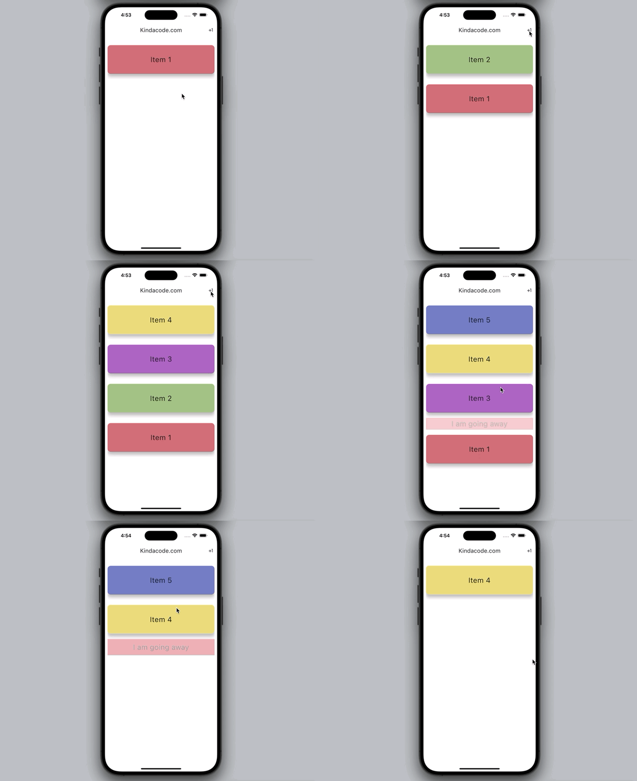
In this example, there are some differences:
Keyis no longer used to remove an item. Instead, we usecontextand theAnimatedList.of(context).removeItem()method.- Several animation effects are used in combination.
- Each item has a cool background color.
- To delete a list item, what you need to do is to tap on it (no more delete buttons).
Preview
The full code
// KindaCode.com
// main.dart
import 'package:flutter/material.dart';

void main() {
  runApp(const MyApp());
}

class MyApp extends StatelessWidget {
  const MyApp({Key? key}) : super(key: key);

  @override
  Widget build(BuildContext context) {
    return MaterialApp(
      debugShowCheckedModeBanner: false,
      title: 'Kindacode.com',
      theme: ThemeData(
        useMaterial3: true,
      ),
      home: const HomePage(),
    );
  }
}

class HomePage extends StatefulWidget {
  const HomePage({Key? key}) : super(key: key);

  @override
  State<HomePage> createState() => _HomePageState();
}

class _HomePageState extends State<HomePage> {
  // Items in the list
  // Each item is a map with 2 keys: title and color
  final List<Map<String, dynamic>> _items = [
    {
      "title": "Item 1",
      "color": Colors.primaries[0][300],
    }
  ];

  // The key of the list
  final GlobalKey<AnimatedListState> _key = GlobalKey();

  // Add a new item to the list
  // This is trigger when the add button is pressed
  void _addItem() {
    _items.insert(0, {
      "title": "Item ${_items.length + 1}",
      "color": Colors.primaries[(_items.length * 100) % Colors.primaries.length]
          [300],
    });
    _key.currentState!.insertItem(0, duration: const Duration(seconds: 1));
  }

  // Remove an item
  // This is trigger when an item is tapped
  void _removeItem(int index, BuildContext context) {
    AnimatedList.of(context).removeItem(index, (_, animation) {
      return FadeTransition(
        opacity: animation,
        child: SizeTransition(
          sizeFactor: animation,
          child: SizedBox(
            height: 150,
            child: Card(
              margin: const EdgeInsets.symmetric(vertical: 20),
              elevation: 10,
              color: Colors.red[400],
              child: const Center(
                child: Text("I am going away", style: TextStyle(fontSize: 28)),
              ),
            ),
          ),
        ),
      );
    }, duration: const Duration(seconds: 1));

    _items.removeAt(index);
  }

  @override
  Widget build(BuildContext context) {
    return Scaffold(
      appBar: AppBar(
        title: const Text('Kindacode.com'),
        actions: [
          IconButton(
            onPressed: _addItem,
            icon: const Icon(Icons.plus_one),
          )
        ],
      ),

      // Implement the AnimatedList widget
      body: AnimatedList(
        key: _key,
        initialItemCount: 1,
        padding: const EdgeInsets.all(10),
        itemBuilder: (context, index, animation) {
          return SlideTransition(
            key: UniqueKey(),
            position: Tween<Offset>(
              begin: const Offset(-1, -0.5),
              end: const Offset(0, 0),
            ).animate(animation),
            child: RotationTransition(
              turns: animation,
              child: SizeTransition(
                axis: Axis.vertical,
                sizeFactor: animation,
                child: SizedBox(
                  height: 150,
                  child: InkWell(
                    onTap: () => _removeItem(index, context),
                    child: Card(
                      margin: const EdgeInsets.symmetric(vertical: 20),
                      elevation: 10,
                      color: _items[index]["color"],
                      child: Center(
                        child: Text(_items[index]["title"],
                            style: const TextStyle(fontSize: 28)),
                      ),
                    ),
                  ),
                ),
              ),
            ),
          );
        },
      ),
    );
  }
}
API
Constructor
AnimatedList({
  Key? key,
  required AnimatedItemBuilder itemBuilder,
  int initialItemCount = 0,
  Axis scrollDirection = Axis.vertical,
  bool reverse = false,
  ScrollController? controller,
  bool? primary,
  ScrollPhysics? physics,
  bool shrinkWrap = false,
  EdgeInsetsGeometry? padding,
  Clip clipBehavior = Clip.hardEdge
})
Details about the parameters
The first 4 parameters listed in the table below are used most frequently:
| Parameter | Type | Description |
|---|---|---|
| itemBuilder (required) | AnimatedListItemBuilder | Builds items in the list when they are scrolled into view |
| initialItemCount | int | The number of items at the beginning |
| controller | ScrollController | Controls the scroll position of the list |
| key | Key | Used to access the list from outside |
| scrollDirection | Axis | Determines the scrolling behaviors of items |
| reverse | bool | Determine whether the scroll view scrolls in the reading direction |
| physics | ScrollPhysics | Decides how the scroll should behave on user input |
| shrinkWrap | bool | Determine whether the size of the list should take full available space or match it to the size of items in the list |
| padding | EdgeInsetsGeometry | Set padding around the list of items |
| primary | bool | Whether this is the primary scroll view associated with the parent PrimaryScrollController |
Conclusion
We have learned and discovered a lot of things about AnimatedList, helping us to have more options in the implementation of real applications. You can explore other kinds of list widgets in Flutter in the following articles:
- SliverList – Tutorial and Example
- Highlight selected items in a ListView
- How to implement a horizontal ListView
- Scrolling to the desired item in a ListView
- Flutter: Get Current Scroll Offset in ListView/GridView
- Flutter: ListView Pagination (Load More) Example (updated)
If you would like to discover more interesting things, check out our Flutter topic page or Dart topic page for the latest tutorials and examples.


