


Flutter has libraries with lots of built-in widgets like Material and Cupertino. If you want to make an app that your target audience is iPhone and iPad users, then you’ll probably want to use the Cupertino library. This one provides a bunch of widgets that implement the current iOS design language.
In this article, we’ll take a look at the CupertinoButton widget and walk through several examples of using it in Flutter applications. You’ll also learn how to customize, style, and disable a Cupertino button.
Overview
A Cupertino button responds to touches with fade-in and fade-out effects. By default, its padding is 16. When using it inside a fixed-height widget, the padding should be set to a smaller number.
To use CupertinoButton, don’t forget to import the Cupertino library:
import 'package:flutter/cupertino.dart';Constructors
CupertinoButton constructor:
CupertinoButton({
Key? key,
required Widget child,
EdgeInsetsGeometry? padding,
Color? color,
Color disabledColor = CupertinoColors.quaternarySystemFill,
double? minSize = kMinInteractiveDimensionCupertino,
double? pressedOpacity = 0.4,
BorderRadius? borderRadius = const BorderRadius.all(Radius.circular(8.0)),
AlignmentGeometry alignment = Alignment.center,
required VoidCallback? onPressed
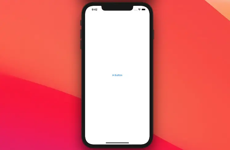
})The most basic example:
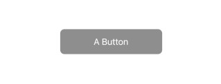
class HomePage extends StatelessWidget {
  const HomePage({Key? key}) : super(key: key);

  @override
  Widget build(BuildContext context) {
    return CupertinoPageScaffold(
      child: Center(
          child: CupertinoButton(
             onPressed: () {},
             child: const Text('A Button'),
      )),
    );
  }
}
Output:
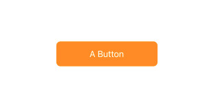
This quick example creates a Cupertino button with an orange background when active:
CupertinoButton(
          child: const Text('A Button'),
          color: CupertinoColors.activeOrange,
          onPressed: (){},
)
Output:
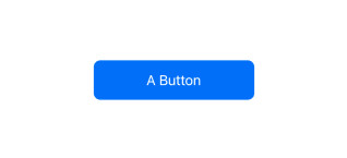
CupertinoButton.filled
You can also create a filled Cupertino button by using CupertinoButton.filled. Here’s the constructor:
CupertinoButton.filled({
  Key? key,
  required Widget child,
  EdgeInsetsGeometry? padding,
  Color disabledColor = CupertinoColors.quaternarySystemFill,
  double? minSize = kMinInteractiveDimensionCupertino,
  double? pressedOpacity = 0.4,
  BorderRadius? borderRadius = const BorderRadius.all(Radius.circular(8.0)),
  AlignmentGeometry alignment = Alignment.center,
  required VoidCallback? onPressed
})
This example creates a filled Cupertino button (the default background color is blue):
CupertinoButton.filled(
          child: const Text('A Button'),
          onPressed: () {},
)
Output:
Disable a Cupertino button
To disable a Cupertino button, just set its onPressed property to null.
Example:
CupertinoButton.filled(
          child: const Text('A Button'),
          disabledColor: CupertinoColors.inactiveGray,
          onPressed: null,
)
Output:
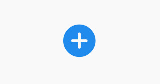
Cupertino icon buttons
A CupertinoButton can take in an icon as its child.
Example
This example uses a Cupertino icon but using a material icon with a Cupertino button is totally fine and you can do that if you like.
CupertinoButton(
     onPressed: () {},
     child: const Icon(CupertinoIcons.add_circled_solid, size: 100,)
),
Output:
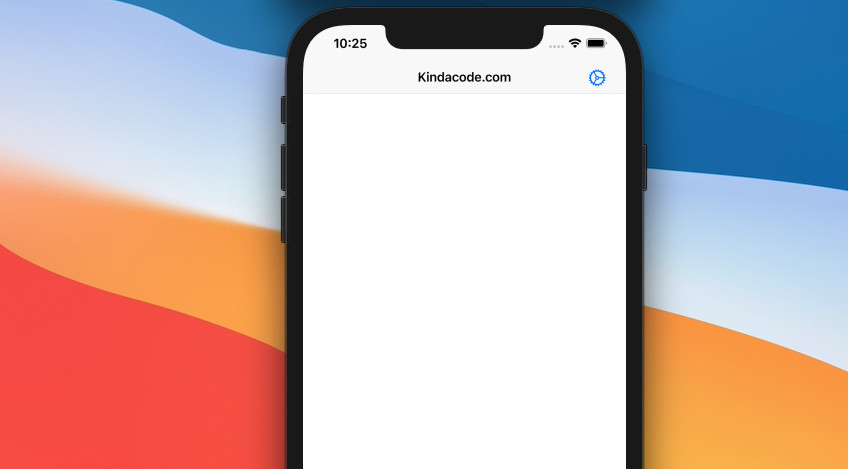
CupertinoButton within CupertinoNavigationBar
If you want to implement a CupertinoButton within a CupertinoNavigationBar, don’t forget to set the button’s padding to 0, otherwise, your interface will be skewed.
Example:
import 'package:flutter/cupertino.dart';

void main() {
  runApp(const MyApp());
}

class MyApp extends StatelessWidget {
  const MyApp({Key? key}) : super(key: key);

  @override
  Widget build(BuildContext context) {
    return const CupertinoApp(
      // hide the debug banner
      debugShowCheckedModeBanner: false,
      title: "Kindacode.com",
      home: HomePage(),
    );
  }
}

class HomePage extends StatelessWidget {
  const HomePage({Key? key}) : super(key: key);

  @override
  Widget build(BuildContext context) {
    return CupertinoPageScaffold(
      navigationBar: CupertinoNavigationBar(
        middle: const Text('Kindacode.com'),
        trailing: CupertinoButton(
          onPressed: () {},
          padding: EdgeInsets.zero,
          child: const Icon(CupertinoIcons.settings),
        ),
      ),
      child: Container(),
    );
  }
}
Output:
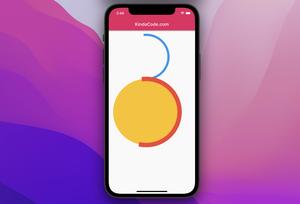
Circle Cupertino Button
This example creates a big (300 x 300) circular Cupertino button.
Screenshot:
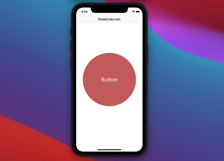
The code:
import 'package:flutter/cupertino.dart';

void main() {
  runApp(const MyApp());
}

class MyApp extends StatelessWidget {
  const MyApp({Key? key}) : super(key: key);

  @override
  Widget build(BuildContext context) {
    return const CupertinoApp(
      // hide the debug banner
      debugShowCheckedModeBanner: false,
      title: "Kindacode.com",
      home: HomePage(),
    );
  }
}

class HomePage extends StatelessWidget {
  const HomePage({Key? key}) : super(key: key);

  @override
  Widget build(BuildContext context) {
    return CupertinoPageScaffold(
      navigationBar:
          const CupertinoNavigationBar(middle: Text('KindaCode.com')),
      child: Center(
        child: CupertinoButton(
            borderRadius: const BorderRadius.all(Radius.circular(150)),
            padding: EdgeInsets.zero,
            onPressed: () {},
            child: Container(
              width: 300,
              height: 300,
              decoration: const BoxDecoration(
                  color: Color.fromRGBO(200, 100, 100, 1),
                  shape: BoxShape.circle),
              child: const Center(
                child: Text(
                  'Button',
                  style: TextStyle(
                      color: Color.fromRGBO(255, 255, 255, 1), fontSize: 30),
                ),
              ),
            )),
      ),
    );
  }
}
Conclusion
This article went over the basics and a few examples of using Cupertino buttons in Flutter applications. These iOS-style buttons are great and are suitable if the app you’re working on focuses on iPhone and iPad users, giving them the best experience and comfort.
If you’d like to explore more Cupertino widgets and other interesting things in Flutter, take a look at the following articles:
- Flutter Cupertino ActionSheet: Tutorial & Example
- Working with Cupertino Date Picker in Flutter
- Flutter CupertinoSegmentedControl Example
- Flutter: Cupertino ContextMenu example
- Flutter & Hive Database: CRUD Example
- Using GetX (Get) for State Management in Flutter
You can also check out our Flutter category page or Dart category page for the latest tutorials and examples.


