This article is dedicated to theCustomPaint widget and the CustomPainter class in Flutter. We’ll walk through an end-to-end example of drawing heart shapes using these features then see their constructors and available options. Without any further ado (like talking about the history of Flutter or how gorgeous it is), let’s get to the main points!
Complete Example
Preview
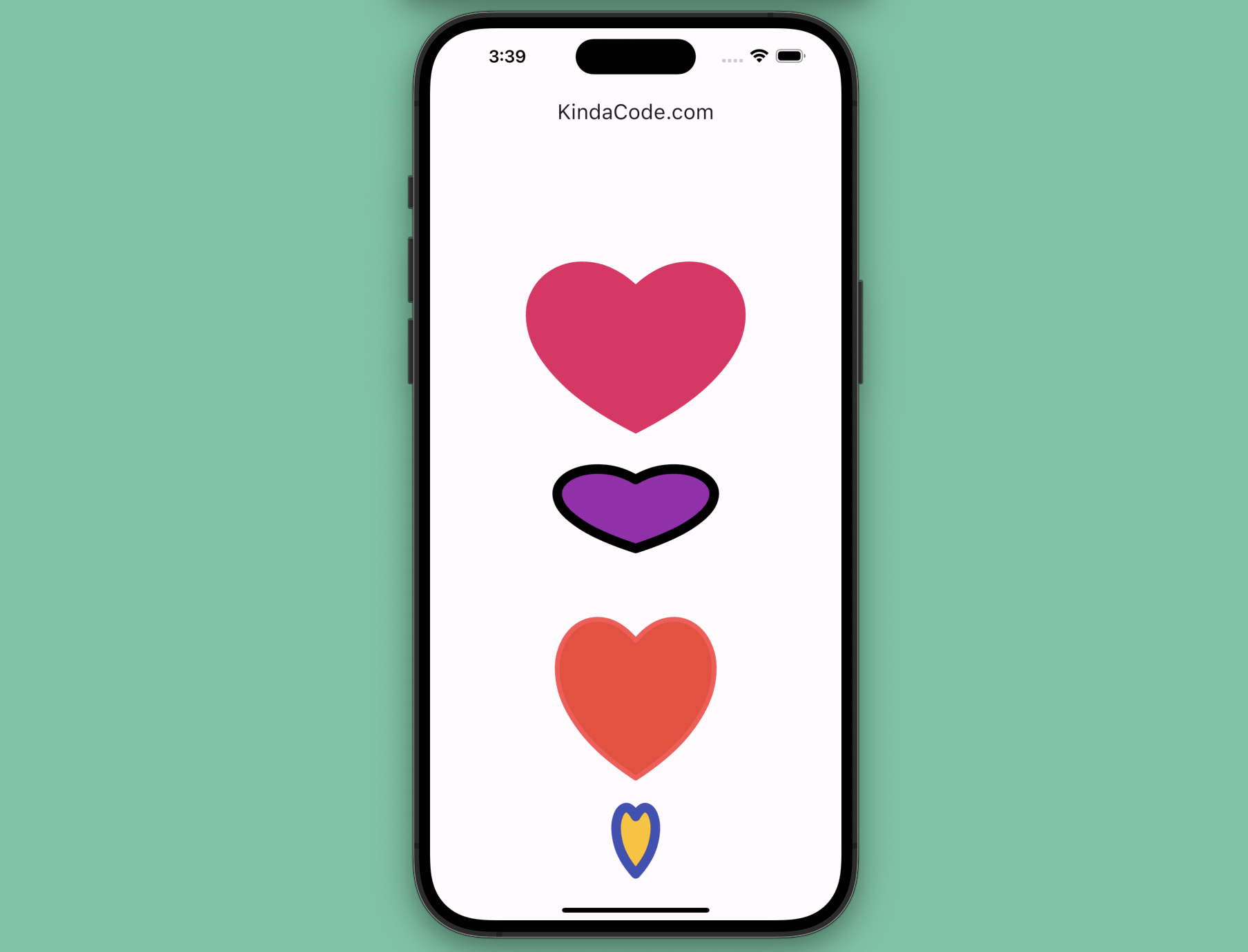
We’ll create 4 heart shapes. The first one doesn’t have a border but the others have.
The Steps
Below is the process to build up the app you just saw:
1. Implementing a painter by extending the CustomPainter class:
class MyPainter extends CustomPainter {
  // The color of the heart
  final Color bodyColor;

  // The color of the border of the heart
  final Color borderColor;
  // The thickness of the border
  final double borderWith;

  MyPainter(this.bodyColor, this.borderColor, this.borderWith);

  @override
  void paint(Canvas canvas, Size size) {
    // The body of the heart
    final Paint body = Paint();
    body
      ..color = bodyColor
      ..style = PaintingStyle.fill
      ..strokeWidth = 0;

    // The border of the heart
    final Paint border = Paint();
    border
      ..color = borderColor
      ..style = PaintingStyle.stroke
      ..strokeCap = StrokeCap.round
      ..strokeWidth = borderWith;

    final double width = size.width;
    final double height = size.height;

    final Path path = Path();
    path.moveTo(0.5 * width, height * 0.4);
    path.cubicTo(0.2 * width, height * 0.1, -0.25 * width, height * 0.6,
        0.5 * width, height);
    path.moveTo(0.5 * width, height * 0.4);
    path.cubicTo(0.8 * width, height * 0.1, 1.25 * width, height * 0.6,
        0.5 * width, height);

    canvas.drawPath(path, body);
    canvas.drawPath(path, border);
  }
2. Drawing heart shapes with the CustomPaint widget and the painter we’ve created before:
// Non-border heart
          CustomPaint(
            size: const Size(280, 260),
            painter: MyPainter(Colors.pink, Colors.transparent, 0),
          ),

// Hearts with borders
          CustomPaint(
            size: const Size(200, 120),
            painter: MyPainter(Colors.purple, Colors.black, 10),
          ),
          CustomPaint(
            size: const Size(200, 240),
            painter: MyPainter(Colors.red, Colors.redAccent, 5),
          ),
          CustomPaint(
            size: const Size(50, 100),
            painter: MyPainter(Colors.amber, Colors.indigo, 10),
          ),
The Final Code
Here’s the complete and runnable code in main.dart that produces the cool heart shapes shown in the screenshot above:
// main.dart
import 'package:flutter/material.dart';

void main() {
  runApp(const MyApp());
}

class MyApp extends StatelessWidget {
  const MyApp({Key? key}) : super(key: key);
  @override
  Widget build(BuildContext context) {
    return MaterialApp(
      // Hide the debug banner
      debugShowCheckedModeBanner: false,
      title: 'KindaCode.com',
      theme: ThemeData(primarySwatch: Colors.indigo, useMaterial3: true),
      home: const HomeScreen(),
    );
  }
}

// Implementing our heart painter
class MyPainter extends CustomPainter {
  // The color of the heart
  final Color bodyColor;

  // The color of the border of the heart
  final Color borderColor;
  // The thickness of the border
  final double borderWith;

  MyPainter(this.bodyColor, this.borderColor, this.borderWith);

  @override
  void paint(Canvas canvas, Size size) {
    // The body of the heart
    final Paint body = Paint();
    body
      ..color = bodyColor
      ..style = PaintingStyle.fill
      ..strokeWidth = 0;

    // The border of the heart
    final Paint border = Paint();
    border
      ..color = borderColor
      ..style = PaintingStyle.stroke
      ..strokeCap = StrokeCap.round
      ..strokeWidth = borderWith;

    final double width = size.width;
    final double height = size.height;

    final Path path = Path();
    path.moveTo(0.5 * width, height * 0.4);
    path.cubicTo(0.2 * width, height * 0.1, -0.25 * width, height * 0.6,
        0.5 * width, height);
    path.moveTo(0.5 * width, height * 0.4);
    path.cubicTo(0.8 * width, height * 0.1, 1.25 * width, height * 0.6,
        0.5 * width, height);

    canvas.drawPath(path, body);
    canvas.drawPath(path, border);
  }

  @override
  bool shouldRepaint(CustomPainter oldDelegate) {
    return true;
  }
}

class HomeScreen extends StatefulWidget {
  const HomeScreen({Key? key}) : super(key: key);

  @override
  State<HomeScreen> createState() => _HomeScreenState();
}

class _HomeScreenState extends State<HomeScreen> {
  @override
  Widget build(BuildContext context) {
    return Scaffold(
      appBar: AppBar(
        title: const Text('KindaCode.com'),
      ),
      body: Center(
          child: Column(
        mainAxisAlignment: MainAxisAlignment.spaceAround,
        mainAxisSize: MainAxisSize.min,
        children: [
          // Non-border heart
          CustomPaint(
            size: const Size(280, 260),
            painter: MyPainter(Colors.pink, Colors.transparent, 0),
          ),

          // Hearts with borders
          CustomPaint(
            size: const Size(200, 120),
            painter: MyPainter(Colors.purple, Colors.black, 10),
          ),
          CustomPaint(
            size: const Size(200, 240),
            painter: MyPainter(Colors.red, Colors.redAccent, 5),
          ),
          CustomPaint(
            size: const Size(50, 100),
            painter: MyPainter(Colors.amber, Colors.indigo, 10),
          ),
        ],
      )),
    );
  }
}
API
CustomPaint
Constructor:
CustomPaint({
  Key? key,
  CustomPainter? painter,
  CustomPainter? foregroundPainter,
  Size size = Size.zero,
  bool isComplex = false,
  bool willChange = false,
  Widget? child
})
Parameters explained:
key: An optional key for the widget.painter: ACustomPainterthat paints on the canvas before the child is rendered. This is the background layer of the widget.foregroundPainter: ACustomPainterthat paints on the canvas after the child is rendered. This is the foreground layer of the widget.size: The size of the canvas. If not specified, it defaults to zero. If there is a child, the size is ignored and the size of the child is used instead.isComplex: A hint to the compositor that this painting is likely to be complex and may benefit from caching. This is false by default.willChange: A hint to the compositor that this painting will change in the next frame. This is false by default and should only be set to true if the painter will produce a different output in the next frame.child: An optional child widget that is painted on top of the background layer and below the foreground layer.
CustomPainter
Constructor:
CustomPainter({Listenable? repaint})Here, repaint is an optional Listenable that notifies the CustomPaint widget when to repaint. This can be an Animation, a ChangeNotifier, or any other object that implements Listenable. If not specified, the CustomPaint widget will repaint whenever its parent widget changes.
Afterword
You’ve learned how to paint a custom heart shape from scratch without using any third-party packages. If you’re new to Flutter, this might seem a little challenging. However, by relentlessly practicing, you will absolutely gain a deep understanding of drawing things in Flutter. If you’d like to explore more new and exciting stuff about this wonderful multi-platform SDK, take a look at the following articles:
- Implementing Tooltips in Flutter
- Flutter: Stream.periodic example
- Using GetX (Get) for Navigation and Routing in Flutter
- Flutter & SQLite: CRUD Example
- Flutter: Drawing an N-Pointed Star with CustomClipper
- Flutter AnimatedList – Tutorial and Examples
You can also take a tour around our Flutter topic page and Dart topic page to see the latest tutorials and examples.
