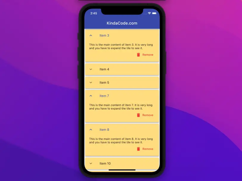
The ExpansionTile widget in Flutter is used to create expansible and collapsable list tiles. This article walks you through 2 examples of using that widget in practice. The first example is short and simple while the second one is a little bit more complicated.
Example 1: A single ExpansionTile
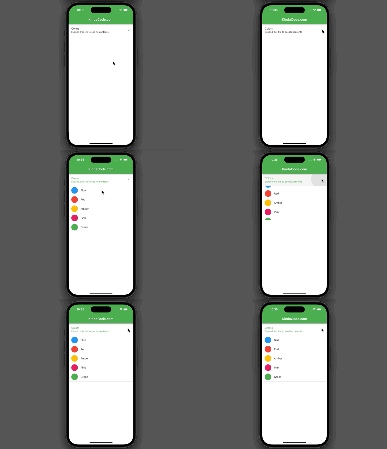
Preview
This sample app displays an expansion tile whose children are a list of colors:
The Code
The full source code that produces the sample above:
// main.dart
import 'package:flutter/material.dart';

void main() {
  runApp(const MyApp());
}

class MyApp extends StatelessWidget {
  const MyApp({Key? key}) : super(key: key);

  @override
  Widget build(BuildContext context) {
    return MaterialApp(
        // Hide the debug banner
        debugShowCheckedModeBanner: false,
        title: 'KindaCode.com',
        theme: ThemeData(primarySwatch: Colors.green),
        home: const HomeScreen());
  }
}

class HomeScreen extends StatelessWidget {
  const HomeScreen({Key? key}) : super(key: key);

  @override
  Widget build(BuildContext context) {
    return Scaffold(
      appBar: AppBar(title: const Text('KindaCode.com')),
      // Implement the ExpansionTile
      body: const ExpansionTile(
        title: Text('Colors'),
        subtitle: Text('Expand this tile to see its contents'),
        // Contents
        children: [
          ListTile(
              leading: CircleAvatar(
                backgroundColor: Colors.blue,
              ),
              title: Text('Blue')),
          ListTile(
              leading: CircleAvatar(
                backgroundColor: Colors.red,
              ),
              title: Text('Red')),
          ListTile(
              leading: CircleAvatar(
                backgroundColor: Colors.amber,
              ),
              title: Text('Amber')),
          ListTile(
              leading: CircleAvatar(
                backgroundColor: Colors.pink,
              ),
              title: Text('Pink')),
          ListTile(
              leading: CircleAvatar(
                backgroundColor: Colors.green,
              ),
              title: Text('Green')),
        ],
      ),
    );
  }
}
Example 2: ExpansionTile and ListView.builder
The ExpansionTile widget is usually used with ListView. To save and restore ExpansionTile expanded state we must give each item of the ListView a PageStorageKey, like so:
key: PageStorageKey(/* item id or something unique */),See also: Global, Unique, Value, Object, and PageStorage Keys in Flutter
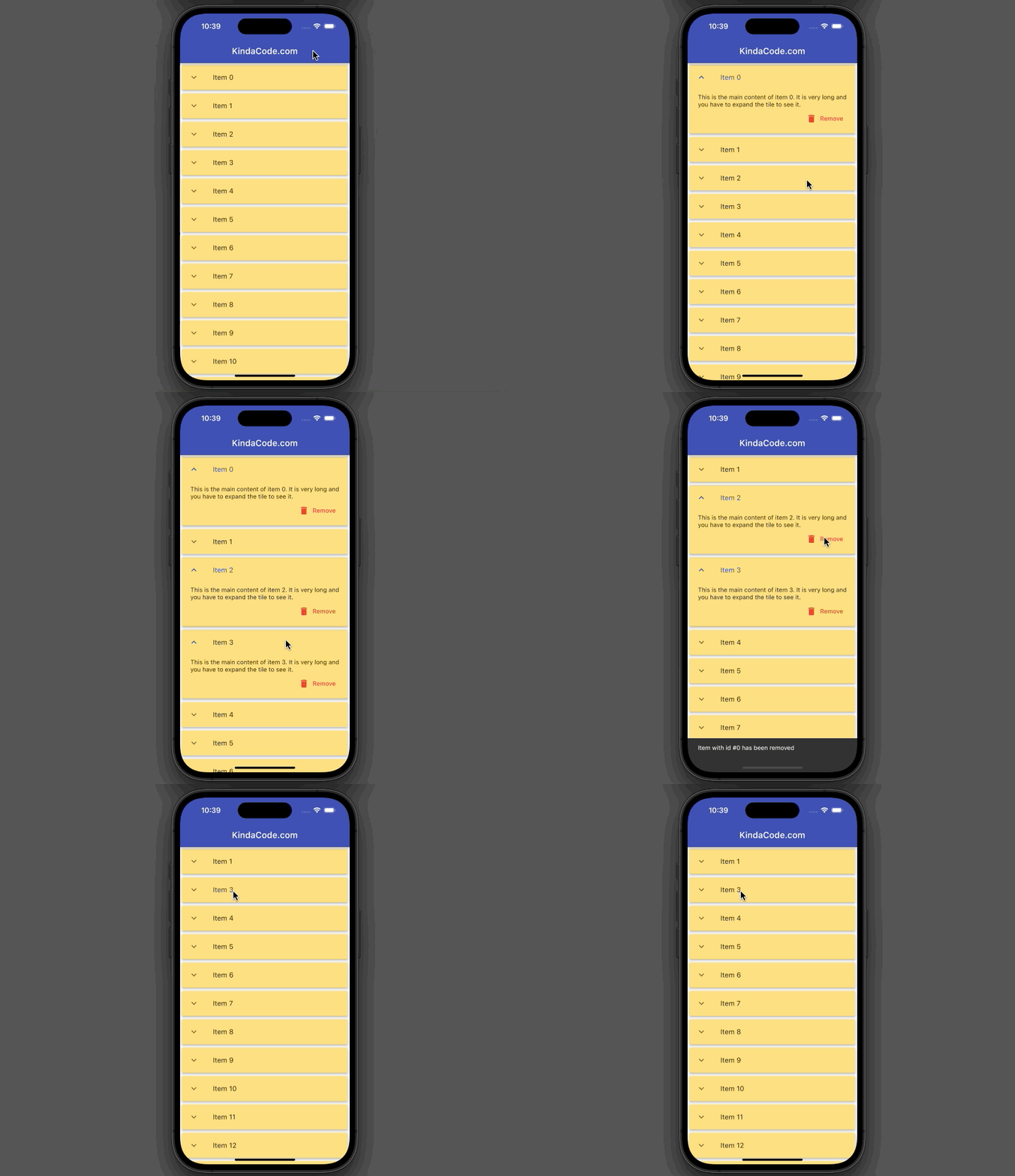
App Preview
The app we’re going to build has a list view that renders a list of items. The number of items is large so we use the ListView.builder constructor for performance purposes. Each item has a title and long text content. To see that content, the user has to expand the item tile. The user can also remove an item from the list by using the corresponding Remove button. Right after an item is deleted, a snack bar will show up.
Here’s how it works:
The Code
The complete source code with explanations:
// main.dart
import 'package:flutter/material.dart';

void main() {
  runApp(const MyApp());
}

class MyApp extends StatelessWidget {
  const MyApp({Key? key}) : super(key: key);
  @override
  Widget build(BuildContext context) {
    return MaterialApp(
        // Remove the debug banner
        debugShowCheckedModeBanner: false,
        title: 'KindaCode.com',
        theme: ThemeData(
          primarySwatch: Colors.indigo,
        ),
        home: const HomePage());
  }
}

class HomePage extends StatefulWidget {
  const HomePage({Key? key}) : super(key: key);

  @override
  State<HomePage> createState() => _HomePageState();
}

class _HomePageState extends State<HomePage> {
  // Generate a list of list items
  // In real app, data often is fetched from an API or a database
  final List<Map<String, dynamic>> _items = List.generate(
      50,
      (index) => {
            "id": index,
            "title": "Item $index",
            "content":
                "This is the main content of item $index. It is very long and you have to expand the tile to see it."
          });

  // This function is called when a "Remove" button associated with an item is pressed
  void _removeItem(int id) {
    setState(() {
      _items.removeWhere((element) => element['id'] == id);
    });
    ScaffoldMessenger.of(context).showSnackBar(SnackBar(
        duration: const Duration(milliseconds: 600),
        content: Text('Item with id #$id has been removed')));
  }

  @override
  Widget build(BuildContext context) {
    return Scaffold(
        appBar: AppBar(title: const Text('KindaCode.com')),
        body: ListView.builder(
            itemCount: _items.length,
            itemBuilder: (_, index) {
              final item = _items[index];
              return Card(
                // this key is required to save and restore ExpansionTile expanded state
                key: PageStorageKey(item['id']),
                color: Colors.amber.shade200,
                elevation: 4,
                child: ExpansionTile(
                  controlAffinity: ListTileControlAffinity.leading,
                  childrenPadding:
                      const EdgeInsets.symmetric(vertical: 10, horizontal: 20),
                  expandedCrossAxisAlignment: CrossAxisAlignment.end,
                  maintainState: true,
                  title: Text(item['title']),
                  // contents
                  children: [
                    Text(item['content']),
                    // This button is used to remove this item
                    TextButton.icon(
                      onPressed: () => _removeItem(item['id']),
                      icon: const Icon(Icons.delete),
                      label: const Text(
                        'Remove',
                      ),
                      style: TextButton.styleFrom(foregroundColor: Colors.red),
                    )
                  ],
                ),
              );
            }));
  }
}
See also: Flutter: ExpansionPanelList and ExpansionPanelList.radio examples
Conclusion
We’ve examined a couple of examples of the ExpansionTile widget in Flutter. This widget is really helpful and gives you a simple solution to arrange your content in your app. If you’d like to explore more new and interesting things about modern Flutter development, take a look at the following articles:
- Flutter SliverAppBar Example (with Explanations)
- Flutter AnimatedList – Tutorial and Examples
- Flutter: SliverGrid example
- Flutter: ListView Pagination (Load More) example
- Flutter & Hive Database: CRUD Example
- Flutter + Firebase Storage: Upload, Retrieve, and Delete files
You can also take a tour around our Flutter topic page and Dart topic page to see the latest tutorials and examples.
