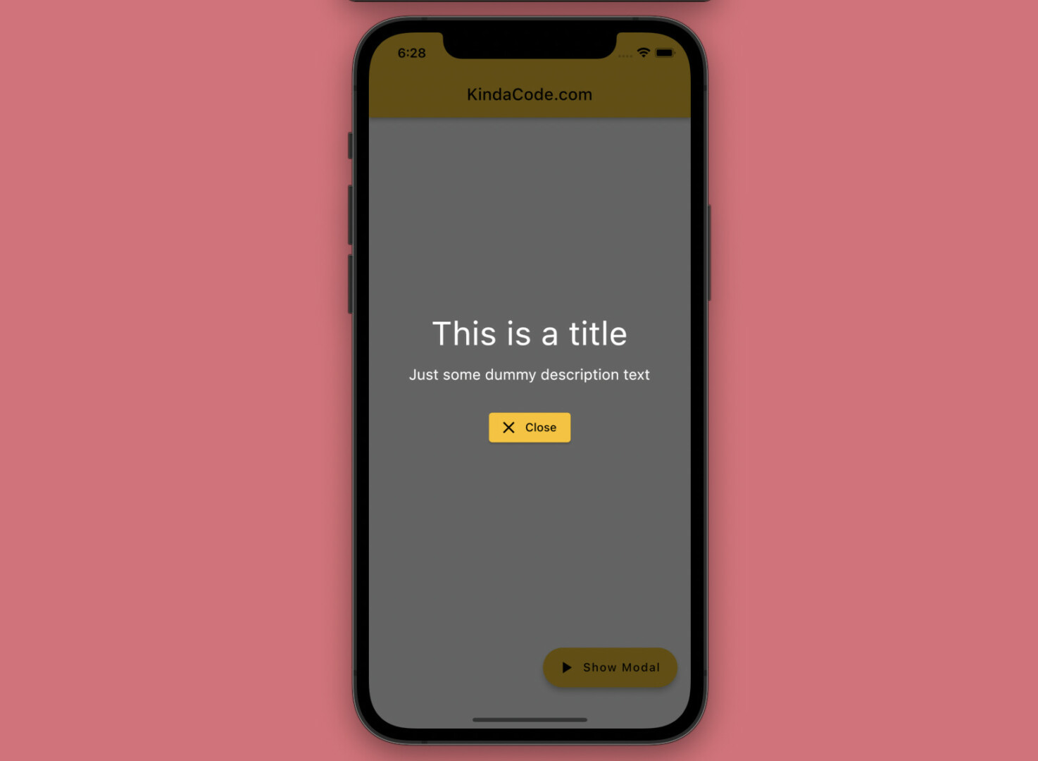
This practical article shows you how to implement a full-screen semi-transparent modal dialog in Flutter (with some animations). You will also learn how to pass data between the parent screen and the modal dialog. No more rambling, let’s get started.
A Quick Overview
To make the mentioned dialog, we create a class named FullScreenModal (the name is totally up to you) that extends the built-in ModalRoute class, as follows:
// this class defines the full-screen semi-transparent modal dialog
// by extending the ModalRoute class
class FullScreenModal extends ModalRoute {
  // variables passed from the parent widget
  final String title;
  final String description;

  // constructor
  FullScreenModal({
    required this.title,
    required this.description,
  });

  @override
  Duration get transitionDuration => const Duration(milliseconds: 500);

  @override
  bool get opaque => false;

  @override
  bool get barrierDismissible => false;

  @override
  Color get barrierColor => Colors.black.withOpacity(0.6);

  @override
  String? get barrierLabel => null;

  @override
  bool get maintainState => true;

  @override
  Widget buildPage(
    BuildContext context,
    Animation<double> animation,
    Animation<double> secondaryAnimation,
  ) {
    return Material(
      type: MaterialType.transparency,
      child: Center(
        child: Column(
          mainAxisSize: MainAxisSize.min,
          children: [
            Text(
              title,
              style: const TextStyle(color: Colors.white, fontSize: 40.0),
            ),
            const SizedBox(
              height: 15,
            ),
            Text(description,
                style: const TextStyle(color: Colors.white, fontSize: 18)),
            const SizedBox(
              height: 30,
            ),
            ElevatedButton.icon(
              onPressed: () {
                // close the modal dialog and return some data if needed
                Navigator.pop(context, [
                  'This message was padded from the modal',
                  'KindaCode.com'
                ]);
              },
              icon: const Icon(Icons.close),
              label: const Text('Close'),
            )
          ],
        ),
      ),
    );
  }

  @override
  Widget buildTransitions(BuildContext context, Animation<double> animation,
      Animation<double> secondaryAnimation, Widget child) {
    // add fade animation
    return FadeTransition(
      opacity: animation,
      // add slide animation
      child: SlideTransition(
        position: Tween<Offset>(
          begin: const Offset(0, -1),
          end: Offset.zero,
        ).animate(animation),
        // add scale animation
        child: ScaleTransition(
          scale: animation,
          child: child,
        ),
      ),
    );
  }
}
To see the full source code, move on to the next section.
Complete Example
App Preview
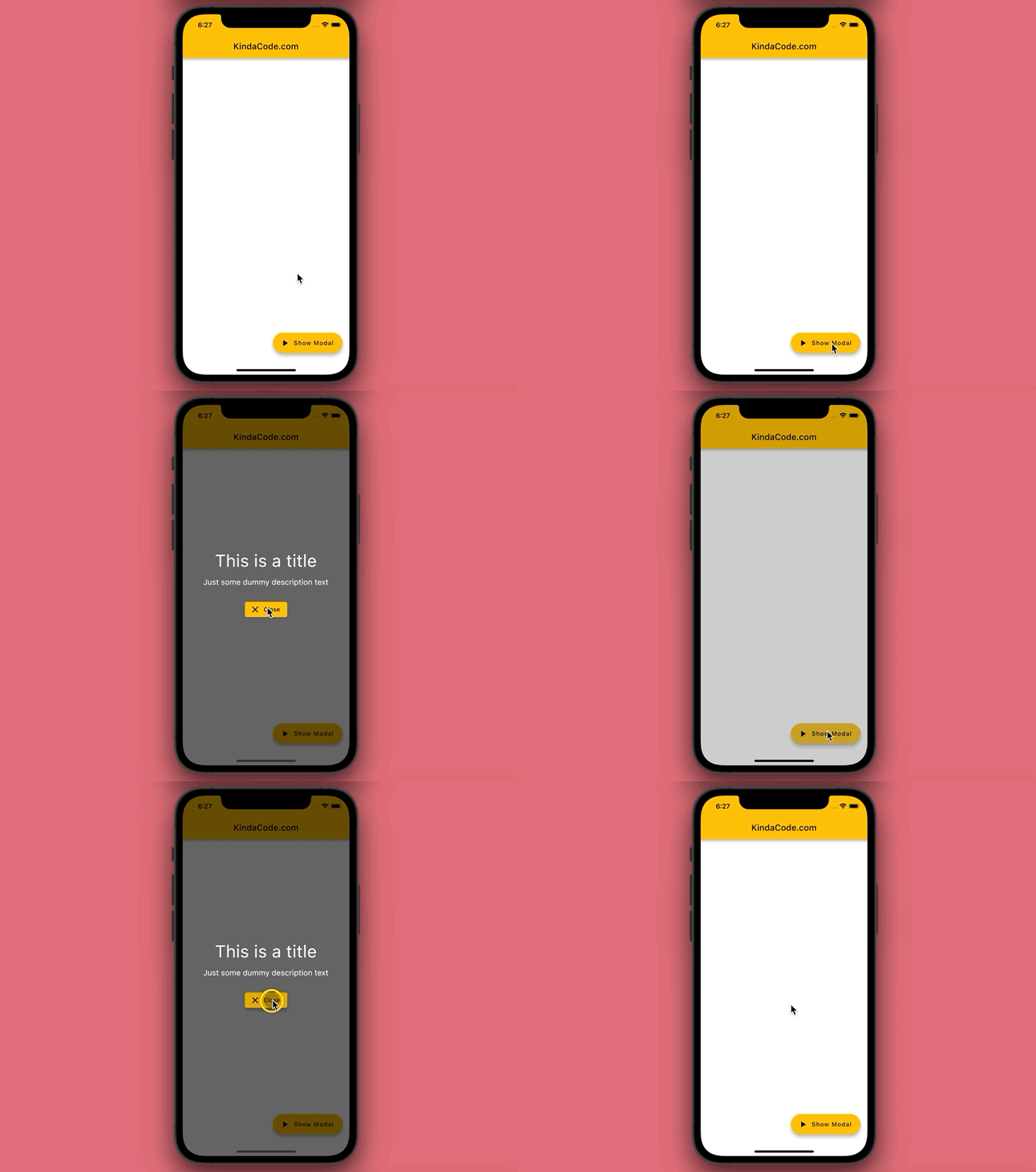
The small app we’re going to make has a floating action button. When this button gets pressed, a full-screen modal will show up. This modal dialog has a transparent black background. When it appears, its contents will have the following motions:
- Fade animation
- Slide animation (top-down transition)
- Scale animation (size increases from small to large)
Inside the modal, there is a Close button that can be used to dismiss it. The title and the description text of the modal are passed from the parent screen. When the modal is closed, some data is will be sent back.
Here’s how it works in action:
The Code
The complete source code in main.dart with explanations:
// KindaCode.com
// main.dart
import 'package:flutter/material.dart';

void main() => runApp(const MyApp());

class MyApp extends StatelessWidget {
  const MyApp({Key? key}) : super(key: key);

  @override
  Widget build(BuildContext context) {
    return MaterialApp(
      // remove the debug banner
      debugShowCheckedModeBanner: false,
      title: 'KindaCode.com',
      theme: ThemeData(
        primarySwatch: Colors.amber,
      ),
      home: const HomeScreen(),
    );
  }
}

// this class defines the full-screen semi-transparent modal dialog
// by extending the ModalRoute class
class FullScreenModal extends ModalRoute {
  // variables passed from the parent widget
  final String title;
  final String description;

  // constructor
  FullScreenModal({
    required this.title,
    required this.description,
  });

  @override
  Duration get transitionDuration => const Duration(milliseconds: 500);

  @override
  bool get opaque => false;

  @override
  bool get barrierDismissible => false;

  @override
  Color get barrierColor => Colors.black.withOpacity(0.6);

  @override
  String? get barrierLabel => null;

  @override
  bool get maintainState => true;

  @override
  Widget buildPage(
    BuildContext context,
    Animation<double> animation,
    Animation<double> secondaryAnimation,
  ) {
    return Material(
      type: MaterialType.transparency,
      child: Center(
        child: Column(
          mainAxisSize: MainAxisSize.min,
          children: [
            Text(
              title,
              style: const TextStyle(color: Colors.white, fontSize: 40.0),
            ),
            const SizedBox(
              height: 15,
            ),
            Text(description,
                style: const TextStyle(color: Colors.white, fontSize: 18)),
            const SizedBox(
              height: 30,
            ),
            ElevatedButton.icon(
              onPressed: () {
                // close the modal dialog and return some data if needed
                Navigator.pop(context, [
                  'This message was padded from the modal',
                  'KindaCode.com'
                ]);
              },
              icon: const Icon(Icons.close),
              label: const Text('Close'),
            )
          ],
        ),
      ),
    );
  }

  @override
  Widget buildTransitions(BuildContext context, Animation<double> animation,
      Animation<double> secondaryAnimation, Widget child) {
    // add fade animation
    return FadeTransition(
      opacity: animation,
      // add slide animation
      child: SlideTransition(
        position: Tween<Offset>(
          begin: const Offset(0, -1),
          end: Offset.zero,
        ).animate(animation),
        // add scale animation
        child: ScaleTransition(
          scale: animation,
          child: child,
        ),
      ),
    );
  }
}

// This is the main screen of the application
class HomeScreen extends StatelessWidget {
  const HomeScreen({Key? key}) : super(key: key);

  // this method shows the modal dialog
  dynamic _showModal(BuildContext context) async {
    // show the modal dialog and pass some data to it
    final result = await Navigator.of(context).push(FullScreenModal(
        title: 'This is a title',
        description: 'Just some dummy description text'));

    // print the data returned by the modal if any
    debugPrint(result.toString());
  }

  @override
  Widget build(BuildContext context) {
    return Scaffold(
      appBar: AppBar(title: const Text('KindaCode.com')),
      body: Container(),
      // this button is used to show the modal
      floatingActionButton: FloatingActionButton.extended(
        onPressed: () => _showModal(context),
        label: const Text('Show Modal'),
        icon: const Icon(Icons.play_arrow),
      ),
    );
  }
}
After close the modal, you can see the following output in your terminal window:
[This message was padded from the modal, KindaCode.com]References
- ModalRoute<T> class (flutter.dev)
- FadeTransition class (flutter.dev)
- ScaleTransition class (flutter.dev)
- SlideTransition class (flutter.dev)
- Dialogs – Material Design 3 (material.io)
Epilogue
We’ve examined an end-to-end example of building a full-screen semi-transparent dialog from the ground up in Flutter. Try to modify the code, add some things, remove some things, change some values, and see what happens next.
Flutter is awesome and relentlessly evolving. Keep the balling rolling and continue exploring more interesting stuff by taking a look at the following articles:
- Flutter: Uploading Files with GetConnect (GetX)
- Flutter: Best Packages to Create Cool Bottom App Bars
- Using GetX (Get) for Navigation and Routing in Flutter
- How to get the Current Route Name in Flutter
- How to implement a loading dialog in Flutter
- Flutter and Firestore Database: CRUD example
You can also tour around our Flutter topic page or Dart topic page for the most recent tutorials and examples.

