Table of Contents
Introduction
When working with a ListView in Flutter that not only displays the list items but also allows the user to select one or more items from the list, it would be helpful if we render the selected items differently from the non-selected items (eg different background colors and styles).
This article walks you through a complete example of implementing a ListView that highlights selected items and unhighlights unselected items. Without any further ado, let’s dive right in.
The Example
App Preview
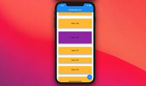
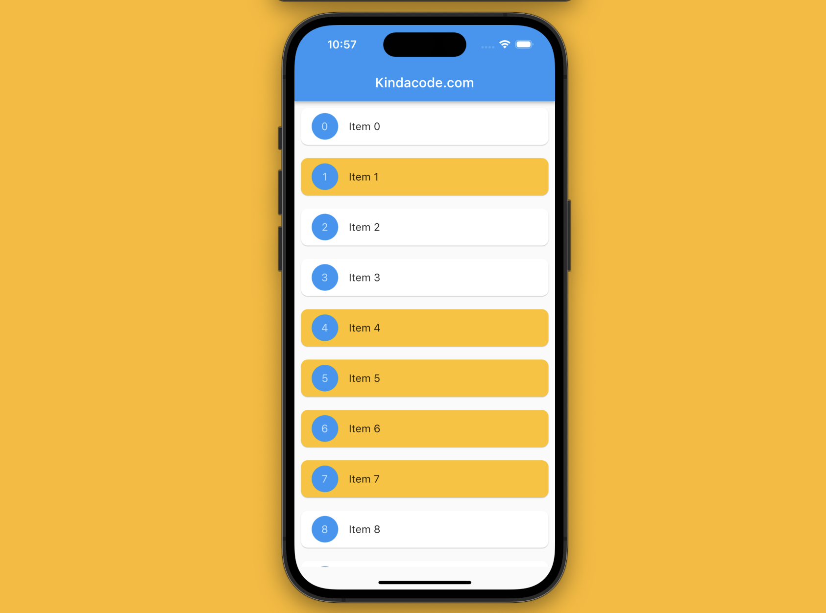
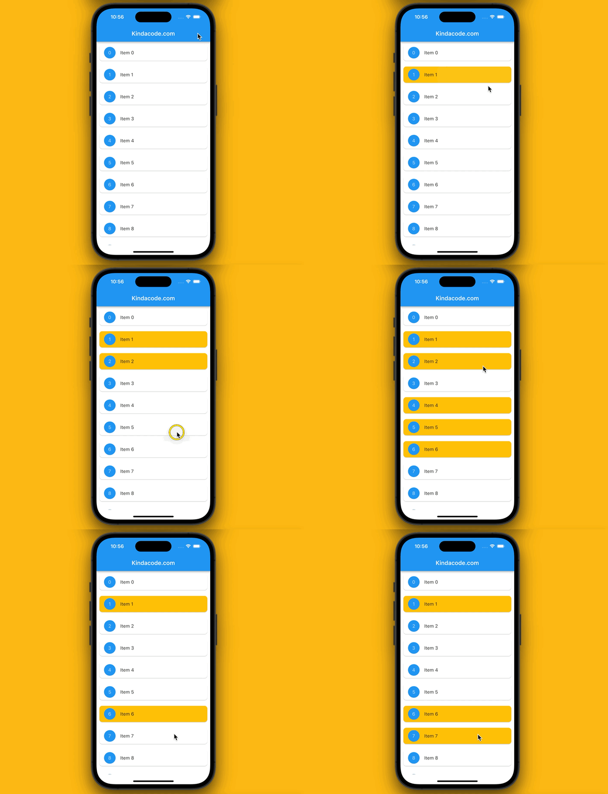
The app we are going to make contains a ListView that presents a long list of items. If the user taps an item whose background is white, it will be selected, and the background will turn to amber. If a selected item is tapped, its background will change from amber to white.
Here’s how the app works in action:
The Code
The full source code in main.dart with explanations:
import 'package:flutter/material.dart';

void main() {
  runApp(const MyApp());
}

class MyApp extends StatelessWidget {
  const MyApp({Key? key}) : super(key: key);

  @override
  Widget build(BuildContext context) {
    return const MaterialApp(
      // Hide the debug banner
      debugShowCheckedModeBanner: false,
      title: 'Kindacode.com',
      home: HomePage(),
    );
  }
}

class HomePage extends StatefulWidget {
  const HomePage({Key? key}) : super(key: key);

  @override
  State<HomePage> createState() => _HomePageState();
}

class _HomePageState extends State<HomePage> {
  // Generating a long list to fill the ListView
  final List<Map> data = List.generate(100,
      (index) => {'id': index, 'name': 'Item $index', 'isSelected': false});

  @override
  Widget build(BuildContext context) {
    return Scaffold(
        appBar: AppBar(
          title: const Text('Kindacode.com'),
        ),
        body: SafeArea(
            child: ListView.builder(
          itemCount: data.length,
          itemBuilder: (BuildContext ctx, index) {
            return Card(
                key: ValueKey(data[index]['name']),
                margin: const EdgeInsets.all(10),
                shape: RoundedRectangleBorder(
                    borderRadius: BorderRadius.circular(10)),

                // The color depends on this is selected or not
                color: data[index]['isSelected'] == true
                    ? Colors.amber
                    : Colors.white,
                child: ListTile(
                  onTap: () {
                    // if this item isn't selected yet, "isSelected": false -> true
                    // If this item already is selected: "isSelected": true -> false
                    setState(() {
                      data[index]['isSelected'] = !data[index]['isSelected'];
                    });
                  },
                  leading: CircleAvatar(
                      backgroundColor: Colors.blue,
                      child: Text(data[index]['id'].toString())),
                  title: Text(data[index]['name']),
                ));
          },
        )));
  }
}
Conclusion
We’ve examined a full example that demonstrates how to highlight selected items and unhighlight unselected items in a list view. Continue to explore more about list stuff and other exciting things in Flutter by taking a look at the following articles:
- Flutter SliverList – Tutorial and Example
- Flutter AnimatedList – Tutorial and Examples
- Flutter: ExpansionPanelList and ExpansionPanelList.radio examples
- Flutter: ListView Pagination (Load More) example
- Dart & Flutter: Get the Index of a Specific Element in a List
- Sorting Lists in Dart and Flutter (5 Examples)
You can also check out our Flutter category page or Dart category page for the latest tutorials and examples.


