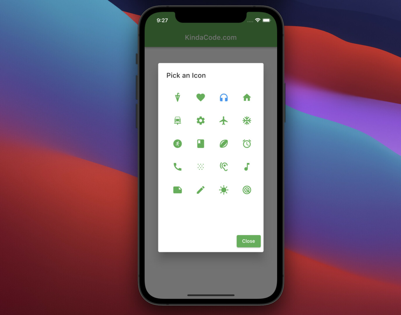
The example below shows you how to create a custom icon picker from scratch in Flutter. There is no need to install any third-party packages so our icon picker will be neat and extremely flexible (you can design it the way you want), without having to worry about incompatibility issues when updating Flutter to a newer version.
Table of Contents
The Example
App Preview
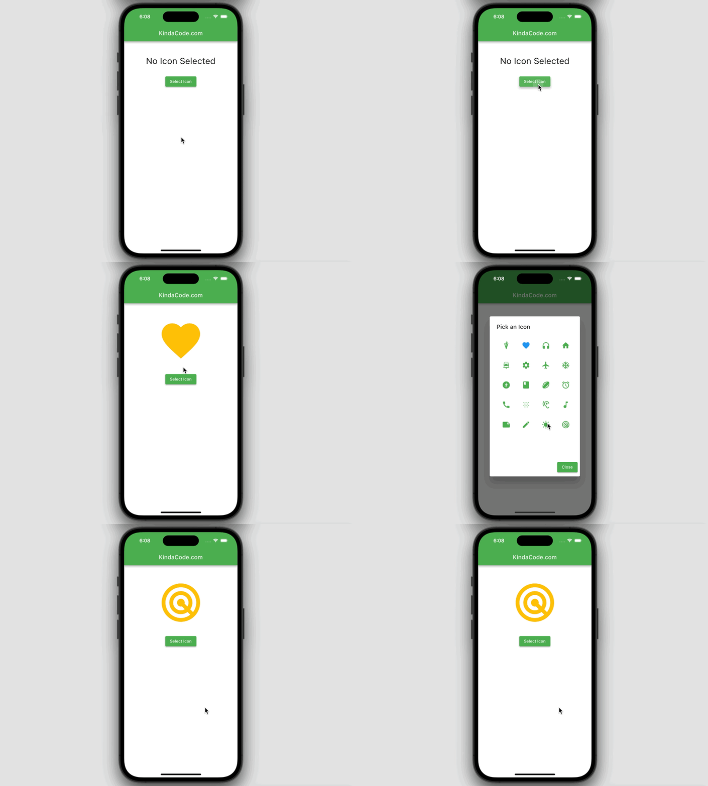
The icon that we are going to make will be displayed as a dialog. When you click on an icon, that icon will be selected. Alternatively, you can close the dialog without making any selections by using the Close button.
The icons displayed are material icons from Flutter. You can add or remove any material icon you want. In addition, the previously selected icon will be highlighted with blue color. Other icons are green.
A quick demo is worth more than a thousand words:
Writing Code
1. In the lib folder of your project, create a new file called custom_icon_picker.dart. This file stores the code of our icon picker. It is separate, independent, and can be reused later.
Here’s the code with explanations:
// custom_icon_picker.dart
// by KindaCode.com
import 'package:flutter/material.dart';

Future<IconData?> showIconPicker(
    {required BuildContext context, IconData? defalutIcon}) async {
  // these are the selectable icons
  // they will be displayed in a grid view
  // you can specify the icons you need
  final List<IconData> allIcons = [
    Icons.umbrella_sharp,
    Icons.favorite,
    Icons.headphones,
    Icons.home,
    Icons.car_repair,
    Icons.settings,
    Icons.flight,
    Icons.ac_unit,
    Icons.run_circle,
    Icons.book,
    Icons.sports_rugby_rounded,
    Icons.alarm,
    Icons.call,
    Icons.snowing,
    Icons.hearing,
    Icons.music_note,
    Icons.note,
    Icons.edit,
    Icons.sunny,
    Icons.radar,

    // add more icons here if you want
  ];

  // selected icon
  // the selected icon is highlighed
  // so it looks different from the others
  IconData? selectedIcon = defalutIcon;

  await showDialog(
      context: context,
      builder: (_) => AlertDialog(
            title: const Text('Pick an Icon'),
            content: Container(
              width: 320,
              height: 400,
              alignment: Alignment.center,
              // This grid view displays all selectable icons
              child: GridView.builder(
                  gridDelegate: const SliverGridDelegateWithMaxCrossAxisExtent(
                      maxCrossAxisExtent: 60,
                      childAspectRatio: 1 / 1,
                      crossAxisSpacing: 10,
                      mainAxisSpacing: 10),
                  itemCount: allIcons.length,
                  itemBuilder: (_, index) => Container(
                        key: ValueKey(allIcons[index].codePoint),
                        padding: const EdgeInsets.all(10),
                        child: Center(
                          child: IconButton(
                            // give the selected icon a different color
                            color: selectedIcon == allIcons[index]
                                ? Colors.blue
                                : Colors.green,
                            iconSize: 30,
                            icon: Icon(
                              allIcons[index],
                            ),
                            onPressed: () {
                              selectedIcon = allIcons[index];
                              Navigator.of(context).pop();
                            },
                          ),
                        ),
                      )),
            ),
            actions: [
              ElevatedButton(
                  onPressed: () {
                    Navigator.of(context).pop();
                  },
                  child: const Text('Close'))
            ],
          ));

  return selectedIcon;
}
2. Now is the time to test it. Replace all the code in main.dart with the following:
// main.dart
import 'package:flutter/material.dart';

// Import the custom icon picker
import './custom_icon_picker.dart';

void main() {
  runApp(const MyApp());
}

class MyApp extends StatelessWidget {
  const MyApp({Key? key}) : super(key: key);

  @override
  Widget build(BuildContext context) {
    return MaterialApp(
      // Remove the debug banner icon
      debugShowCheckedModeBanner: false,
      title: 'KindaCode.com',
      theme: ThemeData(
        primarySwatch: Colors.green,
      ),
      home: const HomeScreen(),
    );
  }
}

class HomeScreen extends StatefulWidget {
  const HomeScreen({Key? key}) : super(key: key);

  @override
  State<HomeScreen> createState() => _HomeScreenState();
}

class _HomeScreenState extends State<HomeScreen> {
  // selected icon
  // it will be shown if not null
  IconData? _selectedIcon;

  @override
  Widget build(BuildContext context) {
    return Scaffold(
      appBar: AppBar(title: const Text('KindaCode.com')),
      body: Center(
        child: Column(
          children: [
            const SizedBox(
              height: 50,
            ),
            _selectedIcon == null
                ? const Text(
                    'No Icon Selected',
                    style: TextStyle(fontSize: 30),
                  )
                : Icon(
                    _selectedIcon,
                    size: 160,
                    color: Colors.amber,
                  ),
            const SizedBox(
              height: 30,
            ),

            // this button is used to show the icon picker
            ElevatedButton(
                onPressed: () async {
                  final IconData? result = await showIconPicker(
                      context: context, defalutIcon: _selectedIcon);
                  setState(() {
                    _selectedIcon = result;
                  });
                },
                child: const Text('Select Icon'))
          ],
        ),
      ),
    );
  }
}
3. Start your app and see the result.
Conclusion
We built our own icon picker with no dependencies. It is good because it will work stably in the distant future without fear of incompatibility errors.
If you’d like to explore more new and interesting things about modern Flutter, take a look at the following articles:
- How to create selectable text in Flutter
- Flutter: Make a simple Color Picker from scratch
- Using Font Awesome Icons in Flutter
- How to use Cupertino icons in Flutter
- Flutter: Save Icon to Database, File, Shared Preferences
- 2 Ways to Create Flipping Card Animation in Flutter
You can also take a tour around our Flutter topic page and Dart topic page to see the latest tutorials and examples.


