Today, rounding the sharp edges of rectangular objects is a popular trend in design. You can see this everywhere, from cell phones to laptops, from TVs to car monitors. Websites and mobile applications are also in this school, with the roundedness of many of the elements appearing on the screen.
In this article, we will go over several approaches to making rounded buttons in Flutter applications. Boring sentences will be limited and replaced with more examples and illustrations.
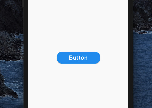
Using ElevatedButton + RoundedRectangleBorder
The code:
Center(
        child: ElevatedButton(
          style: ElevatedButton.styleFrom(
              padding: const EdgeInsets.symmetric(horizontal: 50, vertical: 10),
              shape: RoundedRectangleBorder(
                  borderRadius: BorderRadius.circular(20))),
          child: const Text(
            'Button',
            style: TextStyle(fontSize: 24),
          ),
          onPressed: () {},
        ),
),
Output:
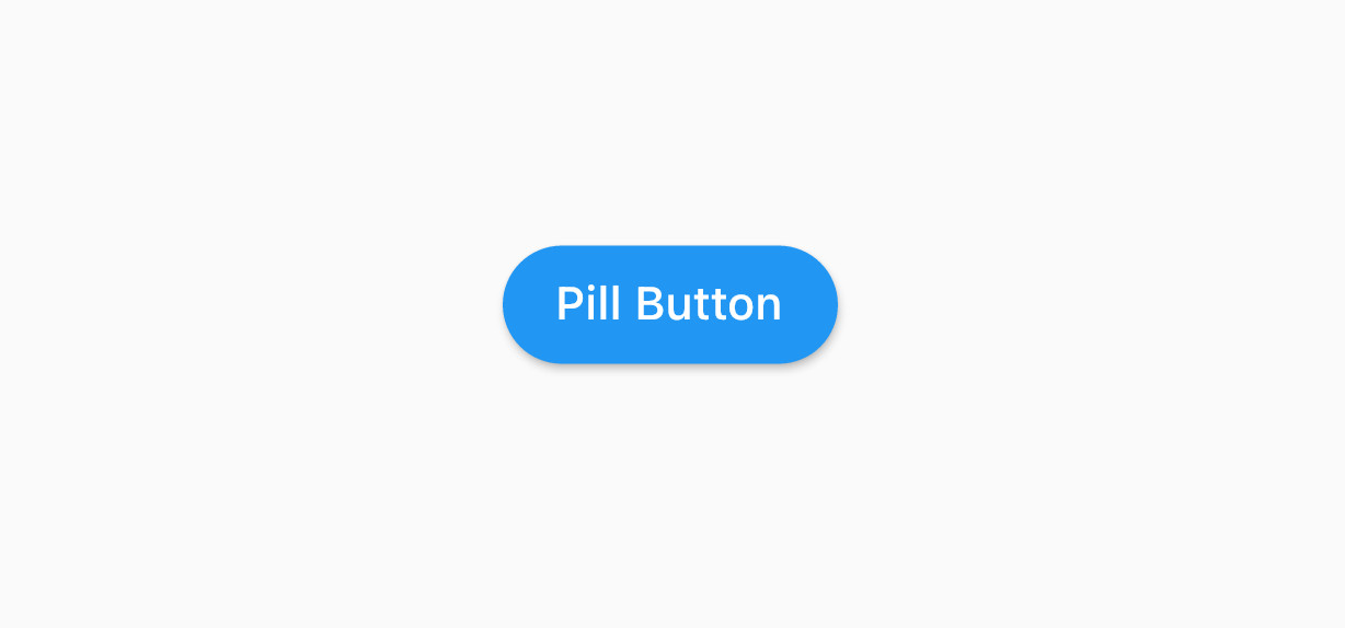
Using ElevatedButton + StadiumBorder
This approach helps you easily create a perfect pill button.
Screenshot:
The code:
ElevatedButton(
          style: ElevatedButton.styleFrom(
            shape: const StadiumBorder(),
          ),
          child: const Text('Pill Button'),
          onPressed: () {},
),
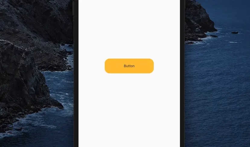
Using InkWell + Material
Screenshot:
The code:
Material(
          color: Colors.amber,
          borderRadius: BorderRadius.circular(15),
          child: InkWell(
            hoverColor: Colors.orange,
            splashColor: Colors.red,
            focusColor: Colors.yellow,
            highlightColor: Colors.purple,
            onTap: () {},
            borderRadius: BorderRadius.circular(20),
            child: Container(
              width: 200,
              height: 60,
              decoration: BoxDecoration(
                borderRadius: BorderRadius.circular(15),
              ),
              alignment: Alignment.center,
              child: const Text('Button'),
            ),
          ),
),
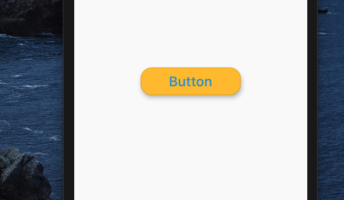
Using OutlinedButton + RoundedRectangleBorder
The code:
OutlinedButton(
        style: OutlinedButton.styleFrom(
            elevation: 6,
            padding: const EdgeInsets.symmetric(horizontal: 50, vertical: 10),
            backgroundColor: Colors.amber,
            shape: RoundedRectangleBorder(
                borderRadius: BorderRadius.circular(20))),
        child: const Text(
          'Button',
          style: TextStyle(fontSize: 24),
        ),
        onPressed: () {},
)
Output:
Using GestureDetector
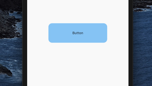
Note: The GestureDetector widget doesn’t provide ripple effects and is rarely used to create buttons.
The code:
GestureDetector(
          onTap: () {},
          child: Container(
            width: 240,
            height: 80,
            alignment: Alignment.center,
            decoration: BoxDecoration(
              borderRadius: BorderRadius.circular(15),
              color: Colors.blue[200],
            ),
            child: const Text('Button'),
          ),
),
Output:
Conclusion
This article has covered many ways to create a rounded button in a Flutter application. Which method do you like best, and will you use it in your projects?
You can explore more about the button topic by taking a look at the following articles:
- Flutter Cupertino Button – Tutorial and Examples
- Working with ElevatedButton in Flutter
- How to make Circular Buttons in Flutter
- Working with TextButton in Flutter
- Flutter: Create a Button with a Loading Indicator Inside
- Working with OutlinedButton in Flutter
You can also check out our Flutter category page or Dart category page for the latest tutorials and examples.

