This article shows you how to set the width, height, and inner padding of a TextField widget in Flutter.
Setting the width of a TextField
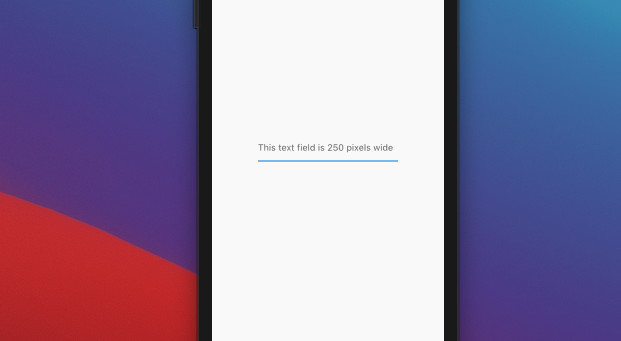
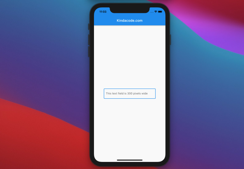
You can set the width of a TextField exactly as you want by wrapping it inside a Container, a SizedBox, or a ContrainedBox widget.
Note that the height of the parent widget will not affect the height of the text field inside it.
The height of a TextField widget depends on multiple factors and we’ll talk about that in a later section of this tutorial.
Example
Screenshot:
The code:
Widget build(BuildContext context) {
    return Scaffold(
      appBar: AppBar(
        title: const Text('Kindacode.com'),
      ),
      body: const Center(
        child: SizedBox(
          width: 250,
          child: TextField(
            decoration: InputDecoration(
              hintText: 'This text field is 250 pixels wide',
            ),
          ),
        ),
      ),
    );
  }
Another example
Screenshot:
The code:
// main.dart
import 'package:flutter/material.dart';

void main() {
  runApp(const MyApp());
}

class MyApp extends StatelessWidget {
  const MyApp({Key? key}) : super(key: key);

  @override
  Widget build(BuildContext context) {
    return const MaterialApp(
      // Remove the debug banner
      debugShowCheckedModeBanner: false,
      title: 'Kindacode.com',
      home: HomePage(),
    );
  }
}

class HomePage extends StatelessWidget {
  const HomePage({Key? key}) : super(key: key);

  @override
  Widget build(BuildContext context) {
    return Scaffold(
      appBar: AppBar(
        title: const Text('Kindacode.com'),
      ),
      body: Center(
        child: ConstrainedBox(
          constraints: const BoxConstraints.tightFor(width: 300),
          child: const TextField(
            decoration: InputDecoration(
              hintText: 'This text field is 300 pixels wide',
              border: OutlineInputBorder(),
            ),
          ),
        ),
      ),
    );
  }
}
TextField Inner Padding
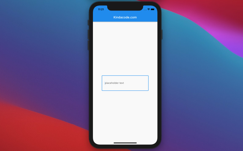
You can set the inner padding of a TextField by using the contentPadding property of the InputDecoration class.
Example
Screenshot:
The code:
Widget build(BuildContext context) {
    return Scaffold(
      appBar: AppBar(
        title: const Text('Kindacode.com'),
      ),
      body: const Center(
        child: SizedBox(
          width: 300,
          child: TextField(
            decoration: InputDecoration(
              hintText: 'placeholder text',
              contentPadding:
                  EdgeInsets.symmetric(vertical: 40, horizontal: 20),
              border: OutlineInputBorder(),
            ),
          ),
        ),
      ),
    );
  }
Adjusting the height of a TextField
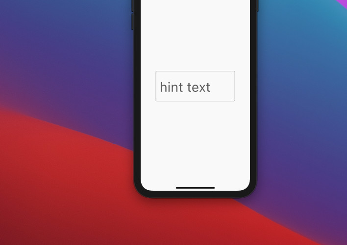
The height of a TextField depends on its inner padding, font size, and line height.
The font size can be set by manipulating the fontSize property of the TextStyle class.
The line height can be adjusted by using the height property of the TextStyle class. When height is non-null, the line height of the span of text will be a multiple of fontSize and be exactly fontSize * height logical pixels tall.
Words can be long and confusing. The following example will help you understand better.
Example
Screenshot:
The code:
Widget build(BuildContext context) {
    return Scaffold(
      appBar: AppBar(
        title: const Text('Kindacode.com'),
      ),
      body: const Center(
        child: SizedBox(
          width: 300,
          child: TextField(
            style: TextStyle(fontSize: 50, height: 1.5),
            decoration: InputDecoration(
              hintText: 'hint text',
              contentPadding:
                  EdgeInsets.symmetric(vertical: 20, horizontal: 15),
              border: OutlineInputBorder(),
            ),
          ),
        ),
      ),
    );
  }
Final Words
You’ve learned how to adjust the width, height, and inner padding of a TextFeild widget. If you’d like to learn more about Flutter, take a look at the following articles:
- Understanding Typedefs (Type Aliases) in Dart and Flutter
- Flutter and Firestore Database: CRUD example
- Flutter TextField: Styling labelText, hintText, and errorText
- Most Popular Packages for State Management in Flutter
- Flutter: Make a TextField Read-Only or Disabled
- Flutter & Hive Database: CRUD Example
You can also check out our Flutter category page or Dart category page for the latest tutorials and examples.

