Accordions display collapsible content panels to present information in a limited amount of space. This article shows you how to make Accordions in Flutter without using third-party plugins.
Table of Contents
Preview
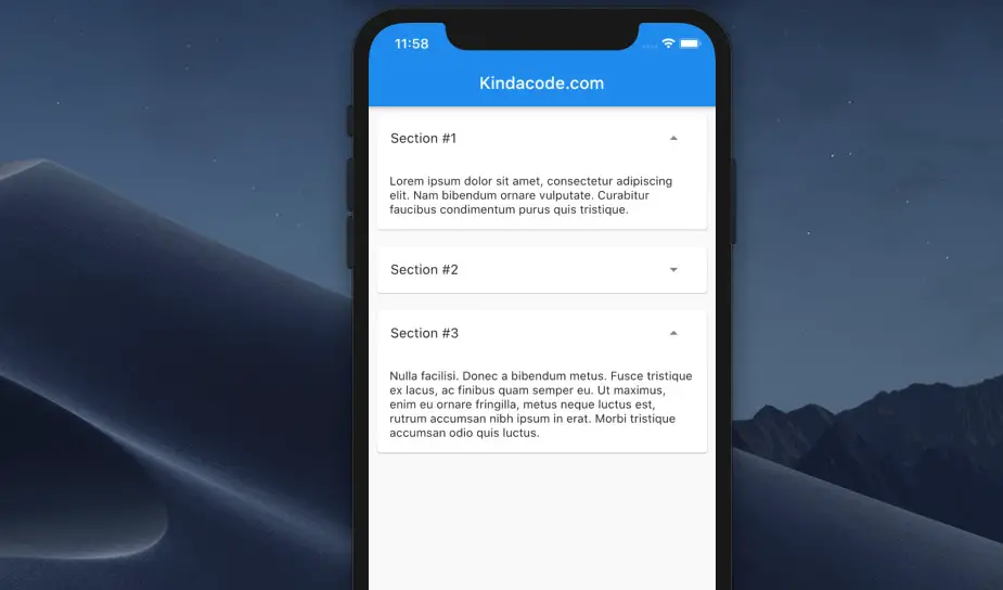
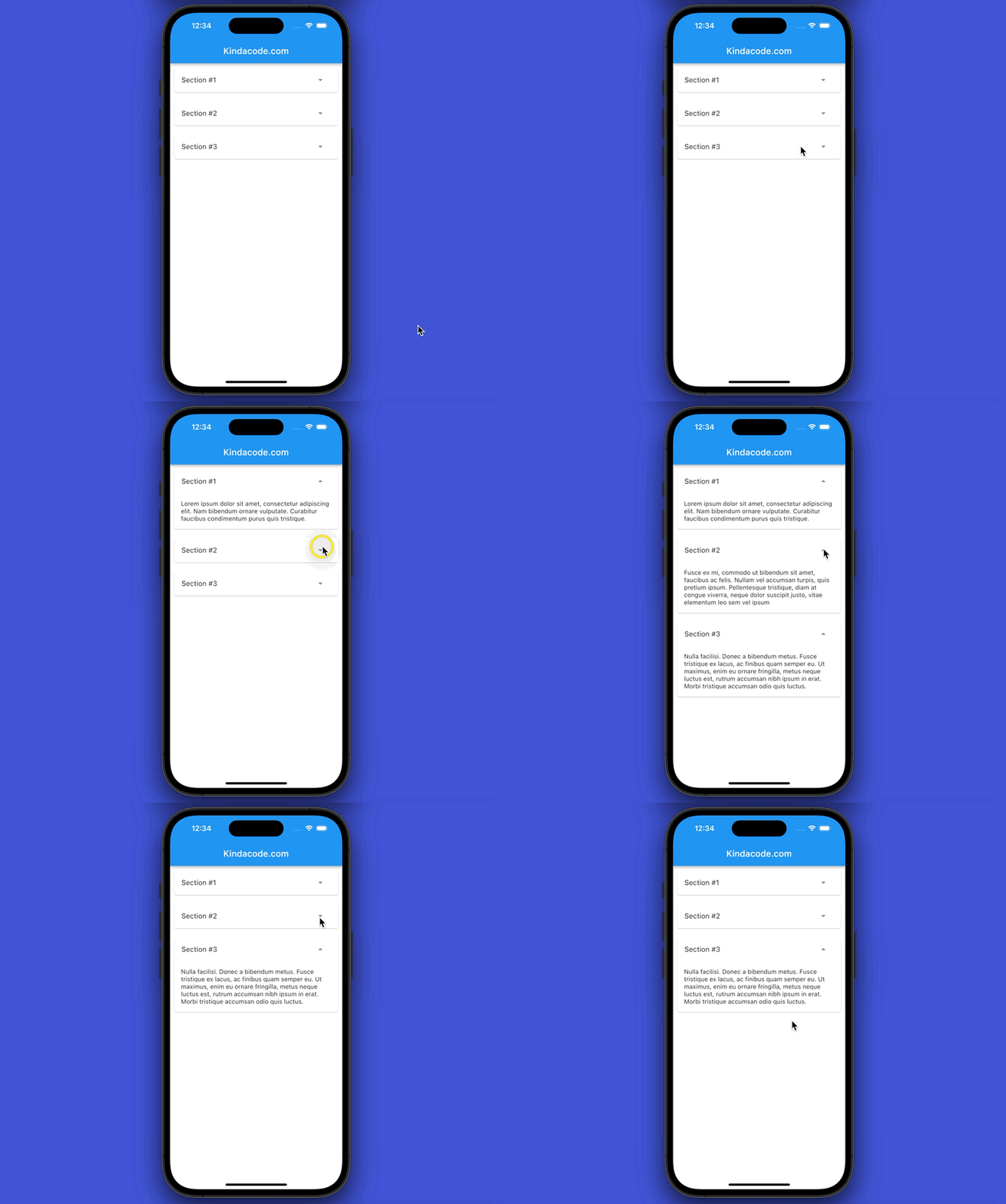
Here’s what we’re going to make:
The Steps
1. Create a new file called accordion.dart in your ./lib folder and add the following code to create a reusable Accordion widget:
// kindacode.com
// accordion.dart
import 'package:flutter/material.dart';

class Accordion extends StatefulWidget {
  final String title;
  final String content;

  const Accordion({Key? key, required this.title, required this.content})
      : super(key: key);
  @override
  State<Accordion> createState() => _AccordionState();
}

class _AccordionState extends State<Accordion> {
  // Show or hide the content
  bool _showContent = false;

  @override
  Widget build(BuildContext context) {
    return Card(
      margin: const EdgeInsets.all(10),
      child: Column(children: [
        // The title
        ListTile(
          title: Text(widget.title),
          trailing: IconButton(
            icon: Icon(
                _showContent ? Icons.arrow_drop_up : Icons.arrow_drop_down),
            onPressed: () {
              setState(() {
                _showContent = !_showContent;
              });
            },
          ),
        ),
        // Show or hide the content based on the state
        _showContent
            ? Container(
                padding:
                    const EdgeInsets.symmetric(vertical: 15, horizontal: 15),
                child: Text(widget.content),
              )
            : Container()
      ]),
    );
  }
}
2. Import accordion.dart into the file you want to implement our Accordion widget (i.e., main.dart):
import './accordion.dart';3. Use:
// main.dart
import 'package:flutter/material.dart';
import './accordion.dart';

void main() {
  runApp(const MyApp());
}

class MyApp extends StatelessWidget {
  const MyApp({Key? key}) : super(key: key);
  @override
  Widget build(BuildContext context) {
    return const MaterialApp(
      // Hide the debug banner
      debugShowCheckedModeBanner: false,
      title: 'Kindacode.com',
      home: HomePage(),
    );
  }
}

class HomePage extends StatelessWidget {
  const HomePage({Key? key}) : super(key: key);

  @override
  Widget build(BuildContext context) {
    return Scaffold(
        appBar: AppBar(
          centerTitle: true,
          title: const Text(
            'Kindacode.com',
          ),
        ),
        // implement several Accordion widgets in a Column
        body: Column(children: const [
          Accordion(
            title: 'Section #1',
            content:
                'Lorem ipsum dolor sit amet, consectetur adipiscing elit. Nam bibendum ornare vulputate. Curabitur faucibus condimentum purus quis tristique.',
          ),
          Accordion(
              title: 'Section #2',
              content:
                  'Fusce ex mi, commodo ut bibendum sit amet, faucibus ac felis. Nullam vel accumsan turpis, quis pretium ipsum. Pellentesque tristique, diam at congue viverra, neque dolor suscipit justo, vitae elementum leo sem vel ipsum'),
          Accordion(
              title: 'Section #3',
              content:
                  'Nulla facilisi. Donec a bibendum metus. Fusce tristique ex lacus, ac finibus quam semper eu. Ut maximus, enim eu ornare fringilla, metus neque luctus est, rutrum accumsan nibh ipsum in erat. Morbi tristique accumsan odio quis luctus.'),
        ]));
  }
}
Alternative
This example creates self-made accordions from scratch so that you can customize them as much as you want. If you want quickly get the job done, see this article: Flutter: ExpansionPanelList and ExpansionPanelList.radio examples.
Conclusion
We’ve built a custom, reusable Accordion widget. At this point, you should get a better and deeper understanding of creating interactive user interfaces in Flutter. If you’d like to explore more, take a look at the following articles:
- Flutter: ListView Pagination (Load More) example
- Flutter AnimatedList – Tutorial and Examples
- Flutter: SliverGrid example
- 2 Ways to Create Flipping Card Animation in Flutter
- Flutter: How to Draw a Heart with CustomPaint
You can also check out our Flutter category page or Dart category page for the latest tutorials and examples.
