Ant Design provides a set of free, high-quality icons for web applications. you can use this set of icons separately without having to use other Ant Design stuff.
This article shows you how to use Ant Design Icons in a React.js project.
1. Install the required package:
npm install @ant-design/icons --saveIf you don’t want to use other utilities of Ant Design, then there is no need to install any other libraries.
2. Import the icons you need, for example:
import { CheckCircleFilled } from '@ant-design/icons';You can also see them in the official docs.
Note: To see the full list of available icons, go to this file:
<your_project>/node_modules/@ant-design/icons/lib/icons/index.d.ts3. Try some Ant Design Icons with the style property:
import React from "react";
import {
  CheckCircleFilled,
  LikeFilled,
  GoldFilled,
  HomeFilled,
} from "@ant-design/icons";

function App() {
  return (
    <center style={{ marginTop: 100 }}>
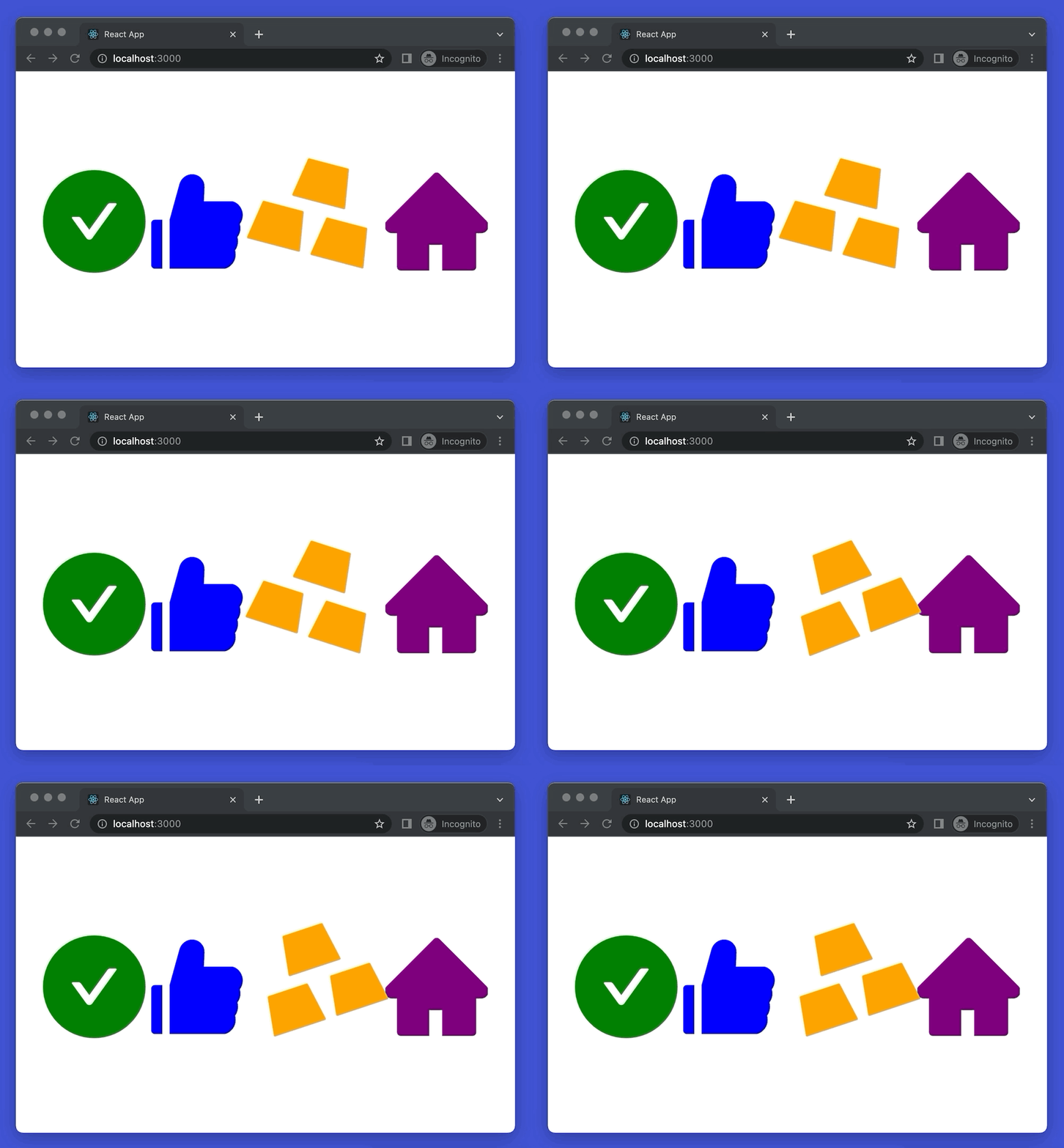
      <CheckCircleFilled style={{ fontSize: 150, color: "green" }} />
      <LikeFilled style={{ fontSize: 150, color: "blue" }} />
      <GoldFilled style={{ fontSize: 200, color: "orange" }} spin={true} />
      <HomeFilled style={{ fontSize: 150, color: "purple" }} />
    </center>
  );
}

export default App;
Output:
Futher reading:
- Most popular React Component UI Libraries
- How to Use Bootstrap and Bootstrap Icons in React
- Using Font Awesome Icons in React Native
- React: Get the Width & Height of a dynamic Element
- React + TypeScript: Create an Autosize Textarea from scratch
- Best Open-Source HTTP Request Libraries for React
You can also check our React category page and React Native category page for the latest tutorials and examples.
