This article shows you a couple of different ways to use Bootstrap 5 (the latest version of Bootstrap) and Bootstrap icons in a React project.
Using Bootstrap Official Packages
1. To use Bootstrap 5, you can install the bootstrap package:
npm i bootstrap bootstrap-iconsThen import the required CSS file at the top of your src/index.js file:
import 'bootstrap/dist/css/bootstrap.min.css';With this setup, you are ready to use Bootstrap CSS classes. If you want to use its Javascript functionality, you have to install popper:
npm install @popperjs/coreNow you need to add extra dependencies in your src/index.js:
import Popper from '@popperjs/core';
import 'bootstrap/dist/js/bootstrap.bundle.min';
To reduce the size of your app, you can import only components you want from Bootstrap instead of the whole JS file as shown above. Example:
import { Modal } from 'bootstrap';2. In order to use Bootstrap icons, you need to install the bootstrap-icons package:
npm i bootstrap-iconsAfter that, you need to include the bootstrap-icons.css file in your src/index.js file:
import 'bootstrap-icons/font/bootstrap-icons.css';You can see the full list of Bootstrap icons here.
Example
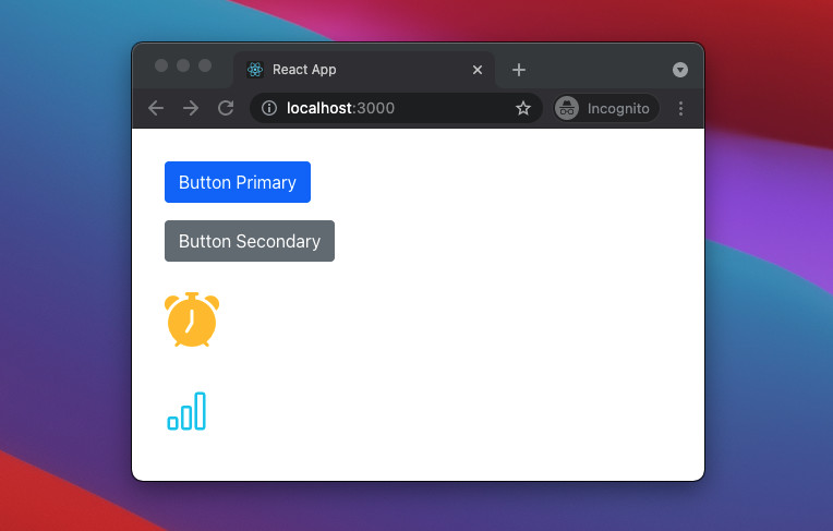
Screenshot:
The Code
1. src/index.js:
import 'bootstrap/dist/css/bootstrap.min.css';
import 'bootstrap-icons/font/bootstrap-icons.css';
import React from 'react';
import ReactDOM from 'react-dom';
import './index.css';
import App from './App';

ReactDOM.render(
  <React.StrictMode>
    <App />
  </React.StrictMode>,
  document.getElementById('root')
);
2. src/App.js:
// App.js
// Kindacode.com
const App = () => {
  return (
    <div style={{ margin: "30px" }}>
      <p>
        <button className="btn btn-primary">Button Primary</button>
      </p>
      <p>
        <button className="btn btn-secondary">Button Secondary</button>
      </p>
      <p>
        <i class="bi bi-alarm-fill text-warning" style={{ fontSize: 50 }}></i>
      </p>
      <p>
        <i class="bi bi-bar-chart text-info" style={{ fontSize: 40 }}></i>
      </p>
    </div>
  );
};

export default App;
Using React Bootstrap
If you don’t like to use Bootstrap CSS classes as the example above, you can use React Bootstrap components instead.
To do so, you need to install the React Bootstrap library. Run the following command to get the latest version:
npm install react-bootstrapEven though React Bootstrap doesn’t depend on a very precise version of Bootstrap and doesn’t ship with any included CSS, some stylesheet is required to use its components. The following line can be included at the top of your src/index.js file:
import 'bootstrap/dist/css/bootstrap.min.css'; // This CSS file was added to your project when you installed react-bootstrapExample
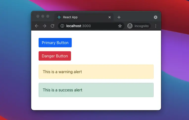
Screenshot:
The code
1. src/index.js:
import 'bootstrap/dist/css/bootstrap.min.css';
import React from 'react';
import ReactDOM from 'react-dom';
import './index.css';
import App from './App';

ReactDOM.render(
  <React.StrictMode>
    <App />
  </React.StrictMode>,
  document.getElementById('root')
);
2. src/App.js:
// App.js
// Kindacode.com
import { Button, Alert } from "react-bootstrap";
const App = () => {
  return (
    <div style={{ margin: "30px" }}>
      <p>
        <Button variant="primary">Primary Button</Button>
      </p>
      <p>
        {" "}
        <Button variant="danger">Danger Button</Button>
      </p>
      <Alert variant="warning">This is a warning alert</Alert>
      <Alert variant="success">This is a success alert</Alert>
    </div>
  );
};

export default App;
See also: How to Use Tailwind CSS in React
Conclusion
We’ve gone through 2 different ways to use Bootstrap 5 in a React project. If you’d like to explore more about modern React and frontend development, take a look at the following articles:
- React + TypeScript: onMouseOver & onMouseOut events
- React + TypeScript: Image onLoad & onError Events
- React + TypeScript: Create an Autosize Textarea from scratch
- React: Show Image Preview before Uploading
- 2 Ways to Render HTML Content in React and JSX
- React: Using inline styles with the calc() function
You can also check our React category page and React Native category page for the latest tutorials and examples.
