There are many ways to create the circle icon button in Flutter. Each of the examples below will use a different method.
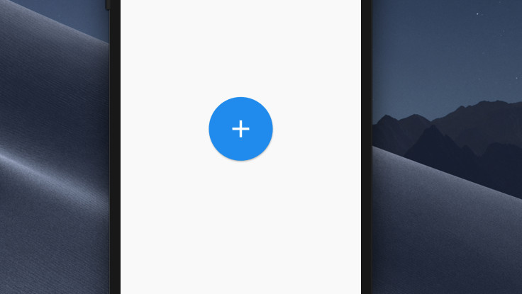
Example 1: Using ElevatedButton + Icon (recommended)
The code:
ElevatedButton(
          style: ElevatedButton.styleFrom(
              shape: const CircleBorder(),
              padding: const EdgeInsets.all(30)
          ),
          child: const Icon(
            Icons.add,
            size: 50,
          ),
          onPressed: () {},
),
Output:
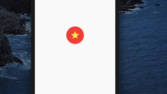
Example 2: Using MaterialButton
The code:
MaterialButton(
        shape: const CircleBorder(),
        color: Colors.red,
        padding: const EdgeInsets.all(20),
        onPressed: () {},
        child: const Icon(
          Icons.star,
          size: 50,
          color: Colors.yellow,
        ),
)
Output:
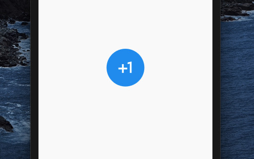
Example 3: ClipOval + Material + InkWell + Padding + Icon
The code:
ClipOval(
        child: Material(
          color: Colors.blue,
          child: InkWell(
            onTap: () {},
            child: const Padding(
              padding: EdgeInsets.all(20),
              child: Icon(
                Icons.plus_one,
                size: 50,
                color: Colors.white,
              ),
            ),
          ),
        ),
)
Output:
Example 4: IconButton + CircleAvatar
The code:
CircleAvatar(
          radius: 50,
          backgroundColor: Colors.amber,
          child: IconButton(
              color: Colors.black,
              padding: const EdgeInsets.all(20),
              iconSize: 50,
              icon: const Icon(Icons.shop),
              onPressed: () {
              // do something
              }),
),
Output:

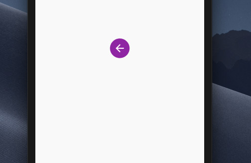
Example 5: Ink + IconButton
The code:
Ink(
        decoration:
            const ShapeDecoration(
                shape: CircleBorder(),
                color: Colors.purple
            ),
        child: IconButton(
          icon: const Icon(Icons.arrow_back),
          iconSize: 30,
          color: Colors.white,
          onPressed: () {},
        ),
)
Output:
Afterword
Above are examples of how to create the circle icon button in Flutter. Hope they help you in some way. Continue learning more about Flutter with the following articles:
- 2 Ways to Add Multiple Floating Buttons in Flutter
- How to add a Share button to your Flutter app
- How to implement Star Rating in Flutter
- Flutter: Make a “Scroll Back To Top” button
- Working with ElevatedButton in Flutter
- Working with TextButton in Flutter
You can also take a tour around our Flutter topic page and Dart topic page to see the latest tutorials and examples.

