Modern web apps often have both a light theme and a dark theme so that users can choose what works best for them. The light theme is suitable for daytime use, while the dark theme is suitable for night use and reduces eye strain as well as saves energy.
This article walks you through a complete example of implementing a light/dark theme toggle in a React application built with MUI (we’ll use MUI 5 – the latest version).
Table of Contents
Example Preview
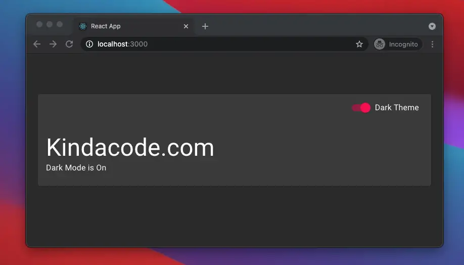
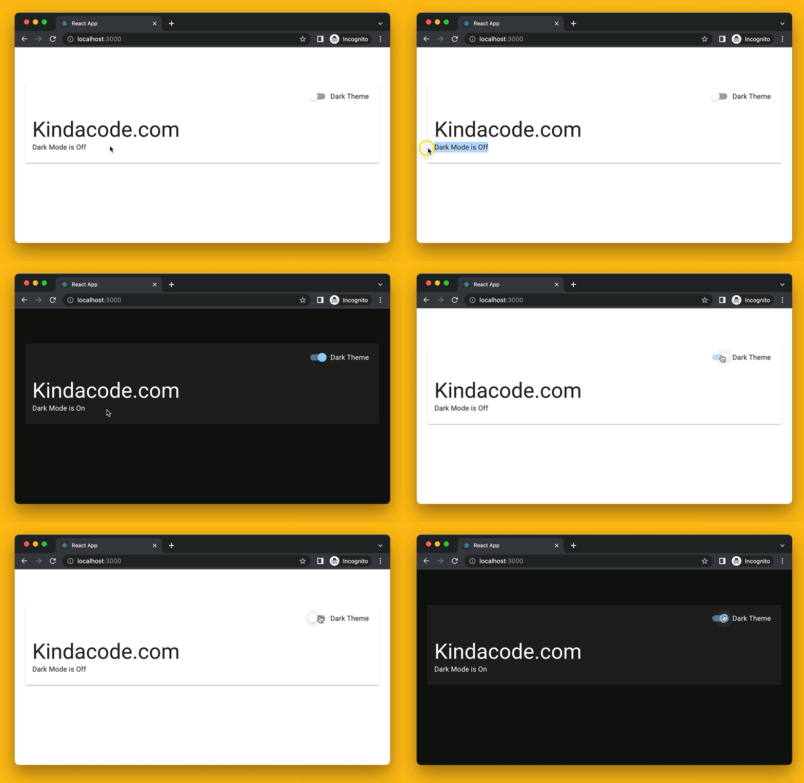
We are going to build a super simple React app that contains a card with some text and a switch inside. When the switch is off, the light theme is used. When the switch is on, the dark theme will be applied.
Here’s how it works:
The Code
1. Create a new React project by executing the command below:
npx create-react-app my_app2. Installing the required packages:
npm i @mui/material @emotion/react @emotion/styled @fontsource/robotoThe Roboto font is not automatically loaded by MUI. That’s why we need to add the @fontsource/roboto package.
3. Remove all of the default code in your src/App.js and add the following:
import { useState } from "react";

// Import MUI stuff
import "@fontsource/roboto"; // Loading Roboto font. MUI was designed with this font in mind.
import {
  Card,
  CardHeader,
  Switch,
  CardContent,
  Box,
  Container,
  Typography,
  FormGroup,
  FormControlLabel,
  CssBaseline,
} from "@mui/material";
import { createTheme, ThemeProvider } from "@mui/material/styles";

// Define theme settings
const light = {
  palette: {
    mode: "light",
  },
};

const dark = {
  palette: {
    mode: "dark",
  },
};

const App = () => {
  // The light theme is used by default
  const [isDarkTheme, setIsDarkTheme] = useState(false);

  // This function is triggered when the Switch component is toggled
  const changeTheme = () => {
    setIsDarkTheme(!isDarkTheme);
  };

  return (
    <ThemeProvider theme={isDarkTheme ? createTheme(dark) : createTheme(light)}>
      <CssBaseline />
      <Container>
        <div className="App">
          <Box component="div" p={5}></Box>
          <Card>
            <CardHeader
              action={
                <FormGroup>
                  <FormControlLabel
                    control={
                      <Switch checked={isDarkTheme} onChange={changeTheme} />
                    }
                    label="Dark Theme"
                  />
                </FormGroup>
              }
            />
            <CardContent>
              <Typography variant="h3" component="h3">
                Kindacode.com
              </Typography>
              <Typography variant="body1">
                Dark Mode is {isDarkTheme ? "On" : "Off"}
              </Typography>
            </CardContent>
          </Card>
        </div>
      </Container>
    </ThemeProvider>
  );
};

export default App;
4. Run your project and check the result.
Conclusion
You’ve learned how to switch between dark and light themes in a React app that uses MUI. Continue learning more new and interesting things about the modern React world by taking a look at the following articles:
- React + TypeScript: Handling form onSubmit event
- How to fetch data from APIs with Axios and Hooks in React
- Most popular React Component UI Libraries
- Top 4 React form validation libraries
- React: Get the Width & Height of a dynamic Element
- React: Using inline styles with the calc() function
You can also check our React topic page and React Native topic page for the latest tutorials and examples.
