This article walks you through a complete example of creating a reading progress indicator in React. We are going to write code in TypeScript and make use of modern features provided by React including hooks and functional components. The sample app is going to be built from scratch. No third-party libraries are required.
Table of Contents
Overview
A reading progress indicator can help the user know how much content has been read and how much is left. It is usually horizontal and sticky at the top of the page (while the web browser’s scroll bar is vertical and on the right side of the screen). The width of the indicator is proportional to the amount of content that has been read.
To calculate the width of the indicator, we must know the following factors:
- How far has the user scrolled down (we can get this information by using document.documentElement.scrollTop).
- Height of main content (we’ll use the useRef hook for this).
- Offset top of the main content (we’ll use the useRef hook for this).
You can see a detailed guide about the useRef hook here.
The Complete Example
App Preview
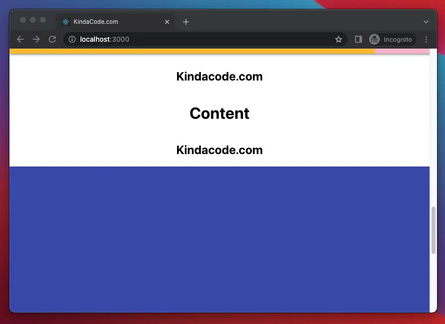
The app we are going to build contains 4 main sections:
- The reading progress bar: Always stays at the top of the page.
- Header: The green area that appears before the main content.
- Main Content: This is where the user’s reading progress will be shown in the reading progress bar. The height of this section depends on its content.
- Footer: The blue area that resides at the bottom of the page.
Our reading progress bar is only really active when the user scrolls up or down in the main content area. When in the header or footer area, it will stay at 0% or 100%, respectively.
A demo is worth more than thousands of words:
In this example, I made the reading progress bar quite thick to make it easier to see. In fact, it’s usually thinner (you can easily adjust the thickness in the App.css file).
The Code
1. Initialize a new React project with TypeScript:
npx create-react-app kindacode_example --template typescriptThe project name is totally up to you.
2. Remove all of the default code in src/App.tsx and add the following (each piece of code goes with an explanation):
import { useState, useEffect, useRef } from "react";
import "./App.css";

const App = () => {
  // the width of the indicator (which is orange in color)
  const [width, setWidth] = useState(0);

  // this ref will be used to connected with the main content section
  const contentRef = useRef<HTMLElement | null>(null);

  const scrollProgress = () => {
    // how far the user has scrolled down
    const scrollTop = document.documentElement.scrollTop;

    if (contentRef.current) {
      // the distance from the content section to the top of the page
      const contentOffsetTop = contentRef.current?.offsetTop;

      // the height of the content section
      const contentHeight = contentRef.current?.clientHeight;

      if (scrollTop - contentOffsetTop <= 0) {
        return setWidth(0);
      }

      if (scrollTop - contentHeight > contentHeight) {
        return setWidth(100);
      }

      setWidth(((scrollTop - contentOffsetTop) / contentHeight) * 100);
    }
  };

  // add event listener
  useEffect(() => {
    window.addEventListener("scroll", scrollProgress);
  }, []);

  return (
    <>
      {/* The reading progress indicator bar */}
      <div className="progress-container">
        <div className="progress-bar" style={{ width: `${width}%` }} />
      </div>

      {/* Header */}
      <header>
        <h1>Header</h1>
        <h1>KindaCode.com</h1>
      </header>

      <main className="content" ref={contentRef}>
        {/* Just some dummy content */}
        <h1>Content</h1>
        <h2>Kindacode.com</h2>
        <h1>Content</h1>
        <h2>Kindacode.com</h2>
        <h1>Content</h1>
        <h2>Kindacode.com</h2>
        <h1>Content</h1>
        <h2>Kindacode.com</h2>
        <h1>Content</h1>
        <h2>Kindacode.com</h2>
        <h1>Content</h1>
        <h2>Kindacode.com</h2>
        <h1>Content</h1>
        <h2>Kindacode.com</h2>
        <h1>Content</h1>
        <h2>Kindacode.com</h2>
        <h1>Content</h1>
        <h2>Kindacode.com</h2>
        <h1>Content</h1>
        <h2>Kindacode.com</h2>
        <h1>Content</h1>
        <h2>Kindacode.com</h2>
      </main>

      {/* Footer */}
      <footer>
        <h1>Footer</h1>
        <h1>KindaCode.com</h1>
      </footer>
    </>
  );
};

export default App;
3. And here is the code for src/App.css:
/* Header section */
header {
  display: flex;
  flex-direction: column;
  justify-content: center;
  align-items: center;
  background: #4caf50;
  color: #fff;
  padding: 50px 0;
}

/* Styling the progress indicator */
.progress-container {
  background: #f8bbd0;
  box-shadow: 0 2px 4px #999;
  height: 10px;
  position: fixed;
  top: 0;
  left: 0;
  width: 100vw;
  z-index: 99;
}

.progress-bar {
  height: 10px;
  background: #ffc107;
}

/* Main content */
main.content {
  display: flex;
  flex-direction: column;
  justify-content: center;
  align-items: center;
}

/* Footer section */
footer {
  padding: 50px 0;
  min-height: 150vh;
  background: #3f51b5;
  display: flex;
  flex-direction: column;
  justify-content: center;
  align-items: center;
  color: white;
}
4. Finally, get the app up and running by performing the command below:
npm startGo to http://localhost:3000 with your favorite web browser and check the result.
Conclusion
We’ve examined an end-to-end example of implementing a reading progress indicator in a React app written in TypeScript. If you’d like to explore more new and interesting things in the modern React world, take a look at the following articles:
- React + TypeScript: Re-render a Component on Window Resize
- Best open-source WYSIWYG editors for React
- Most popular React Component UI Libraries
- React + TypeScript: Making a Custom Context Menu
- React + TypeScript: Multiple Dynamic Checkboxes
- Best open-source Admin Dashboard libraries for React
You can also check our React category page and React Native category page for the latest tutorials and examples.
