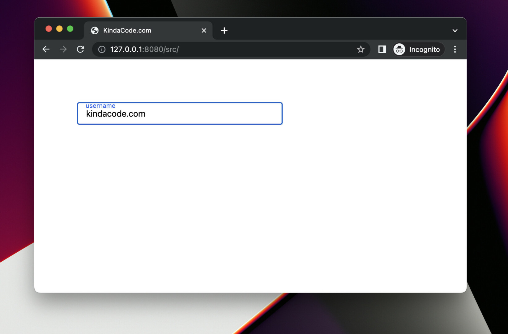
A floating input label is a label that looks like a text placeholder when the associated input field is empty. As soon as you enter something into the input field, the label will move upwards. The minimal example below shows you how to create a floating input label with Tailwind CSS. The point here is to add the peer utility to the input and use the peer-placeholder-shown modifer to determine whether the input is empty or not.
Example Preview:
The code:
<body class="p-20">
    <form class="space-y-5">
        <div class="flex flex-col items-start">
            <input type="text" id="username" placeholder="John Doe" class="peer px-4 py-2 w-96
            border border-slate-600 placeholder-transparent" />
            <label for="username" class="ml-4 -mt-11 text-xs text-blue-600
            peer-placeholder-shown:text-gray-400
            peer-placeholder-shown:-mt-8
            peer-placeholder-shown:text-base
            duration-300">
                username
            </label>
        </div>
    </form>
</body>
Code explained:
- We add the peer class to the input and use the peer-placeholder-shown modifier to style the label when the input field is empty.
- We add a placeholder but make it transparent. The purpose of this placeholder is to help us know if the input is not empty (with the peer-placeholder-shown modifier).
- To style the label when the input field has some text, we use utility classes without a modifier.
- To make the animation smoothier, we use the duration-300 class.
That’s it. Further reading:
- Tailwind CSS: Create an Animated & Closeable Side Menu
- Tailwind CSS: How to Center a Fixed Element
- Tailwind CSS: How to set font size with an arbitrary value
- Tailwind CSS: How to Create a Black-and-White Image
- How to Rotate an Element in Tailwind CSS
- Tailwind CSS: Create a horizontal line with text in the middle
You can also check out our CSS category page for the latest tutorials and examples.
