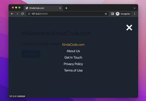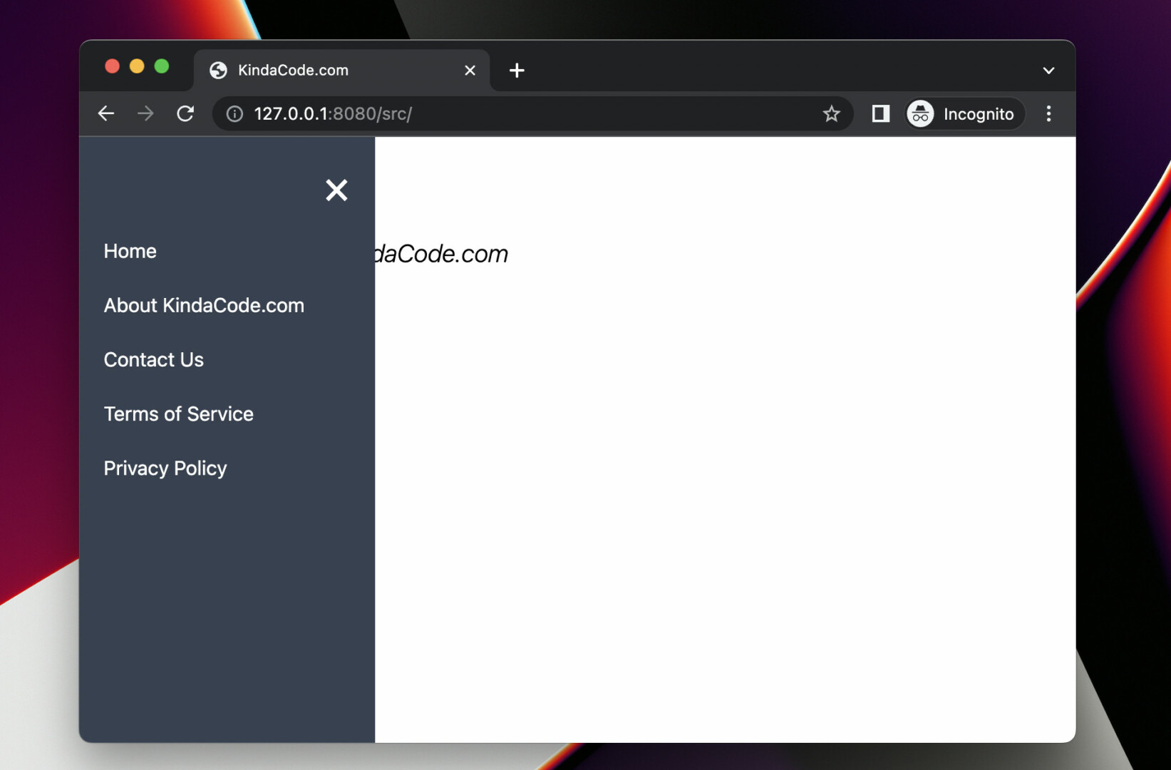
The example below shows you how to create an animated and closeable side navigation menu with Tailwind CSS and a little vanilla Javascript (just a few lines). Our side navigation works well on both large screens (computers) and small screens (mobile phones).
Table of Contents
Preview
The code
<body>
<!-- The menu here -->
<div id="side-menu" class="fixed top-0 left-[-250px] w-[240px] h-screen z-50 bg-gray-700 p-5
flex flex-col space-y-5 text-white duration-300">
<a href="javascript:void(0)" class="text-right text-4xl" onclick="closeMenu()">×</a>
<a class="hover:text-amber-500" href="#">Home</a>
<a class="hover:text-amber-500" href="#">About KindaCode.com</a>
<a class="hover:text-amber-500" href="#">Contact Us</a>
<a class="hover:text-amber-500" href="#">Terms of Service</a>
<a class="hover:text-amber-500" href="#">Privacy Policy</a>
</div>
<main class="p-5">
<!-- This is used to open the menu -->
<span class="cursor-pointer text-4xl" onclick="openMenu()">☰ Open Menu</span>
<h1 class="mt-5 text-xl font-light italic">Side Menu Example - KindaCode.com</h1>
</main>
<!-- Javascript code -->
<script>
var sideMenu = document.getElementById('side-menu');
function openMenu() {
sideMenu.classList.remove('left-[-250px]');
sideMenu.classList.add('left-0');
}
function closeMenu() {
sideMenu.classList.remove('left-0');
sideMenu.classList.add('left-[-250px]');
}
</script>
</body>Explanations
- In the beginning, the side navigation is invisible because it’s out of the viewport. Its position is fixed and its left position is set to -240px by using the left-[-250px] class.
- To open the side navigation, we call the openMenu() function. The left position is set from -250px to 0px.
- To close the side navigation, we call the closeMenu() function. The left position is set from 0px to -250px and the menu will become invisible.
Conclusion
You’ve learned how to implement a side drawer navigation with Tailwind CSS and a few lines of Javascript. With this knowledge in mind, you can build beautiful, professional, and interactive websites. If you’d like to explore more new and interesting stuff about frontend development, take a look at the following articles:
- Form Validation with Tailwind CSS (without Javascript)
- Tailwind CSS: How to create accordions (collapsible content)
- How to Create a Fixed Sidebar with Tailwind CSS
- Tailwind CSS: Create a Fixed/Sticky Footer Menu
- How to Zoom on Hover with Tailwind CSS (the easiest approach)
- Tailwind CSS: Creating Shimmer Loading Placeholder (Skeleton)
You can also check out our CSS category page for the latest tutorials and examples.
