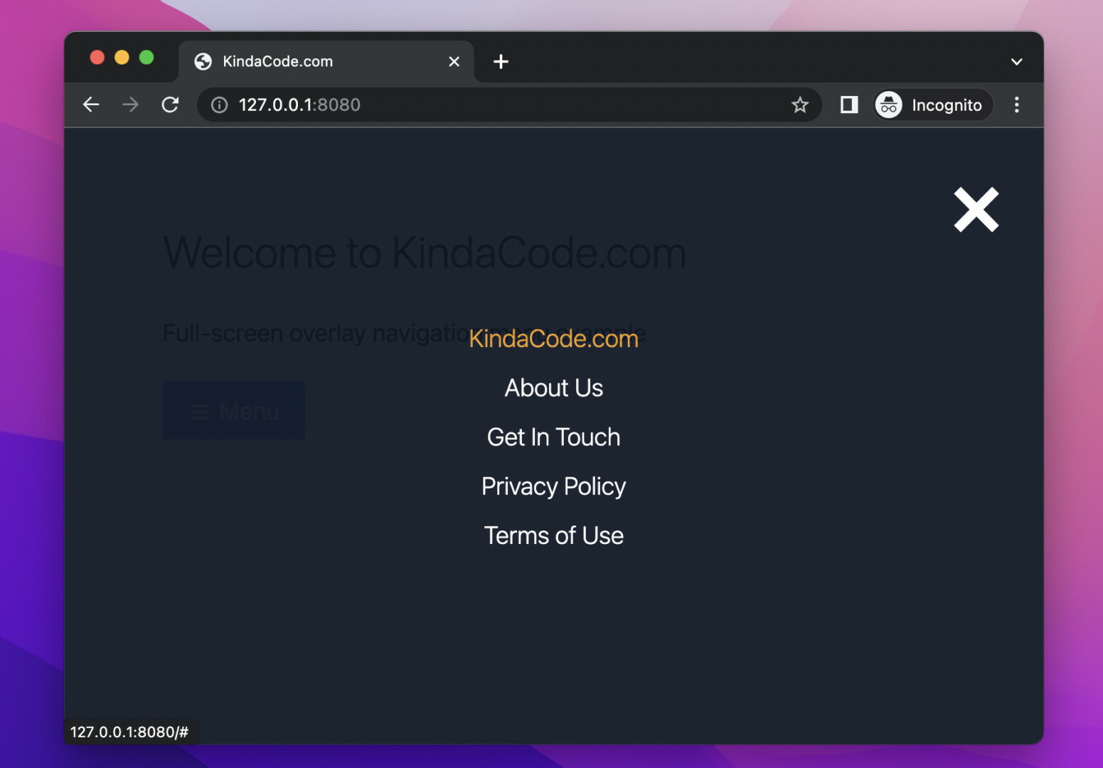
A full-screen overlay menu has a fixed position as well as full-screen width and height. It stays over other elements of the webpage. However, a full-screen overlay menu is hidden by default and only shows up as needed (when the user performs an action like clicking a button).
This article walks you through a complete example of implementing a full-screen overlay menu with Tailwind CSS and a little vanilla Javascript (only a few lines of code). Without any further ado, let’s move on the the things that matter.
Table of Contents
Example review
The simple webpage we’re going to make has a blue button that can be used to show the menu.
The menu will appear softly and smoothly from the top left corner of the viewport as its size increases and the transparency decreases. On the contrary, when leaving, the size of the menu will gradually decrease and the transparency will also increase accordingly.
Here’s how it works:
The code
<body>
<!-- Implement the overlay menu -->
<div id="menu" class="fixed z-90 w-0 h-0 flex justify-center items-center bg-gray-900 opacity-0 duration-700">
<a href="javascript:void(0)"
class="fixed top-6 right-8 text-white hover:text-amber-500 text-7xl font-semibold duration-300"
onclick="closeMenu()">×</a>
<div class="flex flex-col text-white text-center text-xl font-light space-y-3">
<a class="hover:text-amber-500 duration-300" href="#">KindaCode.com</a>
<a class="hover:text-amber-500 duration-300" href="#">About Us</a>
<a class="hover:text-amber-500 duration-300" href="#">Get In Touch</a>
<a class="hover:text-amber-500 duration-300" href="#">Privacy Policy</a>
<a class="hover:text-amber-500 duration-300" href="#">Terms of Use</a>
</div>
</div>
<!-- Other elements -->
<div class="container p-20 space-y-8">
<h1 class="text-4xl font-light">Welcome to KindaCode.com</h1>
<h2 class="text-xl">Full-screen overlay navigation menu example</h2>
<p><a href="javascript:void(0)" onclick="openMenu()"
class="px-5 py-3 bg-blue-500 hover:bg-blue-600 text-xl text-white duration-300">
<span class="text-2xl">☰</span>
Menu
</a></p>
</div>
<!-- Javascript code -->
<script>
var menu = document.getElementById("menu");
// this function is used to open the menu
function openMenu() {
menu.classList.remove("w-0", "h-0", "opacity-0");
menu.classList.add("w-screen", "h-screen", "opacity-95");
}
// this function is used to close the menu
function closeMenu() {
menu.classList.remove("w-screen", "h-screen", "opacity-95");
menu.classList.add("w-0", "h-0", "opacity-0");
}
</script>
</body>Explanation
We use the fixed utility to give the menu (the element with the id of menu) a fixed position. We also add the z-90 utility to set a big z-index. In the beginning, the width and height are both zero (w-0, h-0) and the opacity is completely transparent (opacity-0).
When the blue button is clicked, the openMenu() function is called. At this point, we change the width and the height from zero to full screen (w-screen, h-screen). Opacity from 0 to 95% (opacity-95):
menu.classList.remove("w-0", "h-0", "opacity-0");
menu.classList.add("w-screen", "h-screen", "opacity-95");The menu does not appear suddenly, but gently, thanks to the duration-700 utility class.
When the closeMenu() function is fired, everything happens in reverse.
Epilogue
You’ve examined an end-to-end example of constructing a full-screen overlay navigation menu with Tailwind CSS and vanilla Javascript. You can modify the code, add some things, remove some things, and adjust some values to make it suit your need. I
If you’d like to learn how to build other kinds of menus with Tailwind CSS, take a look at the following articles:
- Tailwind CSS: How to Create an Off-Canvas Side Menu
- Tailwind CSS: Create a Responsive Top Navigation Menu
- Tailwind CSS: How to Create a Clickable Dropdown Menu
- Tailwind CSS: Create an Animated & Closable Side Menu
- Tailwind CSS: How to Create a Hoverable Dropdown Menu
- Tailwind CSS: Create a Fixed/Sticky Footer Menu
You can also check out our CSS category page for the latest tutorials and examples.
