This concise article shows you how to create a hover dropdown menu with Tailwind CSS. No Javascript code is required.
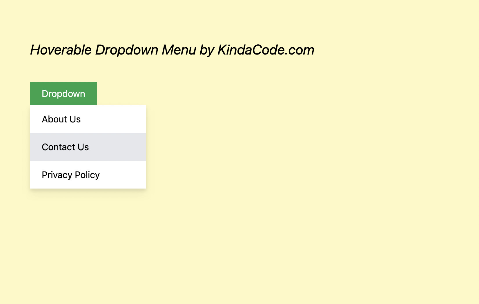
A dropdown menu is a toggleable menu that allows the user to select an option or go to a link from a list of items. A hover dropdown menu will be opened when the user’s mouse hovers over a certain area (e.g., a button). It will help your website save space and only show the menu as needed.
Example
Preview:
The code:
<body class="p-20 flex flex-col space-y-10 bg-yellow-100">
    <h2 class="text-2xl italic">Hoverable Dropdown Menu by KindaCode.com</h2>

    <div>
        <button class="peer px-5 py-2 bg-green-600 hover:bg-green-700 text-white">Dropdown</button>

        <!-- the menu here -->
        <div class="hidden peer-hover:flex hover:flex
         w-[200px]
         flex-col bg-white drop-shadow-lg">
            <a class="px-5 py-3 hover:bg-gray-200" href="#">About Us</a>
            <a class="px-5 py-3 hover:bg-gray-200" href="#">Contact Us</a>
            <a class="px-5 py-3 hover:bg-gray-200" href="#">Privacy Policy</a>
        </div>
    </div>
</body>
Code explained:
- We add the peer class to the button so that we can style the menu based on the button’s state (with the peer-hover modifier). In the beginning, the menu is hidden (with the hidden utility). When the mouse cursor hovers over the button, the menu will show up (with peer-hover:flex).
- The menu still needs to be displayed when the mouse pointer moves over its items. That’s why we use hover:flex.
- In addition to the above important points, we also give the menu a drop shadow and style its items to make it more elegent.
Further reading:
- Tailwind CSS: How to Create a Black-and-White Image
- Tailwind CSS: Use a Checkbox to Show/Hide an Element
- Styling selected text with Tailwind CSS
- Tailwind CSS: How to create accordions (collapsible content)
- Styling a Login Page with Tailwind CSS
- Form Validation with Tailwind CSS (without Javascript)
You can also check out our CSS category page for the latest tutorials and examples.
