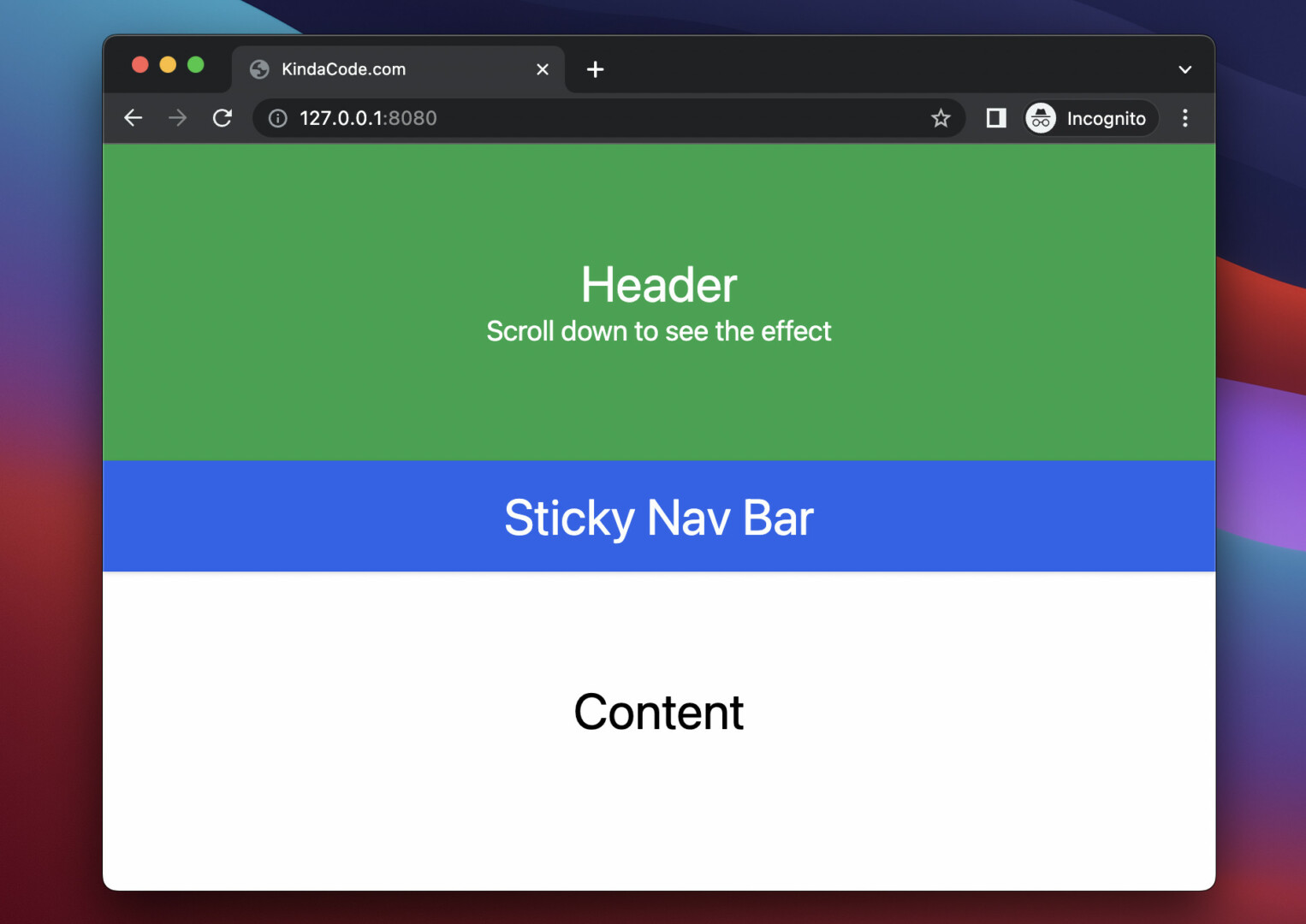
This concise article shows you how to create a sticky/affix navigation bar with only Tailwind CSS (no Javascript code or any extra CSS is required).
Overview
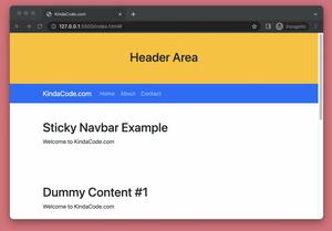
In general, the position of a sticky navbar is relative (it will scroll down like other elements) until it crosses a specified threshold, then its position becomes fixed until its parent is off-screen.
With Tailwind CSS, we can simply implement a sticky navigation bar by using the sticky and top-0 utility classes, like so:
<nav class="sticky top-0 [other classes here]">
  <!-- nav items here -->
</nav>
For more clarity, see the full example below.
Example
Preview:
Note: If you’re using Safari, this demo video might not work nicely or not start at all. Please use Chrome, Edge, Firefox, or another web browser instead.
The complete code:
<!doctype html>
<html>
<head>
    <meta charset="UTF-8">
    <meta name="viewport" content="width=device-width, initial-scale=1.0">
    <script src="https://cdn.tailwindcss.com"></script>
    <title>KindaCode.com</title>
</head>

<body>
    <div>
        <header class="bg-green-600 p-20">
            <h1 class="text-white text-4xl text-center">Header</h1>
            <h2 class="text-white text-xl text-center">Scroll down to see the effect</h2>
        </header>
        <nav class="sticky top-0 bg-blue-600 p-5 drop-shadow shadow-blue-600">
            <h1 class="text-white text-4xl text-center">Sticky Nav Bar</h1>
        </nav>
        <div class="h-screen">
            <h1 class="text-4xl text-center p-20">Content</h1>
        </div>
        <footer class="h-96 p-20 bg-red-600">
            <h1 class="text-white text-4xl text-center p-20">Footer</h1>
        </footer>
    </div>
</body>
</html>
That’s it. Further reading:
- Text Shadows in Tailwind CSS
- Tailwind CSS: How to Create a Fixed Top Menu Bar
- How to Zoom on Hover with Tailwind CSS (the easiest approach)
- Tailwind CSS: How to Create Gradient Text
- Tailwind CSS: Create a Button with Gradient Background
- How to Use Tailwind CSS in React
You can also check out our CSS category page for the latest tutorials and examples.
