This practical article walks you through a complete example of creating image modals (image lightboxes) with Tailwind CSS and pure Javascript (it’s totally fine if you don’t have much experience with this programming language).
Table of Contents
Example Preview
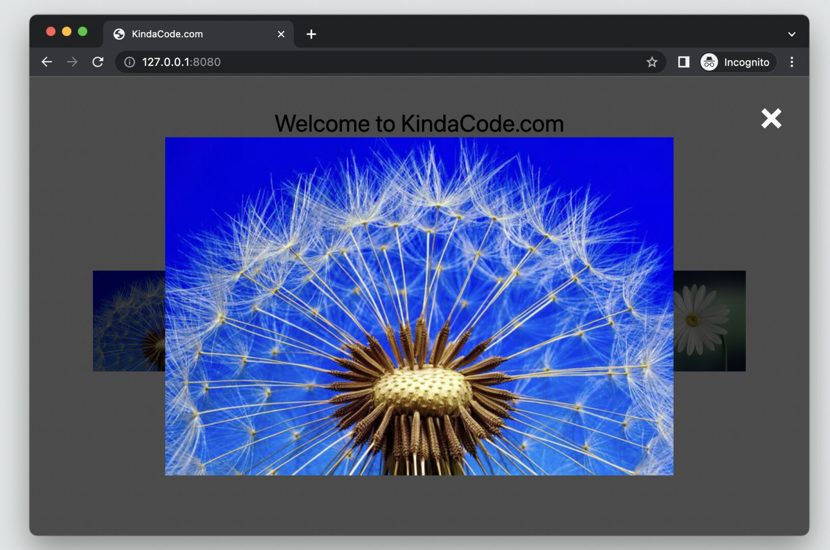
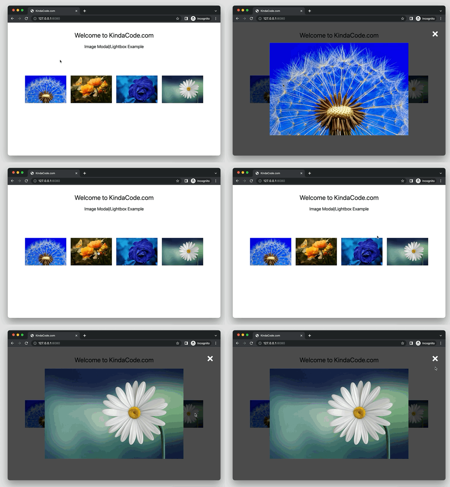
The sample webpage we’re going to build has an image grid. When a thumbnail (a small image) is clicked, a modal dialog with the large size image (associated with the thumbnail) will show up. In the top right corner, there is a close button.
Here’s how it works:
The Code
Here’s the full source code that produces the demo above:
<!doctype html>
<html>
<head>
<meta charset="UTF-8">
<meta name="viewport" content="width=device-width, initial-scale=1.0">
<meta http-equiv="X-UA-Compatible" content="ie=edge">
<script src="https://cdn.tailwindcss.com"></script>
<title>KindaCode.com</title>
</head>
<body>
<h1 class="mt-10 mb-5 text-center text-3xl">Welcome to KindaCode.com</h1>
<h3 class="mb-10 text-center text-xl">Image Modal/Lightbox Example</h3>
<!-- Image gird -->
<div class="p-20 grid grid-cols-4 gap-5">
<img class="w-full h-full object-cover cursor-pointer"
src="https://www.kindacode.com/wp-content/uploads/2022/07/flower-4.jpeg" alt="Flower"
onclick="showModal('https://www.kindacode.com/wp-content/uploads/2022/07/flower-4.jpeg')" />
<img class="w-full h-full object-cover cursor-pointer"
src="https://www.kindacode.com/wp-content/uploads/2022/07/flower-3.jpeg" alt="Flower"
onclick="showModal('https://www.kindacode.com/wp-content/uploads/2022/07/flower-3.jpeg')" />
<img class="w-full h-full object-cover cursor-pointer"
src="https://www.kindacode.com/wp-content/uploads/2022/07/flower-2.jpeg" alt="Flower"
onclick="showModal('https://www.kindacode.com/wp-content/uploads/2022/07/flower-2.jpeg')" />
<img class="w-full h-full object-cover cursor-pointer"
src="https://www.kindacode.com/wp-content/uploads/2022/07/flower-1.jpeg" alt="Flower"
onclick="showModal('https://www.kindacode.com/wp-content/uploads/2022/07/flower-1.jpeg')" />
</div>
<!-- The Modal -->
<div id="modal"
class="hidden fixed top-0 left-0 z-80 w-screen h-screen bg-black/70 flex justify-center items-center">
<!-- The close button -->
<a class="fixed z-90 top-6 right-8 text-white text-5xl font-bold" href="javascript:void(0)"
onclick="closeModal()">×</a>
<!-- A big image will be displayed here -->
<img id="modal-img" class="max-w-[800px] max-h-[600px] object-cover" />
</div>
<script>
// Get the modal by id
var modal = document.getElementById("modal");
// Get the modal image tag
var modalImg = document.getElementById("modal-img");
// this function is called when a small image is clicked
function showModal(src) {
      modal.classList.remove('hidden');
      modalImg.src = src;
 }
// this function is called when the close button is clicked
function closeModal() {
      modal.classList.add('hidden');
}
</script>
</body>
</html>Note: Images in the preceding example are from Pixabay, used under the Pixabay License for tutorial purposes.
Explanations
The modal is hidden by default, thanks to the hidden utility class. When a thumbnail image is clicked, we show the modal by removing the hidden utility. We also display the image in the modal by passing the corresponding URL to the showModal function:
function showModal(src) {
modal.classList.remove('hidden');
modalImg.src = src;
}The modal is set to fixed with a dark transparent background. Its z-index is set to a high value to ensure nothing can eclipse it.
Making the modal go away is quite simple:
function closeModal() {
modal.classList.add('hidden');
}Conclusion
We’ve examined an end-to-end example of implementing image modals with Tailwind CSS and vanilla Javascript. You can modify the code, add some things, remove some things, and adjust some values to improve it as you wish.
If you’d like to explore more new and interesting stuff about modern web technologies, take a look at the following articles:
- Tailwind CSS: Create an Image Carousel/Slideshow
- Tailwind CSS: How to place text over an image
- Tailwind CSS: Create an Animated & Closable Side Menu
- How to Zoom on Hover with Tailwind CSS (the easiest approach)
- Tailwind CSS: Expand a Text Input on Focus (without Javascript)
- Tailwind CSS: How to Create a Vertical Divider Line
You can also check out our CSS category page for the latest tutorials and examples.

