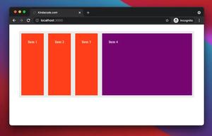
The calc() function performs a calculation and dynamically produces the property value (usually related to width, height, margin, and padding). In Tailwind CSS, you can use the calc() function by putting it between a pair of square brackets [], like this:
<div class="w-[calc(100%-30rem)]"></div>Let’s see the concrete example below for more clarity.
Example Preview
his example creates a simple layout with 3 columns, where the left column (left menu) has a fixed width of w-48 (12rem or 192px). The middle column (main content) has a width of 2/3 of the remaining space, and the right column (right sidebar) has a width of 1/3 of the remaining space:
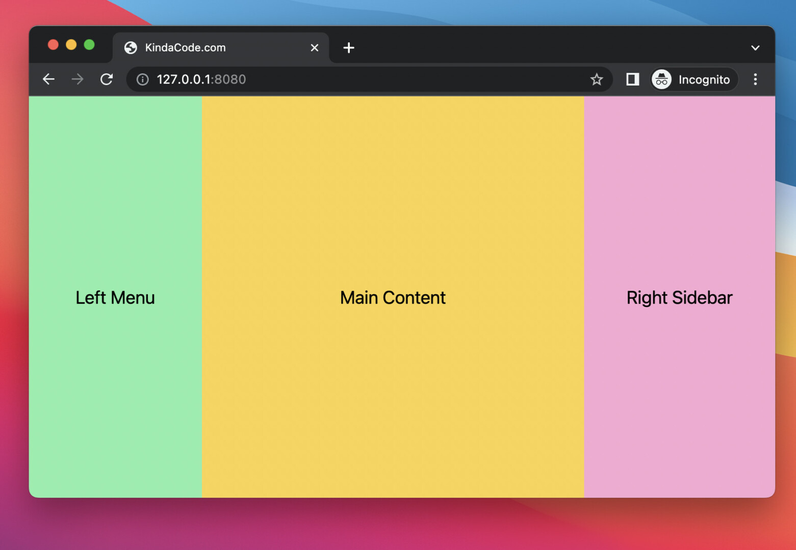
The Code
<body class="w-screen flex">
    <aside class="w-48 h-screen bg-green-300 flex justify-center items-center">
        <h1 class="text-xl"> Left Menu</h1>
    </aside>

    <main class="w-[calc((100%-12rem)*2/3)] bg-amber-300 flex justify-center items-center">
        <h1 class="text-xl"> Main Content</h1>
    </main>

    <aside class="w-[calc((100%-12rem)*1/3)] h-screen bg-pink-300 flex justify-center items-center">
        <h1 class="text-xl"> Right Sidebar</h1>
    </aside>
</body>
Futher reading:
- Tailwind CSS: Create a Fixed/Sticky Footer Menu
- Tailwind CSS: How to Create a Responsive Layout
- Tailwind CSS: Style an Element Based on Its Sibling’s State
- Tailwind CSS: Creating Shimmer Loading Placeholder (Skeleton)
- Tailwind CSS: Create Buttons with Text and Icons Inside
- Tailwind CSS: How to Create Parallax Scrolling Effect
You can also check out our CSS category page for the latest tutorials and examples.


