In Tailwind CSS, you can give an element both light and dark color schemes. Which scheme will be used depends on the settings of the user’s system or browser. To target light mode, just use standard utility classes. To target dark mode, add the dark modifier to utility classes. You can use the dark modifier with other modifiers, like so:
<a href="#" class="text-blue-500 hover:text-blue-700
   dark:text-amber-500 dark:hover:text-red-700>
   KindaCode.com
</a>
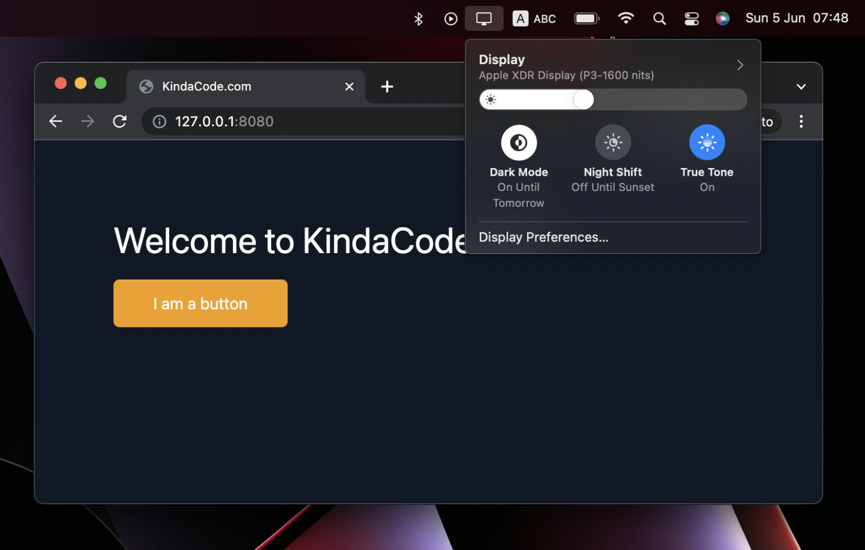
Example
Preview:
The code:
<body class="w-screen h-screen bg-white dark:bg-gray-900 p-20 space-y-5">
   <h1 class="text-4xl text-black dark:text-white">Welcome to KindaCode.com</h1>
   <button class="px-10 py-3 bg-blue-500 text-white rounded-md hover:bg-blue-700
   dark:bg-amber-500 dark:text-dark dark:hover:bg-red-500
   ease-in duration-300">
       I am a button
   </button>
</body>Note: The way to switch between dark and light mode depends on your computer and operating system.
Further reading:
- Styling a Login Page with Tailwind CSS
- Tailwind CSS: How to create accordions (collapsible content)
- Tailwind CSS: How to Create a Responsive Layout
- Tailwind CSS: Create Buttons with Text and Icons Inside
- Tailwind CSS: Style an Element Based on Its Sibling’s State
- How to Create Semi Circles in Tailwind CSS
You can also check out our CSS category page for the latest tutorials and examples.
