In Tailwind CSS, you can apply some styles for elements that have no content by using the empty modifier (a modifier is just a prefix for a utility class).
Example
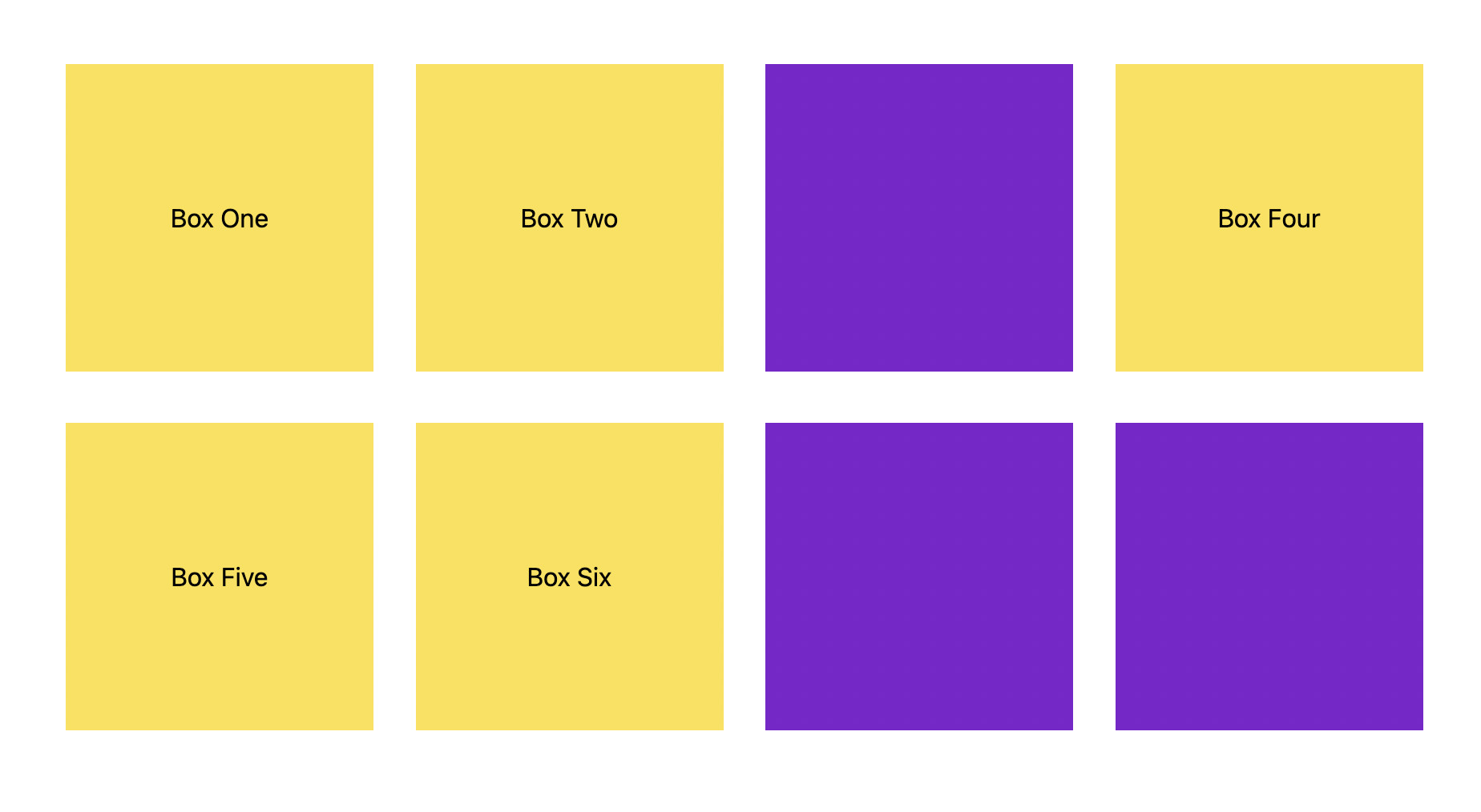
This example displays some boxes. Boxes with content will have a yellow background color, while boxes with no content will have a purple background color.
Screenshot:
The code:
<body class="p-20 grid grid-cols-4 gap-8">
    <div class="w-48 h-48 flex justify-center items-center bg-yellow-300 empty:bg-purple-700">Box One</div>
    <div class="w-48 h-48 flex justify-center items-center bg-yellow-300 empty:bg-purple-700">Box Two</div>
    <div class="w-48 h-48 flex justify-center items-center bg-yellow-300 empty:bg-purple-700"></div>
    <div class="w-48 h-48 flex justify-center items-center bg-yellow-300 empty:bg-purple-700">Box Four</div>
    <div class="w-48 h-48 flex justify-center items-center bg-yellow-300 empty:bg-purple-700">Box Five</div>
    <div class="w-48 h-48 flex justify-center items-center bg-yellow-300 empty:bg-purple-700">Box Six</div>
    <div class="w-48 h-48 flex justify-center items-center bg-yellow-300 empty:bg-purple-700"></div>
    <div class="w-48 h-48 flex justify-center items-center bg-yellow-300 empty:bg-purple-700"></div>
</body>
The usefulness of the empty modifier is clearest when you display a list of items dynamically in a loop (WordPress, React, Vue, Angular, etc).
Further reading:
- Tailwind CSS: Create a horizontal line with text in the middle
- How to Create a Modal Dialog with Tailwind CSS
- Tailwind CSS: How to Detect Device Orientation
- Tailwind CSS: How to create accordions (collapsible content)
- Form Validation with Tailwind CSS (without Javascript)
- How to Zoom on Hover with Tailwind CSS (the easiest approach)
You can also check out our CSS category page for the latest tutorials and examples.
