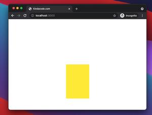
In Tailwind CSS, if utility classes with predefined values for width and height don’t suit your needs, you can use a custom value of your own on the fly by placing it in a pair of square brackets, like this:
<div class="w-[29rem] h-[99px]></div>You can flexibly choose length units (rem, px, em, vw, vh, etc).
Below is a concrete example that demonstrates this technique.
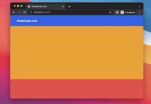
Screenshot:
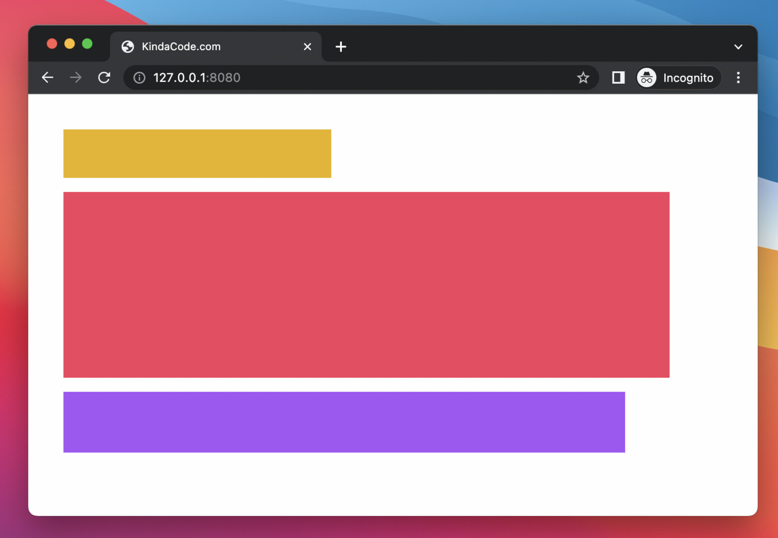
The code:
<body class="p-10 space-y-4">
    <div class="w-[19rem] h-[55px] bg-yellow-500"></div>
    <div class="w-[43em] h-[44vh] bg-rose-500"></div>
    <div class="w-[77vw] h-[69px] bg-purple-500"></div>
</body>
That’s it. Further reading:
- Min-Width, Max-Width, Min-Height, and Max-Height in Tailwind CSS
- Tailwind CSS: Create a Fixed/Sticky Footer Menu
- Tailwind CSS: How to use calc() function
- Tailwind CSS: How to Create Parallax Scrolling Effect
- How to Zoom on Hover with Tailwind CSS (the easiest approach)
- Tailwind CSS: Align an element to the left/right of its parent
You can also check out our CSS category page for the latest tutorials and examples.

