In Flutter, the Banner widget is used to display a little slanted message at one corner of another widget. This is useful in many situations, such as when you want to assign a discount label to a product, highlight a new feature in your app (banner with a “new” word), etc.
You can control where a Banner should show up by setting its location property to one of the following values: BannerLocation.topStart, BannerLocation.topEnd, BannerLocation.bottomStart, and BannerLocation.bottomEnd.
The message of a Banner can be set with the message property (the value is a string, not a Text widget). You can show another widget behind a Banner with the child property (see the second example).
Now, it’s time for code and examples.
Quick Example
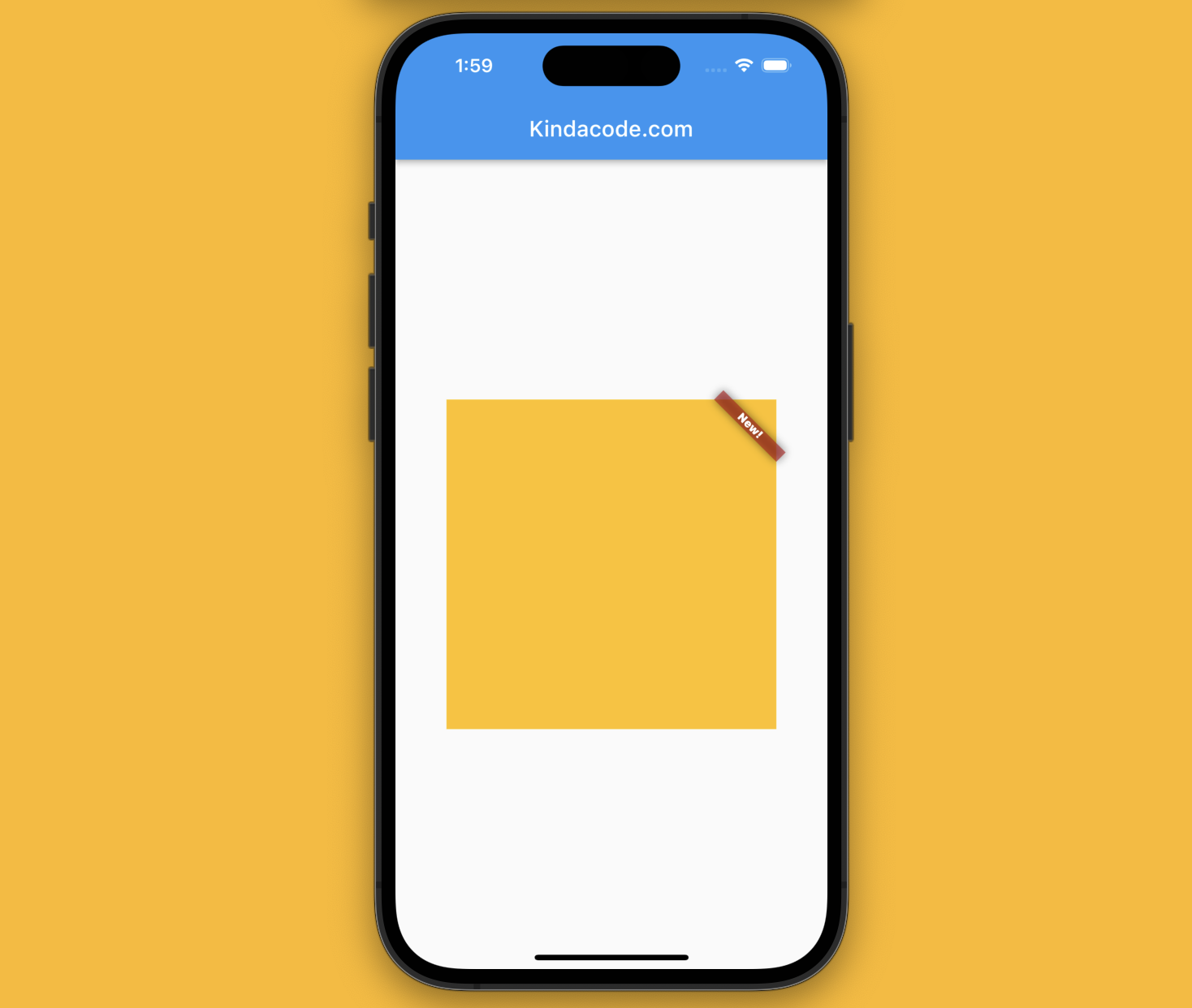
This example shows a little banner that says “News!” in the top right corner of an amber box.
Screenshot
The code
Scaffold(
      appBar: AppBar(
        title: const Text('Kindacode.com'),
      ),
      body: Center(
        child: Container(
          width: 300,
          height: 300,
          color: Colors.amber,
          child: const Banner(message: "New!", location: BannerLocation.topEnd),
        ),
      ),
);
Another Example
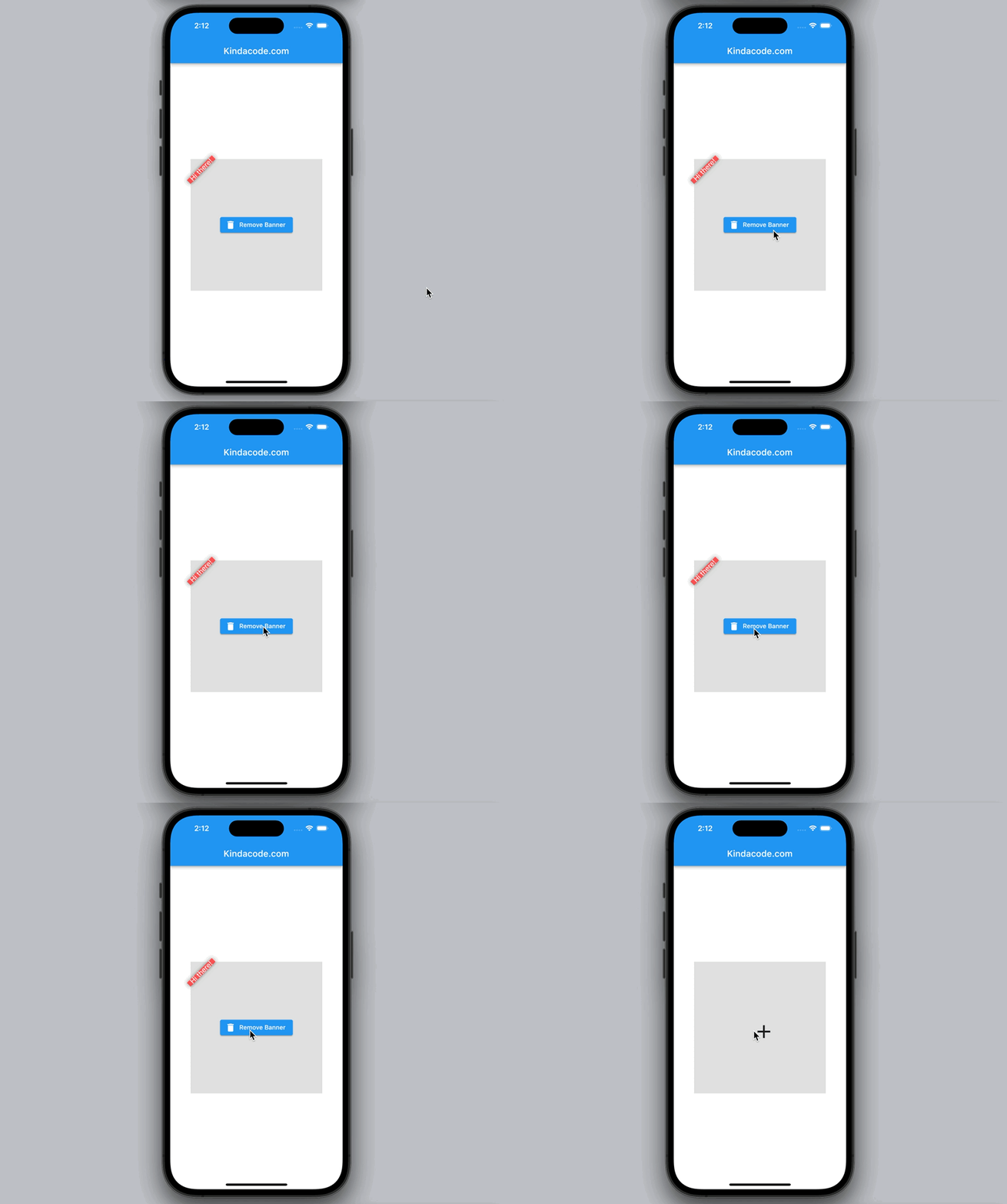
This example is a little bit more complex than the preceding one. You’ll learn how to show/hide a Banner widget dynamically.
Preview
The code with explanations
// Kindacode.com
// main.dart
import 'package:flutter/material.dart';

void main() {
  runApp(const MyApp());
}

class MyApp extends StatelessWidget {
  const MyApp({super.key});

  @override
  Widget build(BuildContext context) {
    return MaterialApp(
      // Remove the debug banner
      debugShowCheckedModeBanner: false,
      title: 'Flutter Demo',
      theme: ThemeData(
        primarySwatch: Colors.blue,
      ),
      home: const KindaCodeDemo(),
    );
  }
}

class KindaCodeDemo extends StatefulWidget {
  const KindaCodeDemo({super.key});

  @override
  State<KindaCodeDemo> createState() => _KindaCodeDemoState();
}

class _KindaCodeDemoState extends State<KindaCodeDemo> {
  // Show banner
  bool _showBanner = true;

  @override
  Widget build(BuildContext context) {
    return Scaffold(
      appBar: AppBar(
        title: const Text('Kindacode.com'),
      ),
      body: Center(
        child: Container(
          width: 300,
          height: 300,
          color: Colors.grey.shade300,
          child: _showBanner
              ? Banner(
                  // banner message
                  message: "Hi there!",
                  // banner text style
                  textStyle: const TextStyle(color: Colors.white, fontSize: 16),
                  // banner location
                  location: BannerLocation.topStart,
                  // banner background color
                  color: Colors.redAccent,
                  child: Center(
                    // This button is used to remove the banner
                    child: ElevatedButton.icon(
                      onPressed: () {
                        setState(() {
                          _showBanner = false;
                        });
                      },
                      icon: const Icon(Icons.delete),
                      label: const Text('Remove Banner'),
                    ),
                  ),
                )
              : Center(
                  // Add the banner
                  child: IconButton(
                    onPressed: () {
                      setState(() {
                        _showBanner = true;
                      });
                    },
                    icon: const Icon(Icons.add, size: 50),
                  ),
                ),
        ),
      ),
    );
  }
}
See also: 2 Ways to Create an Onboarding Flow (Intro Slider) in Flutter
Afterword
You’ve learned the most important things about the Banner widget in Flutter and gone through 2 examples of implementing it in practice. At this point, you can modify the code snippets to improve them or continue exploring more new and interesting stuff by taking a look at the following articles:
- Using Chip widget in Flutter: Tutorial & Examples
- How to Create a Sortable ListView in Flutter
- Flutter & Hive Database: CRUD Example
- Flutter and Firestore Database: CRUD example
- Flutter: Add a Search Field to an App Bar (2 Approaches)
- How to create a Filter/Search ListView in Flutter
You can also check out our Flutter category page or Dart category page for the latest tutorials and examples.
