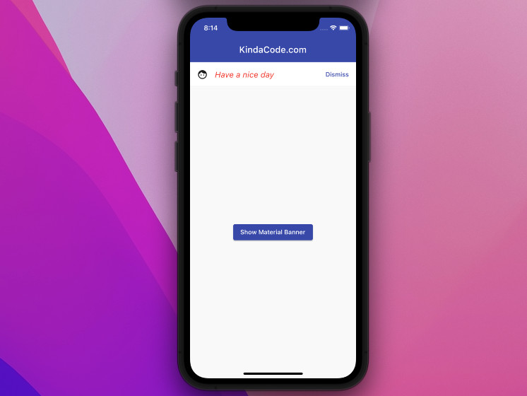
In this article, we’ll explore the fundamentals of the MaterialBanner widget in Flutter and then walk through a complete example of implementing it in practice. Without any further ado, let’s get started.
Table of Contents
Overview
MaterialBanner is used to display a brief message ((such as promotions, security warnings, etc.) and can be dismissed by the user. It includes the following mandatory components:
- content: A widget containing the content of the MaterialBanner
- actions: A list of widgets, usual buttons
A Material Banner is not an overlay or a modal like a Snack Bar or a Dialog. In simple words, it is on the same layer as its parent or siblings.
In general, a MaterialBanner can be shown programmatically by using ScaffoldMessenger like so:
 ScaffoldMessenger.of(context).showMaterialBanner(MaterialBanner(
        content: /* the content you want to show in the banner */
        actions: /* a list of widgets here */
   )
);
The banner will appear right below the app bar and take some space as well as push other content in the body section of your app down.
To close a MaterialBanner, you can call:
ScaffoldMessenger.of(context).clearMaterialBanners();A MaterialBanner can also be used statically like regular widgets:
appBar: /* Your app bar */
body: Column(
  MaterialBanner(/* ... */),

  // other things
  Container(/*...*/),
  Text(/*...*/),
  /* ... */
)
However, this usage is quite rare.
Example
App Preview
The sample app we’re going to build contains an elevated button in the center of the screen. When this button gets pressed, a material banner will show up. You can close the banner by using its Dismiss button.
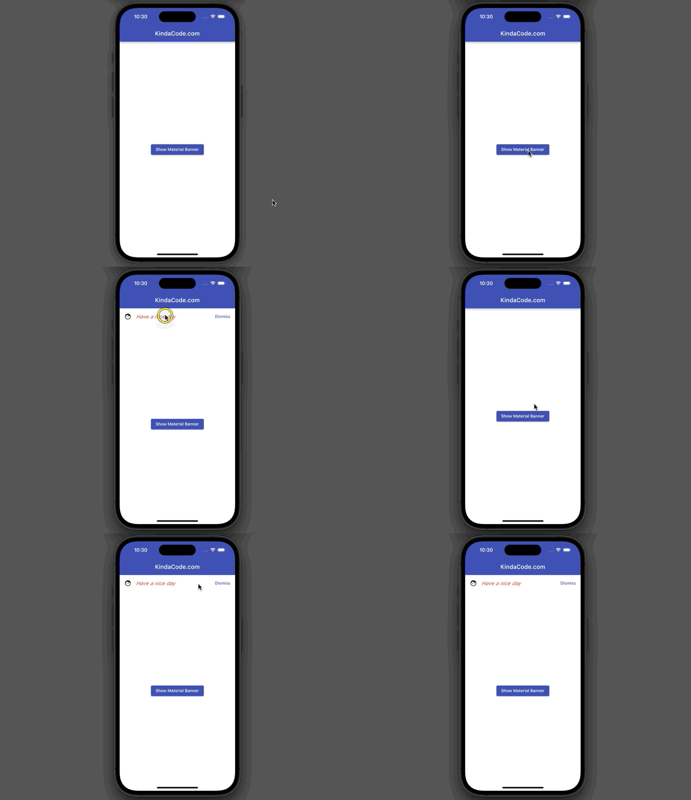
If you have a closer look at the demo above, you’ll notice that the elevated button goes down a little when the banner shows up and returns to the beginning place when the banner disappears.
The Code
The complete code with explanations:
// main.dart
import 'package:flutter/material.dart';

void main() {
  runApp(const MyApp());
}

class MyApp extends StatelessWidget {
  const MyApp({Key? key}) : super(key: key);
  @override
  Widget build(BuildContext context) {
    return MaterialApp(
        // Remove the debug banner
        debugShowCheckedModeBanner: false,
        title: 'KindaCode.com',
        theme: ThemeData(
          primarySwatch: Colors.indigo,
        ),
        home: const HomePage());
  }
}

class HomePage extends StatefulWidget {
  const HomePage({Key? key}) : super(key: key);

  @override
  State<HomePage> createState() => _HomePageState();
}

class _HomePageState extends State<HomePage> {
  void _showMaterialBanner() {
    ScaffoldMessenger.of(context).showMaterialBanner(MaterialBanner(
        content: const Text('Have a nice day'),
        leading: const Icon(Icons.face),
        contentTextStyle: const TextStyle(
            fontSize: 18, color: Colors.red, fontStyle: FontStyle.italic),
        actions: [
          TextButton(
              onPressed: () {
                // dismiss the material banner
                ScaffoldMessenger.of(context).clearMaterialBanners();
              },
              child: const Text('Dismiss'))
        ]));
  }

  @override
  Widget build(BuildContext context) {
    return Scaffold(
      appBar: AppBar(title: const Text('KindaCode.com')),
      body: Center(
        // this button is used to show the material banner
        child: ElevatedButton(
          onPressed: _showMaterialBanner,
          child: const Text('Show Material Banner'),
        ),
      ),
    );
  }
}
Conclusion
That’s it. Congrats if you made it through the entire tutorial. You’ve just successfully shown and hidden a material banner. From now on, you have an extra tool to use in your app as needed. If you’d like to explore more new and exciting things about modern Flutter development, take a look at the following articles:
- How to implement a loading dialog in Flutter
- Flutter: Hide current SnackBar before its duration ends
- How to implement Star Rating in Flutter
- Flutter: Creating OTP/PIN Input Fields (2 approaches)
- 2 Ways to Add Multiple Floating Buttons in Flutter
You can also check out our Flutter category page or Dart category page for the latest tutorials and examples.

