The Switch widget is used to turn on or off a single setting.
Table of Contents
TLDR
In the vast majority of cases, you will implement a switch like this:
Switch(
     value: _myValue, // a boolean variable
     onChanged: (_) {
        setState(() {
            _myValue = !_myValue;
     });
}),
A Complete Example
App Preview
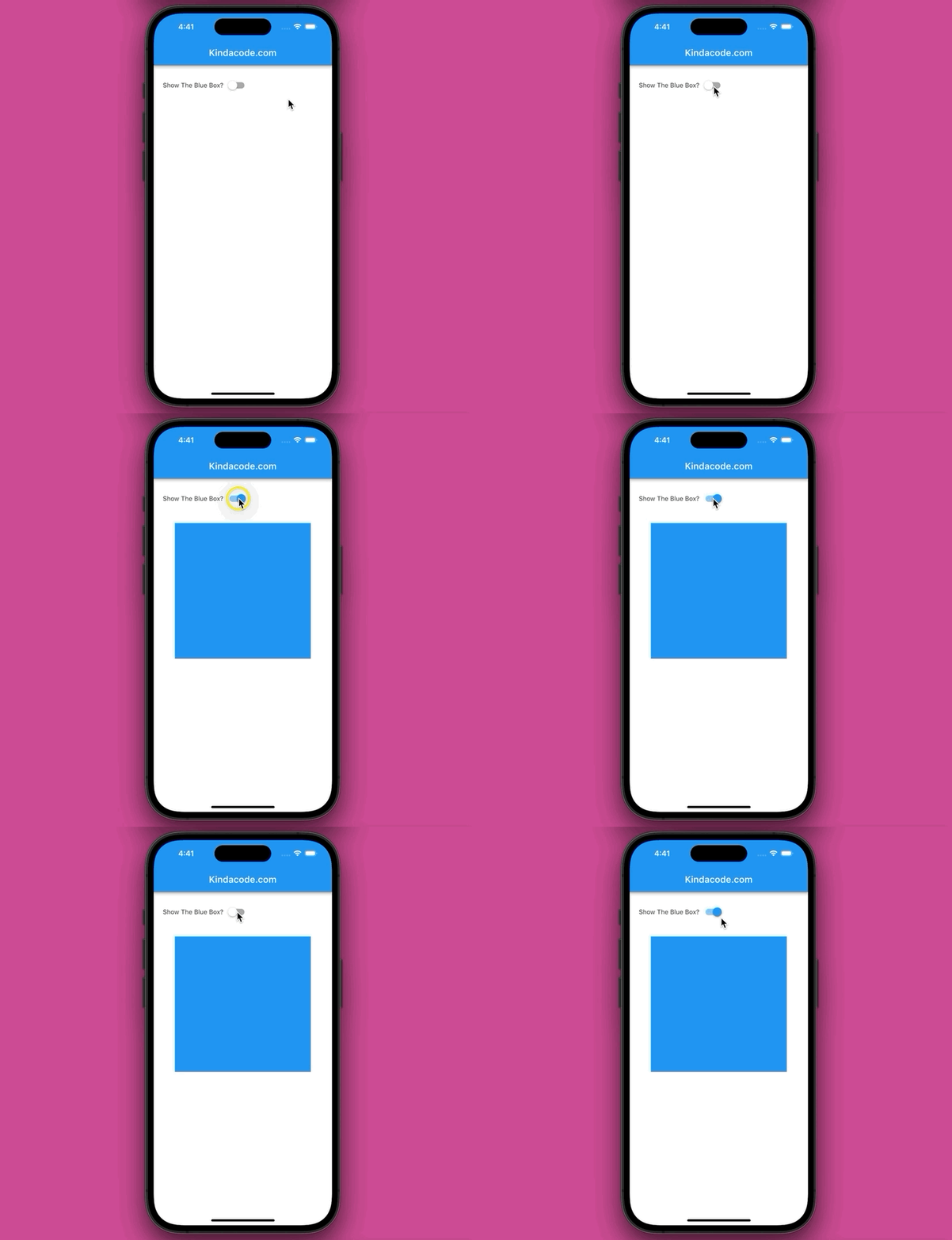
The app we are going to build contains a switch. This switch can be used to show or hide a blue square box. Here’s how is how it works:
The Code
Full code in main.dart:
import 'package:flutter/material.dart';

void main() {
  runApp(const MyApp());
}

class MyApp extends StatelessWidget {
  const MyApp({Key? key}) : super(key: key);

  @override
  Widget build(BuildContext context) {
    return const MaterialApp(
      // Remove the debug banner
      debugShowCheckedModeBanner: false,
      title: "Kindacode.comr",
      home: MyHomePage(),
    );
  }
}

class MyHomePage extends StatefulWidget {
  const MyHomePage({Key? key}) : super(key: key);

  @override
  State<MyHomePage> createState() => _MyHomePageState();
}

class _MyHomePageState extends State<MyHomePage> {
  bool showBox = false;
  @override
  Widget build(BuildContext context) {
    return Scaffold(
      appBar: AppBar(
        title: const Text('Kindacode.com'),
      ),
      body: Padding(
        padding: const EdgeInsets.all(20),
        child: Column(children: [
          Row(
            children: [
              const Text('Show The Blue Box?'),
              Switch(
                  value: showBox,
                  onChanged: (value) {
                    setState(() {
                      showBox = value;
                    });
                  }),
            ],
          ),

          // just adding some space
          const SizedBox(height: 30),

          // the blue box here
          showBox
              ? Container(
                  width: 300, height: 300, color: Colors.blue) // the blue box
              : Container(), // show nothing
        ]),
      ),
    );
  }
}
Constructors
Material Switch:
Switch({
  Key? key,
  required bool value,
  required ValueChanged<bool>? onChanged,
  Color? activeColor,
  Color? activeTrackColor,
  Color? inactiveThumbColor,
  Color? inactiveTrackColor,
  ImageProvider<Object>? activeThumbImage,
  ImageErrorListener? onActiveThumbImageError,
  ImageProvider<Object>? inactiveThumbImage,
  ImageErrorListener? onInactiveThumbImageError,
  MaterialStateProperty<Color?>? thumbColor,
  MaterialStateProperty<Color?>? trackColor,
  MaterialTapTargetSize? materialTapTargetSize,
  DragStartBehavior dragStartBehavior = DragStartBehavior.start,
  MouseCursor? mouseCursor,
  Color? focusColor,
  Color? hoverColor,
  MaterialStateProperty<Color?>? overlayColor,
  double? splashRadius,
  FocusNode? focusNode,
  bool autofocus = false
})
Adaptive material Switch:
Switch.adaptive({
  Key? key,
  required bool value,
  required ValueChanged<bool>? onChanged,
  Color? activeColor,
  Color? activeTrackColor,
  Color? inactiveThumbColor,
  Color? inactiveTrackColor,
  ImageProvider<Object>? activeThumbImage,
  ImageErrorListener? onActiveThumbImageError,
  ImageProvider<Object>? inactiveThumbImage,
  ImageErrorListener? onInactiveThumbImageError,
  MaterialTapTargetSize? materialTapTargetSize,
  MaterialStateProperty<Color?>? thumbColor,
  MaterialStateProperty<Color?>? trackColor,
  DragStartBehavior dragStartBehavior = DragStartBehavior.start,
  MouseCursor? mouseCursor,
  Color? focusColor,
  Color? hoverColor,
  MaterialStateProperty<Color?>? overlayColor,
  double? splashRadius,
  FocusNode? focusNode,
  bool autofocus = false
})
You can find more details in the official docs.
Conclusion
We’ve covered the fundamentals and walked through a complete example of implementing the Switch widget. If you’d like to learn more new and exciting things in Flutter and Dart, take a look at the following articles:
- Flutter: Making a Dropdown Multiselect with Checkboxes
- How to Flatten a Nested List in Dart
- Dart: Convert Class Instances (Objects) to Maps and Vice Versa
- Flutter: Creating OTP/PIN Input Fields (2 approaches)
- Flutter: Creating Strikethrough Text (Cross Out Text)
- Flutter: Making Beautiful Chat Bubbles (2 Approaches)
You can also check out our Flutter category page or Dart category page for the latest tutorials and examples.


