In Flutter, you can show or hide text labels of items of a BottomNavigationBar by using the showSelectedLabels and showUnselectedLabels properties:
- showSelectedLabels: Determines whether the label corresponding to the selected BottomNavigationBarItem is shown or not. The default value is true.
- showUnselectedLabels: Determines whether the labels associated with the unselected BottomNavigationBarItems are shown or not. Defaults to true when type is BottomNavigationBarType.fixed and false when type is BottomNavigationBarType.shifting.
Example 1
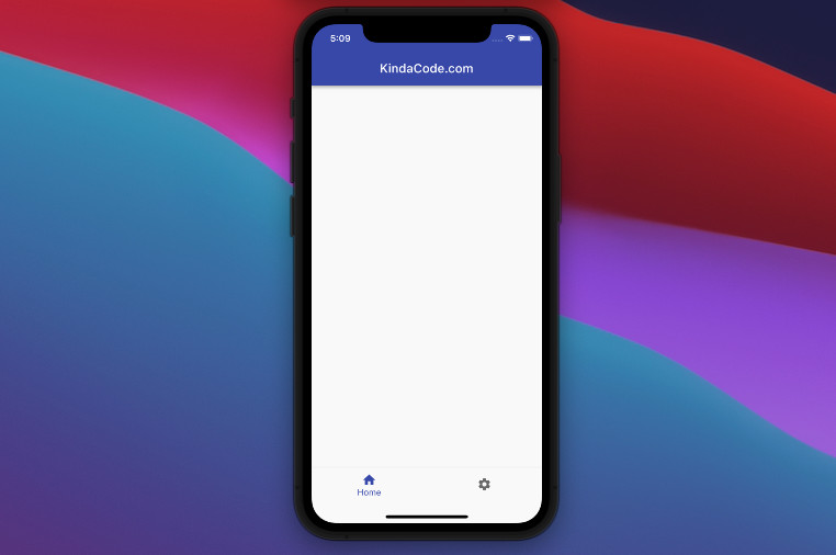
In this example, only the label of the selected item is shown.
Screenshot:
The code:
Widget build(BuildContext context) {
    return Scaffold(
      appBar: AppBar(title: const Text('KindaCode.com')),
      body: Container(),
      bottomNavigationBar: BottomNavigationBar(
        type: BottomNavigationBarType.fixed,
        showSelectedLabels: true,
        showUnselectedLabels: false,
        currentIndex: 0,
        items: const [
          BottomNavigationBarItem(icon: Icon(Icons.home), label: 'Home'),
          BottomNavigationBarItem(icon: Icon(Icons.settings), label: 'Settings')
        ],
      ),
    );
}
Example 2
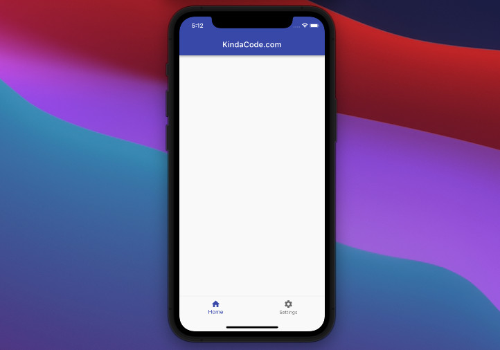
In this example, all labels are shown.
Screenshot:
The code:
 Widget build(BuildContext context) {
    return Scaffold(
      appBar: AppBar(title: const Text('KindaCode.com')),
      body: Container(),
      bottomNavigationBar: BottomNavigationBar(
        type: BottomNavigationBarType.fixed,
        showSelectedLabels: true,
        showUnselectedLabels: true,
        currentIndex: 0,
        items: const [
          BottomNavigationBarItem(icon: Icon(Icons.home), label: 'Home'),
          BottomNavigationBarItem(icon: Icon(Icons.settings), label: 'Settings')
        ],
      ),
    );
  }
That’s it. Further reading:
- Using NavigationRail and BottomNavigationBar in Flutter
- Working with Cupertino Bottom Tab Bar in Flutter
- Flutter BottomAppBar: Tutorial & Examples
- Flutter: 2 Ways to Create an Onboarding Flow (Intro Slider)
- Flutter: Making Beautiful Chat Bubbles (2 Approaches)
- Flutter: 2 Ways to Make a Dark/Light Mode Toggle
You can also check out our Flutter category page or Dart category page for the latest tutorials and examples.


