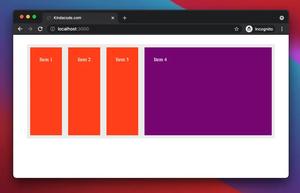
In Tailwind CSS, you can use the flex-1 or grow utility class to force a child element to fill the remaining space on the main axis of a flex container. The child element will expand as much as possible and occupy the free area.
Example
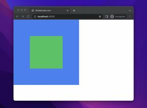
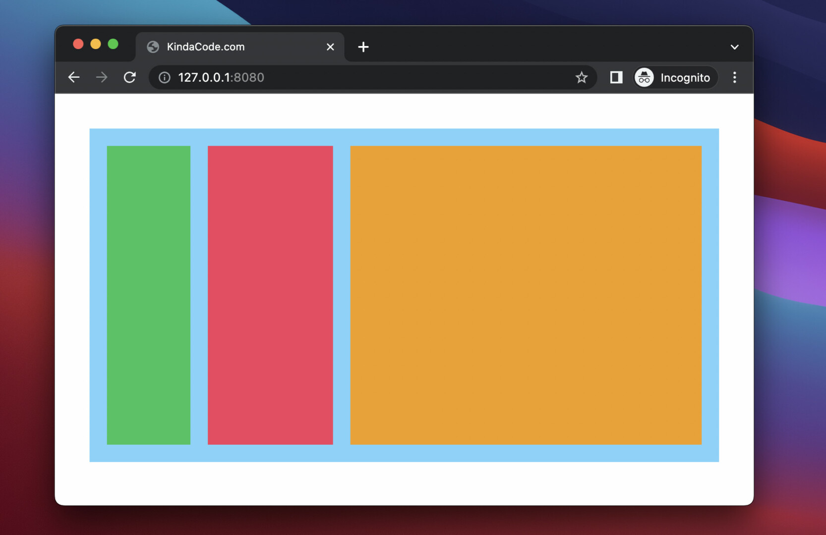
In this example, the size of the amber box can be expanded or reduced to fill the empty space of its parent (the part with the sky color). Meanwhile, the size of the green and red (rose) boxes is unchanged.
Preview:
The code
This code uses the grow utility:
<body class="p-10">
   <div class="flex w-full h-96 p-5 bg-sky-300">
       <div class="w-24 h-full bg-green-500"></div>
       <div class="w-36 h-full ml-5 bg-rose-500"></div>
       <div class="grow h-full ml-5 bg-amber-500"></div>
   </div>
</body>
You can achieve the same result with the flex-1 utility:
<body class="p-10">
   <div class="flex w-full h-96 p-5 bg-sky-300">
       <div class="w-24 h-full bg-green-500"></div>
       <div class="w-36 h-full ml-5 bg-rose-500"></div>
       <div class="flex-1 h-full ml-5 bg-amber-500"></div>
   </div>
</body>
If you’re making a layout on the VERTICAL axis, try this code:
<body>
   <div class="flex flex-col w-full h-screen p-5 bg-sky-300">
       <div class="w-full h-12 bg-green-500"></div>
       <div class="w-full h-36 mt-5 bg-rose-500"></div>
       <div class="grow w-full mt-5 bg-amber-500"></div>
   </div>
</body>
That’s it. Continue learning more about Tailwind CSS and CSS by taking a look at the following articles:
- Text Decoration in Tailwind CSS: The Complete Guide
- Tailwind CSS: Styling the First Letter of Content
- How to Create Striped Tables with Tailwind CSS
- How to Style File Inputs with Tailwind CSS
- How to create cut-out text effect with Tailwind CSS
- How to Create Frosted Glass Effect in Tailwind CSS
You can also check out our CSS category page for the latest tutorials and examples.
